


This is the last principle we want to discuss. Broadly speaking, it states that the content and navigation of a website must be easy to understand. While the responsibility for implementing many of these recommendations lies with the "end user" of the plugin or theme (or whoever publishes the content), there are some recommendations that can be implemented by the developers of these plugins and themes.
The first guideline states that content should be “readable and easy to understand.” Many of the suggestions relate to the reading level of the content and the use of uncommon words, abbreviations, and acronyms, which are not relevant to developers.
One recommendation we can implement is that the human language of web pages should be programmatically identifiable. To do this, the language should be specified on the element via the lang attribute. Additionally, the dir attribute should be used to indicate whether the content is right-to-left.
WordPress simplifies this by providing language_attributes(), which prints the required attributes. In your theme's header.php:
>
language_attributes() The function sets the language and, if necessary, the orientation of the website, and filters the output, allowing plugins (such as multilingual plugins) to change the attributes as needed.
The second guideline states that websites should appear and behave in a predictable manner. Many of the recommendations can be implemented by ensuring that your theme's HTML markup is well-structured and logical. Beyond that, there's plenty of "don't" advice—recommendations against making changes that break the natural and logical behavior of the web page.
We mentioned not using tabindex in the fourth article in this series ("Actionable"). This recommendation builds on the statement that when an item gains focus, it should not be considered to trigger some change in the page state.
For example, a form button receiving focus should not cause the form to be submitted, and a link receiving focus should not cause the link to be activated. This is not to say that tooltips or submenus of navigation menus should not appear when the corresponding item receives focus. These examples do not constitute a change of status. Roughly speaking, you can equate the item that has focus with the item that is hovered over.
You should avoid removing focus from the element receiving focus. For example, you should never do the following:
$('a').on('focus',function(){ $(this).blur(); });
By default, the only forms relevant to theme developers are the login/registration, search, and comment forms. Of these, theme developers usually only focus on the latter two. Since searching for a form never results in an "error", we focus this section on comment forms.
WordPress does a great job of notifying users of errors and telling them exactly what the error is. However, it does this by allowing users to navigate away from the original page and presenting them with a "dead end" error page.
If the user returns to the original page, the form will lose focus and they will have to find it again. A better solution would be to prevent the user from submitting the form before filling it out correctly. However, when doing this, you must communicate to the user that the value entered is invalid, otherwise you have effectively trapped them.
There are a large number of client-side validation scripts available, and it's very easy to build your own simple validation script. What’s important is:
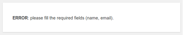
role="alert". This is a simple example, based on WebAIM's own Accessible Form Validation example (which I encourage you to read), that adds an error message if the name field is empty.
    jQuery(document).ready(function($) {

		$('#author').on( 'blur', function( e ){
			var value = $(this).val();
			if( !value ){
				if( $('#author-error').length > 0 ){
					$('#author-error').remove();
				}

				$( '' )
					.insertAfter( $('#author') )
					.text( 'Name field error: Please provide a name' );

			}else if( $('#author-error').length > 0 ){
				$('#author-error').remove();
			}

		});

	});
The WebAIM sample also prevents users from invalidating fields and returns them to the field to correct errors. If you do this, I recommend that you not return the user to the field when the value is empty, otherwise you will frustrate users who accidentally give the field focus without intending to submit the form.
As stated earlier in this series, you should not rely solely on color or placement to convey meaning. In this case, the error messages should be obvious from the text, as should their associated fields.
Themes can only display the comment form using comment_form(), and this handles tags in an accessible way. Likewise, the default search form requires no further work. However, when customizing or designing these forms, you should:
tag must always be visible. Specifically, this means that placeholders do not constitute tags and should not be used in searches. There are several reasons for this:
如果表单字段需要进一步的说明,可以在字段之后提供这些说明,但仍然使用 aria-scribedby 属性显式链接到该字段。该属性引用的元素的内容在field的标签后面读出。
以 W3C 网站为例:
但是,您应该注意,屏幕阅读器对此的支持并不一致。
必填字段应使用 aria-required="true" 属性进行标记。由 comment_form() 生成的默认 WordPress 评论表单已处理此问题,因此您需要在此处执行任何操作。但是,如果您选择自定义评论表单,则应该注意这一点。
本文总结了我们关于 W3C 可访问性原则的粗略主题开发人员指南以及如何实施这些原则。在本系列的最后一篇文章中,我们将研究一些简单的方法,以进一步推动并积极鼓励和帮助我们的主题(或插件)的最终用户生成可访问的内容。
The above is the detailed content of Understanding Accessibility: Part 5. For more information, please follow other related articles on the PHP Chinese website!


![[Web front-end] Node.js quick start](https://img.php.cn/upload/course/000/000/067/662b5d34ba7c0227.png)


