


In the dataset, the strength and direction of the correlation between two pairs of variables is graphically displayed by a correlation heat map, which displays the correlation matrix. It is an effective technique for finding patterns and connections in large-scale data sets.
Python data visualization tool Seaborn provides simple tools to generate statistical visualization graphics. Users can quickly view the correlation matrix of a dataset through its ability to create correlation heatmaps.
We have to import the dataset, calculate the correlation matrix of the variables, and then use the Seaborn heatmap function to generate the heatmap to build the correlation heatmap. A heat map displays a matrix whose colors represent the degree of correlation between variables. Additionally, users can display the correlation coefficient on the heat map.
Seaborn Correlation heatmaps are an effective visualization technique for examining patterns and relationships in a data set and can be used to pinpoint key variables for further investigation.
The heatmap function generates a color-coded matrix illustrating the strength of the correlation between two pairs of variables in the dataset. The heatmap function requires us to provide the correlation matrix of the variables, which can be calculated using the corr method of the Pandas data frame. The heatmap function provides a number of optional options that enable the user to modify the visual effects of the heatmap, including color scheme, annotation, chart size and position.
import seaborn as sns sns.heatmap(data, cmap=None, annot=None)
The parameter data in the above function is the correlation matrix representing the input data set. The color map used to color heatmaps is called cmap.
The Chinese translation ofIn this example, we create a seaborn correlation heatmap using Python. First, we import the seaborn and matplotlib libraries and load the iris dataset using Seaborn's load dataset function. This data set contains the SepalLength, SepalWidth, PetalLength, and PetalWidth variables. The iris data set includes measurements of sepal length, sepal width, petal length, and petal width of iris flowers. Here is an example of the message -
| Serial number | sepal_length | sepal_width | Petal length | Petal Width | Species | |
|---|---|---|---|---|---|---|
| 0 | 5.1 | The Chinese translation of3.5 | is:3.5 | 1.4 | 0.2 | Silk smooth |
| 1 | 4.9 | 3.0 | 1.4 | 0.2 | Silk smooth | |
| 2 | 4.7 | 3.2 | 1.3 | 0.2 | Silk smooth | |
| 3 | The translation of4.6 | is:4.6 | 3.1 | 1.5 | 0.2 | Silk smooth |
| 4 | 5.0 | Translated into Chinese:5.0 | 3.6 | 1.4 | 0.2 | Silk smooth |
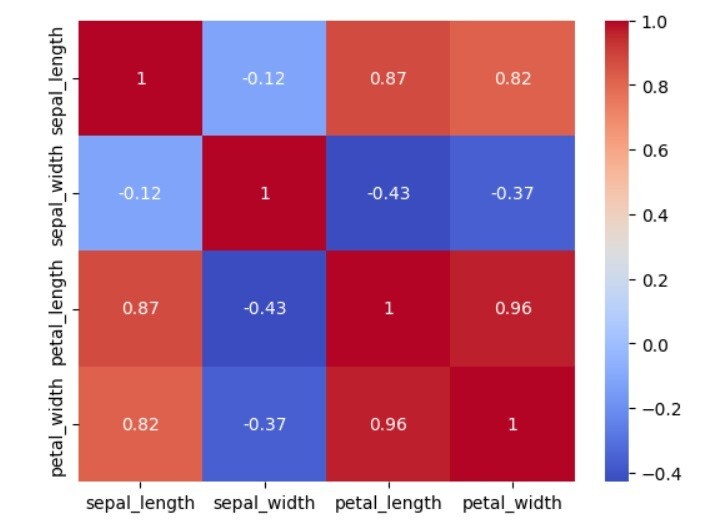
Users can use Seaborn's load dataset method to load the iris dataset into a Pandas DataFrame. The correlation matrix of the variables is then calculated using the corr method of the Pandas dataframe and saved in a variable called corr_matrix. We use Seaborn's heatmap method to generate heat maps. We pass the correlation matrix corr_matrix to the function and set the cmap parameter to "coolwarm" to use different colors to represent positive and negative correlations. Finally, we use the show method of matplotlib's pyplot module to display the heat map.
# Required libraries import seaborn as sns import matplotlib.pyplot as plt # Load the iris dataset into a Pandas dataframe iris_data = sns.load_dataset('iris') # Creating the correlation matrix of the iris dataset iris_corr_matrix = iris_data.corr() print(iris_corr_matrix) # Create the heatmap using the `heatmap` function of Seaborn sns.heatmap(iris_corr_matrix, cmap='coolwarm', annot=True) # Display the heatmap using the `show` method of the `pyplot` module from matplotlib. plt.show()
sepal_length sepal_width petal_length petal_width sepal_length 1.000000 -0.117570 0.871754 0.817941 sepal_width -0.117570 1.000000 -0.428440 -0.366126 petal_length 0.871754 -0.428440 1.000000 0.962865 petal_width 0.817941 -0.366126 0.962865 1.000000
In this example, we again use Python to create a seaborn correlation heatmap. First, we import the seaborn and matplotlib libraries and load the diamond dataset using Seaborn's load dataset function. The Diamond Dataset includes detailed information on the cost and characteristics of diamonds, including their carat weight, cut, color, and clarity. This is an example of information −
| Serial number | carat | The Chinese translation ofcut | is:cut | color | Clarity | The Chinese translation ofdepth | is:depth | surface | price | x | y | z | |
|---|---|---|---|---|---|---|---|---|---|---|---|---|---|
| 0 | 0.23 | The translation ofIdeal | is:Ideal | E | SI2 | 61.5 | 55.0 | Translated into Chinese:55.0 | 326 | The Chinese translation of3.95 | is:3.95 | 3.98 | 2.43 |
| 1 | 0.21 | Premium Edition | E | SI1 | 59.8 | 61.0 | 326 | 3.89 | 3.84 | 2.31 | |||
| 2 | 0.23 | good | E | VS1 | 56.9 | 65.0 | 327 | 4.05 | 4.07 | 2.31 | |||
| 3 | 0.29 | Premium Edition | The Chinese translation ofI | is:I | VS2 | The Chinese translation of62.4 | is:62.4 | 58.0 | 334 | 4.20 | 4.23 | 2.63 | |
| 4 | 0.31 | good | J | SI2 | 63.3 | 58.0 | 335 | 4.34 | 4.35 | The Chinese translation of2.75 | is:2.75 |
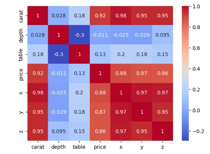
可以使用 Seaborn 的加载数据集函数将钻石数据集加载到 Pandas DataFrame 中。接下来,使用 Pandas 数据帧的 corr 方法,计算变量的相关矩阵并将其存储在名为 Diamond_corr_matrix 的变量中。为了利用不同的颜色来表示与函数的正相关和负相关,我们传递相关矩阵 corr 矩阵并将 cmap 选项设置为“coolwarm”。最后,我们使用 matplotlib 的 show 方法中的 pyplot 模块来显示热图。
# Required libraries import seaborn as sns import matplotlib.pyplot as plt # Load the diamond dataset into a Pandas dataframe diamonds_data = sns.load_dataset('diamonds') # Compute the correlation matrix of the variables diamonds_corr_matrix = diamonds_data.corr() print(diamonds_corr_matrix) # Create the heatmap using the `heatmap` function of Seaborn sns.heatmap(diamonds_corr_matrix, cmap='coolwarm', annot=True) # Display the heatmap using the `show` method of the `pyplot` module from matplotlib. plt.show()
carat depth table price x y z carat 1.000000 0.028224 0.181618 0.921591 0.975094 0.951722 0.953387 depth 0.028224 1.000000 -0.295779 -0.010647 -0.025289 -0.029341 0.094924 table 0.181618 -0.295779 1.000000 0.127134 0.195344 0.183760 0.150929 price 0.921591 -0.010647 0.127134 1.000000 0.884435 0.865421 0.861249 x 0.975094 -0.025289 0.195344 0.884435 1.000000 0.974701 0.970772 y 0.951722 -0.029341 0.183760 0.865421 0.974701 1.000000 0.952006 z 0.953387 0.094924 0.150929 0.861249 0.970772 0.952006 1.000000
热图是一种有益的图形表示形式,seaborn 使其变得简单易用。
The above is the detailed content of How to create seaborn correlation heatmap in Python?. For more information, please follow other related articles on the PHP Chinese website!


![Getting Started with PHP Practical Development: PHP Quick Creation [Small Business Forum]](https://img.php.cn/upload/course/000/000/035/5d27fb58823dc974.jpg)


![[Web front-end] Node.js quick start](https://img.php.cn/upload/course/000/000/067/662b5d34ba7c0227.png)


