

 Backend Development
Python Tutorial
Still annoyed by Matplotlib's cumbersome layer settings! ? Come and take a look at this Python drawing toolkit
Backend Development
Python Tutorial
Still annoyed by Matplotlib's cumbersome layer settings! ? Come and take a look at this Python drawing toolkit
Still annoyed by Matplotlib's cumbersome layer settings! ? Come and take a look at this Python drawing toolkit

- ProPlot library introduction
- ProPlot example demonstration
ProPlot library introduction
When using Python-matplotlib to draw charts, the default color and format themes can only help us become familiar with the drawing functions. If you want to design excellent visualization works (whether it is publication level or slightly artistic), you need to be familiar with a large number of drawing functions, such ascolors, scales, spines, fonts, etc. When it comes to drawingMultiple subplots, these operations will consume a lot of our energy, will inevitably lead to lengthy code writing, and are also error-prone. For details, you can check out my previous article Python-matplotlib Academic Scatter Chart EE Statistics and Drawing and Python-matplotlib horizontally stacked column chart drawing. In addition, if you need to use matplotlib for drawing every day and often need to beautify the charts, then the Proplot drawing package is perfect for you, and don’t worry about not getting used to it. People have highly praised matplotlib. Encapsulation, greatly simplifying the drawing function. Below we will briefly introduce its installation and main usage methods. If you want to know more about it, you can go to the official website.
Installation
We can install directly using pip or conda That’s it,
#for pip
pip install proplot
#for conda
conda install -c conda-forge proplot
Of course, due to the continuous update of the version, you can also use the following code for update processing:
#for pip
pip install --upgrade proplot
#for conda
conda upgrade proplot
format() simplified code
Proplot drawing charts does not require setting each drawing property like matplotlib does. The format() function provided provides the format of changing all settings at once. ization method. Let’s first give a simple example, as follows:
Use matplotlib to draw
import matplotlib.pyplot as plt
import matplotlib.ticker as mticker
import matplotlib as mpl
with mpl.rc_context(rc={'axes.linewidth': 1, 'axes.color': 'gray'}):
    fig, axs = plt.subplots(ncols=2, sharey=True)
    axs[0].set_ylabel('bar', color='gray')
    for ax in axs:
        ax.set_xlim(0, 100)
        ax.xaxis.set_major_locator(mticker.MultipleLocator(10))
        ax.tick_params(width=1, color='gray', labelcolor='gray')
        ax.tick_params(axis='x', which='minor', bottom=True)
        ax.set_xlabel('foo', color='gray')
ProPlot drawing
import proplot as plot
fig, axs = plot.subplots(ncols=2)
axs.format(linewidth=1, color='gray')
axs.format(xlim=(0, 100), xticks=10, xtickminor=True, xlabel='foo', ylabel='bar')
You can see the simplicity of Proplot from this simple example.
A-b-c Add multiple sub-picture serial numbers
In addition to the aboveformat() greatly reduce the code In terms of quantity, we have introduced a drawing method that I think is more convenient -The serial number of multiple subgraphs is automatically added. Specific examples are as follows:
# 样本数据
import numpy as np
state = np.random.RandomState(51423)
data = 2 * (state.rand(100, 5) - 0.5).cumsum(axis=0)

import proplot as plot
fig, axs = plot.subplots(ncols=2)
axs[0].plot(data, lw=2)
axs[0].format(xticks=20, xtickminor=False)
axs.format(abc=True,abcstyle='(A)',abcsize=12,abcloc='ul',
    suptitle='Abc label test', title='Title',
    xlabel='x axis', ylabel='y axis'
)
plt.savefig(r'E:\Data_resourses\DataCharm 公众号\Python\学术图表绘制\ProPlot\abc_01.png',
             dpi=900)
The effect is as follows: 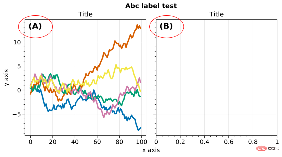
You can also perform style (abcstyle), position (abcloc), size ( abcsize) and other settings. For other detailed settings, please refer to the official website.
Colorbars and legends
- ##axis Colorbars and Legend
import proplot as plot
import numpy as np
fig, axs = plot.subplots(nrows=2, share=0, axwidth='55mm', panelpad='1em')
axs.format(suptitle='Stacked colorbars demo')
state = np.random.RandomState(51423)
N = 10
# Repeat for both axes
for j, ax in enumerate(axs):
    ax.format(
        xlabel='data', xlocator=np.linspace(0, 0.8, 5),
        title=f'Subplot #{j+1}'
    )
    for i, (x0, y0, x1, y1, cmap, scale) in enumerate((
        (0, 0.5, 1, 1, 'grays', 0.5),
        (0, 0, 0.5, 0.5, 'reds', 1),
        (0.5, 0, 1, 0.5, 'blues', 2)
    )):
        if j == 1 and i == 0:
            continue
        data = state.rand(N, N) * scale
        x, y = np.linspace(x0, x1, N + 1), np.linspace(y0, y1, N + 1)
        m = ax.pcolormesh(
            x, y, data, cmap=cmap,
            levels=np.linspace(0, scale, 11)
        )
        ax.colorbar(m, loc='l', label=f'dataset #{i+1}')

plt.savefig(r'E:\Data_resourses\DataCharm 公众号\Python\学术图表绘制\ProPlot\colorbar_legend_02.png',
             dpi=900)
The effect is as follows: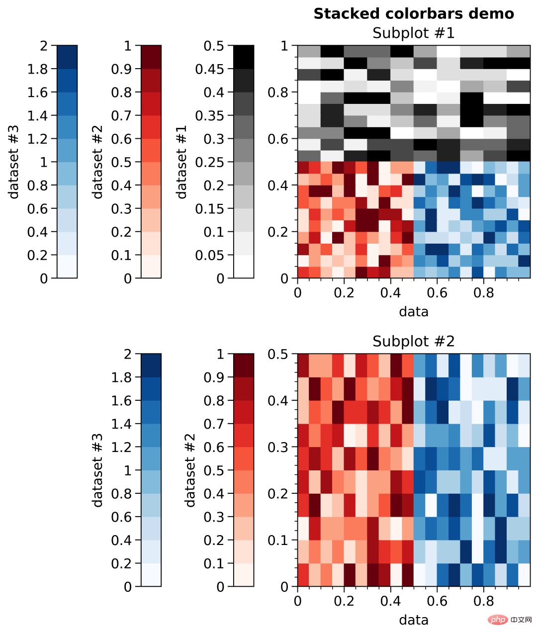
Figure 颜色条和图例
import proplot as plot
import numpy as np
fig, axs = plot.subplots(ncols=3, nrows=3, axwidth=1.4)
state = np.random.RandomState(51423)
m = axs.pcolormesh(
state.rand(20, 20), cmap='grays',
levels=np.linspace(0, 1, 11), extend='both'
)[0]
axs.format(
suptitle='Figure colorbars and legends demo', abc=True,
abcloc='l', abcstyle='(a)', xlabel='xlabel', ylabel='ylabel'
)
fig.colorbar(m, label='column 1', ticks=0.5, loc='b', col=1)
fig.colorbar(m, label='columns 2-3', ticks=0.2, loc='b', cols=(2, 3))
fig.colorbar(m, label='stacked colorbar', ticks=0.1, loc='b', minorticks=0.05)
fig.colorbar(m, label='colorbar with length <1', ticks=0.1, loc='r', length=0.7)效果如下: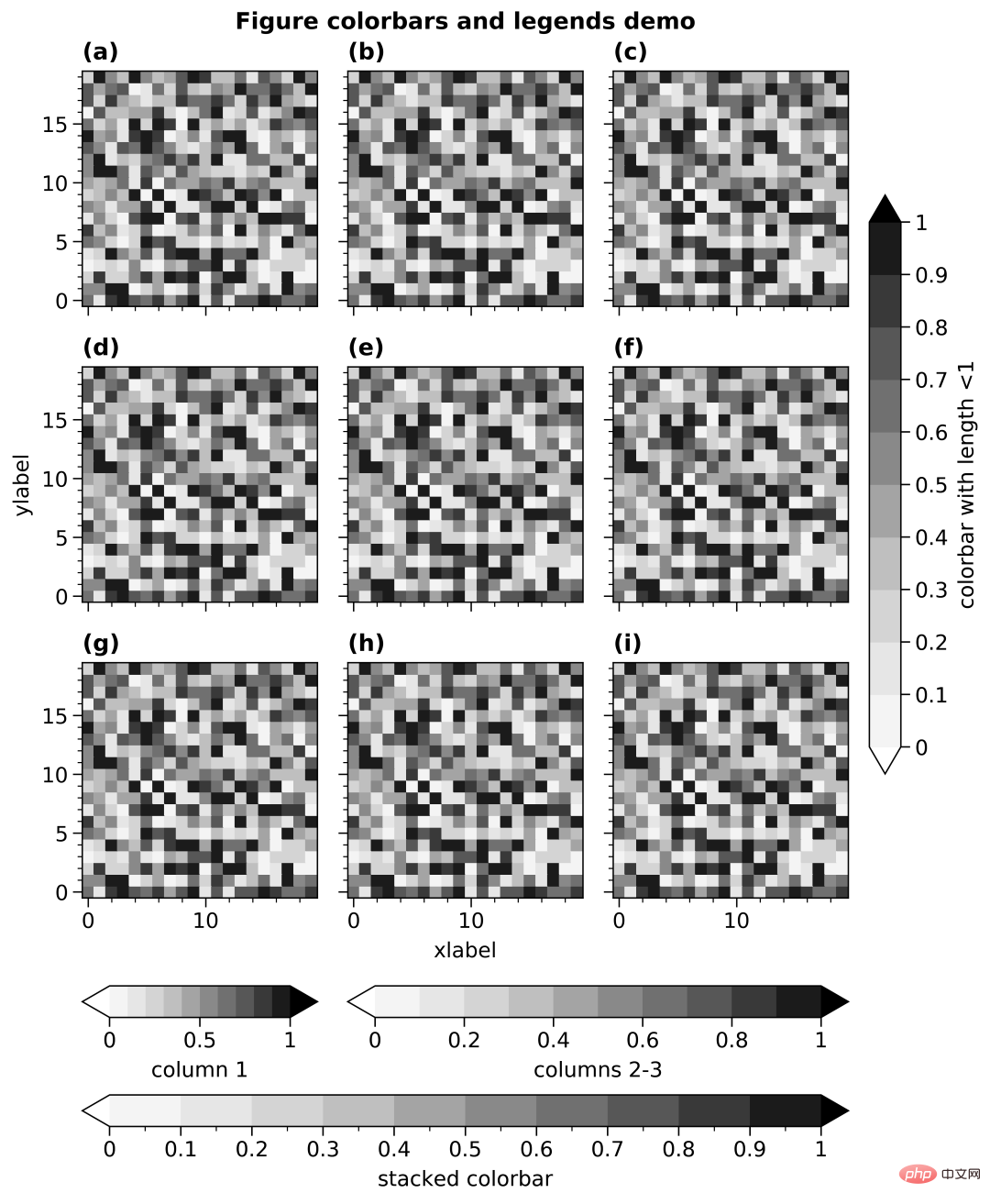
时间刻度(Datetime ticks)
Datetime ticks
import proplot as plot
import numpy as np
plot.rc.update(
    linewidth=1.2, fontsize=10, ticklenratio=0.7,
    figurefacecolor='w', facecolor='pastel blue',
    titleloc='upper center', titleborder=False,
)
fig, axs = plot.subplots(nrows=5, axwidth=6, aspect=(8, 1), share=0)
axs[:4].format(xrotation=0)  # no rotation for these examples

# Default date locator
# This is enabled if you plot datetime data or set datetime limits
axs[0].format(
    xlim=(np.datetime64('2000-01-01'), np.datetime64('2001-01-02')),
    title='Auto date locator and formatter'
)

# Concise date formatter introduced in matplotlib 3.1
axs[1].format(
    xlim=(np.datetime64('2000-01-01'), np.datetime64('2001-01-01')),
    xformatter='concise', title='Concise date formatter',
)

# Minor ticks every year, major every 10 years
axs[2].format(
    xlim=(np.datetime64('2000-01-01'), np.datetime64('2050-01-01')),
    xlocator=('year', 10), xformatter='\'%y', title='Ticks every N units',
)

# Minor ticks every 10 minutes, major every 2 minutes
axs[3].format(
    xlim=(np.datetime64('2000-01-01T00:00:00'), np.datetime64('2000-01-01T12:00:00')),
    xlocator=('hour', range(0, 24, 2)), xminorlocator=('minute', range(0, 60, 10)),
    xformatter='T%H:%M:%S', title='Ticks at specific intervals',
)

# Month and year labels, with default tick label rotation
axs[4].format(
    xlim=(np.datetime64('2000-01-01'), np.datetime64('2008-01-01')),
    xlocator='year', xminorlocator='month',  # minor ticks every month
    xformatter='%b %Y', title='Ticks with default rotation',
)
axs.format(
    ylocator='null', suptitle='Datetime locators and formatters demo'
)
plot.rc.reset()
plt.savefig(r'E:\Data_resourses\DataCharm 公众号\Python\学术图表绘制\ProPlot\datetick.png',
             dpi=900)
效果如下:
以上是我认为ProPlot 比较优秀的几点,当然,大家也可以自行探索,发现自己喜欢的技巧。
ProPlot 实例演示
我们使用之前的推文数据进行实例操作,详细代码如下:
#开始绘图
labels = ['L1', 'L2', 'L3', 'L4', 'L5']
data_a = [20, 34, 30, 35, 27]
data_b = [25, 32, 34, 20, 25]
data_c = [12, 20, 24, 17, 16]

x = np.arange(len(labels))
width = .25
fig, axs = plot.subplots(ncols=2, nrows=1, sharey=1, width=10,height=4)
#for mark, data in zip()
axs[0].plot(x,y1, marker='s',c='k',lw=.5,label='D1',markersize=8)
axs[0].plot(x,y2, marker='s',c='k',ls='--',lw=.5,markersize=8,markerfacecolor='white',markeredgewidth=.4,label='D2')
axs[0].plot(x,y3,marker='^',c='k',lw=.5,markersize=8,markerfacecolor='dimgray',markeredgecolor='dimgray',
                     label='D3')
axs[0].plot(x,y4,marker='^',c='k',lw=.5,markersize=8,label='D4')

axs[1].bar(x-width/2, data_a,width,label='category_A',color='#130074',ec='black',lw=.5)
axs[1].bar(x+width/2, data_b, width,label='category_B',color='#CB181B',ec='black',lw=.5)
axs[1].bar(x+width*3/2, data_c,width,label='category_C',color='#008B45',ec='black',lw=.5)

#先对整体进行设置
axs.format(ylim=(0,40),
    xlabel='', ylabel='Values',
    abc=True, abcloc='ur', abcstyle='(A)',abcsize=13,
    suptitle='ProPlot Exercise'
)
#再对每个子图进行设置
axs[0].format(ylim=(10,40),title='Multi-category scatter plot')
axs[1].format(title='Multi-category bar plot',xticklabels=['L1', 'L2', 'L3', 'L4', 'L5'])

plt.savefig(r'E:\Data_resourses\DataCharm 公众号\Python\学术图表绘制\ProPlot\test_01.png',
            dpi=900)
plt.show()
效果如下: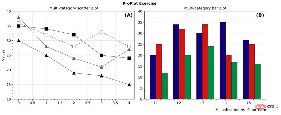
只是简单的绘制,其他的设置也需要熟悉绘图函数,这里就给大家做个简单的演示。
总结
本期推文我们介绍了matplotlib非常优秀的科学图表绘图库PrpPlot, 在一定程度上极大了缩减了定制化绘制时间,感兴趣的同学可以持续关注这个库,当然,还是最好在熟悉matplotlib基本绘图函数及图层属性设置函数的基础上啊。
The above is the detailed content of Still annoyed by Matplotlib's cumbersome layer settings! ? Come and take a look at this Python drawing toolkit. For more information, please follow other related articles on the PHP Chinese website!

Hot AI Tools

Undress AI Tool
Undress images for free

Undresser.AI Undress
AI-powered app for creating realistic nude photos

AI Clothes Remover
Online AI tool for removing clothes from photos.

Clothoff.io
AI clothes remover

Video Face Swap
Swap faces in any video effortlessly with our completely free AI face swap tool!

Hot Article
Hot Tools

Notepad++7.3.1
Easy-to-use and free code editor

SublimeText3 Chinese version
Chinese version, very easy to use

Zend Studio 13.0.1
Powerful PHP integrated development environment

Dreamweaver CS6
Visual web development tools

SublimeText3 Mac version
God-level code editing software (SublimeText3)


 What are class methods in Python
Aug 21, 2025 am 04:12 AM
What are class methods in Python
Aug 21, 2025 am 04:12 AM
ClassmethodsinPythonareboundtotheclassandnottoinstances,allowingthemtobecalledwithoutcreatinganobject.1.Theyaredefinedusingthe@classmethoddecoratorandtakeclsasthefirstparameter,referringtotheclassitself.2.Theycanaccessclassvariablesandarecommonlyused
 python asyncio queue example
Aug 21, 2025 am 02:13 AM
python asyncio queue example
Aug 21, 2025 am 02:13 AM
asyncio.Queue is a queue tool for secure communication between asynchronous tasks. 1. The producer adds data through awaitqueue.put(item), and the consumer uses awaitqueue.get() to obtain data; 2. For each item you process, you need to call queue.task_done() to wait for queue.join() to complete all tasks; 3. Use None as the end signal to notify the consumer to stop; 4. When multiple consumers, multiple end signals need to be sent or all tasks have been processed before canceling the task; 5. The queue supports setting maxsize limit capacity, put and get operations automatically suspend and do not block the event loop, and the program finally passes Canc
 How to run a Python script and see the output in a separate panel in Sublime Text?
Aug 17, 2025 am 06:06 AM
How to run a Python script and see the output in a separate panel in Sublime Text?
Aug 17, 2025 am 06:06 AM
ToseePythonoutputinaseparatepanelinSublimeText,usethebuilt-inbuildsystembysavingyourfilewitha.pyextensionandpressingCtrl B(orCmd B).2.EnsurethecorrectbuildsystemisselectedbygoingtoTools→BuildSystem→Pythonandconfirming"Python"ischecked.3.Ifn
 How to use regular expressions with the re module in Python?
Aug 22, 2025 am 07:07 AM
How to use regular expressions with the re module in Python?
Aug 22, 2025 am 07:07 AM
Regular expressions are implemented in Python through the re module for searching, matching and manipulating strings. 1. Use re.search() to find the first match in the entire string, re.match() only matches at the beginning of the string; 2. Use brackets() to capture the matching subgroups, which can be named to improve readability; 3. re.findall() returns all non-overlapping matches, and re.finditer() returns the iterator of the matching object; 4. re.sub() replaces the matching text and supports dynamic function replacement; 5. Common patterns include \d, \w, \s, etc., you can use re.IGNORECASE, re.MULTILINE, re.DOTALL, re
 How to build and run Python in Sublime Text?
Aug 22, 2025 pm 03:37 PM
How to build and run Python in Sublime Text?
Aug 22, 2025 pm 03:37 PM
EnsurePythonisinstalledbyrunningpython--versionorpython3--versionintheterminal;ifnotinstalled,downloadfrompython.organdaddtoPATH.2.InSublimeText,gotoTools>BuildSystem>NewBuildSystem,replacecontentwith{"cmd":["python","-
 How to use variables and data types in Python
Aug 20, 2025 am 02:07 AM
How to use variables and data types in Python
Aug 20, 2025 am 02:07 AM
VariablesinPythonarecreatedbyassigningavalueusingthe=operator,anddatatypessuchasint,float,str,bool,andNoneTypedefinethekindofdatabeingstored,withPythonbeingdynamicallytypedsotypecheckingoccursatruntimeusingtype(),andwhilevariablescanbereassignedtodif
 How to pass command-line arguments to a script in Python
Aug 20, 2025 pm 01:50 PM
How to pass command-line arguments to a script in Python
Aug 20, 2025 pm 01:50 PM
Usesys.argvforsimpleargumentaccess,whereargumentsaremanuallyhandledandnoautomaticvalidationorhelpisprovided.2.Useargparseforrobustinterfaces,asitsupportsautomatichelp,typechecking,optionalarguments,anddefaultvalues.3.argparseisrecommendedforcomplexsc
 How to debug a remote Python application in VSCode
Aug 30, 2025 am 06:17 AM
How to debug a remote Python application in VSCode
Aug 30, 2025 am 06:17 AM
To debug a remote Python application, you need to use debugpy and configure port forwarding and path mapping: First, install debugpy on the remote machine and modify the code to listen to port 5678, forward the remote port to the local area through the SSH tunnel, then configure "AttachtoRemotePython" in VSCode's launch.json and correctly set the localRoot and remoteRoot path mappings. Finally, start the application and connect to the debugger to realize remote breakpoint debugging, variable checking and code stepping. The entire process depends on debugpy, secure port forwarding and precise path matching.
