

 Backend Development
Python Tutorial
Python draws stunning Sankey diagrams, have you learned it?
Backend Development
Python Tutorial
Python draws stunning Sankey diagrams, have you learned it?
Python draws stunning Sankey diagrams, have you learned it?

Introduction to Sankey Diagram
Many times, we need a situation where we must visualize how data flows between entities. For example, take how residents move from one country to another. Here's a demonstration of how many residents moved from England to Northern Ireland, Scotland and Wales.
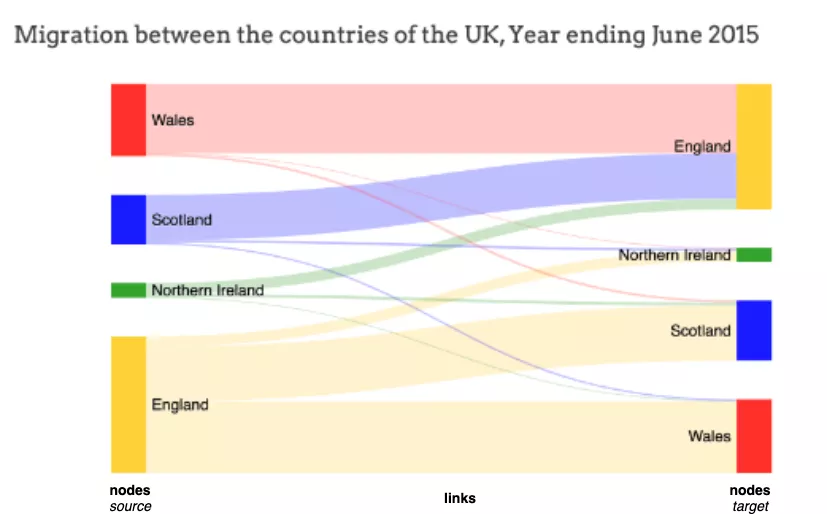
It is clear from this Sankey visualization that more residents moved from England to Wales than from Scotland or Northern Ireland.
What is a Sankey diagram?
Sankey diagrams usually depict the flow of data from one entity (or node) to another entity (or node).
The entities to which data flows are called nodes. The node where the data flow originates is the source node (for example, England on the left), and the node where the flow ends is the target node (for example, Wales on the right). Source and target nodes are usually represented as labeled rectangles.
The flow itself is represented by straight or curved paths, called links. The width of a stream/link is directly proportional to the volume/number of streams. In the example above, the movement from England to Wales (i.e. the migration of residents) is more extensive (i.e. the migration of residents) than the movement from England to Scotland or Northern Ireland (i.e. the migration of residents), indicating that more residents move to Wales than to other countries .
Sankey diagrams can be used to represent the flow of energy, money, costs, and anything that has a flow concept.
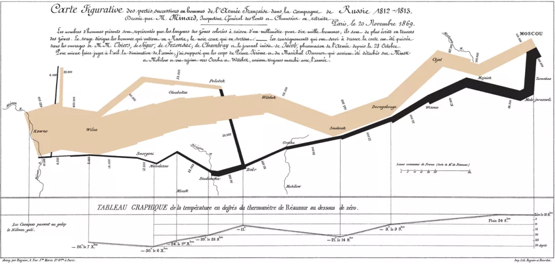
Minard's classic chart of Napoleon's invasion of Russia is probably the most famous example of a Sankey chart. This visualization using a Sankey diagram shows very effectively how the French army progressed (or decreased?) on its way to Russia and back.
#In this article, we use python’s plotly to draw a Sankey diagram.
How to draw a Sankey diagram?
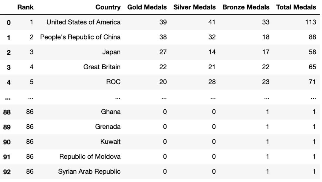
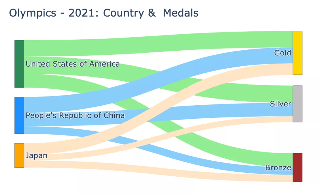
This article uses the 2021 Olympic Games data set to draw a Sankey diagram. The dataset contains detailed information about the total number of medals - country, total number of medals, and individual totals for gold, silver, and bronze medals. We plot a Sankey chart to find out how many gold, silver and bronze medals a country has won.
df_medals = pd.read_excel("data/Medals.xlsx")
print(df_medals.info())
df_medals.rename(columns={'Team/NOC':'Country', 'Total': 'Total Medals', 'Gold':'Gold Medals', 'Silver': 'Silver Medals', 'Bronze': 'Bronze Medals'}, inplace=True)
df_medals.drop(columns=['Unnamed: 7','Unnamed: 8','Rank by Total'], inplace=True)

df_medals<class 'pandas.core.frame.DataFrame'> RangeIndex: 93 entries, 0 to 92 Data columns (total 9 columns): # Column Non-Null CountDtype --------- ------------------- 0 Rank 93 non-null int64 1 Team/NOC 93 non-null object 2 Gold 93 non-null int64 3 Silver 93 non-null int64 4 Bronze 93 non-null int64 5 Total93 non-null int64 6 Rank by Total93 non-null int64 7 Unnamed: 7 0 non-nullfloat64 8 Unnamed: 8 1 non-nullfloat64 dtypes: float64(2), int64(6), object(1) memory usage: 6.7+ KB None
Sankey diagram drawing basics
Use plotly's go.Sankey, this method takes 2 parameters - nodes and links (nodes and links ).
Note: All nodes - source and target should have unique identifiers.
In the case of the Olympic medals data set in this article:
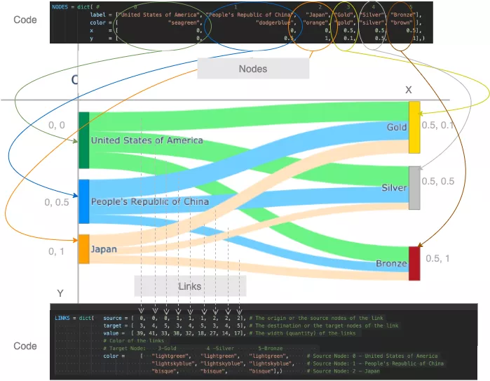
Source is the country. Consider the first 3 countries (United States, China, and Japan) as source nodes. Label these source nodes with the following (unique) identifiers, labels, and colors:
- 0: United States: Green
- 1: China: Blue
- 2: Japan: Orange
Target is gold, silver or bronze. Label these target nodes with the following (unique) identifiers, labels, and colors:
- 3: Gold Medal: Gold
- 4: Silver Medal: Silver
- 5 : Bronze: Brown
Link (between source node and target node) is the number of medals of each type. In each source there are 3 links, each ending with a target - Gold, Silver and Bronze. So there are 9 links in total. The width of each link should be the number of gold, silver and bronze medals. Tag these links to targets, values and colors with the following sources:
- 0 (US) to 3,4,5 : 39, 41, 33
- 1 (China) to 3 ,4,5 : 38, 32, 18
- 2 (Japan) to 3,4,5 : 27, 14, 17
You need to instantiate 2 python dict objects to Represents
- nodes (source and target): labels and colors as separate lists and
- links: source node, target node, value (width) and color of the link as separate List
and pass it to plotly's go.Sankey.
Each index of the list (label, source, target, value and color) corresponds to a node or link.
NODES = dict(
# 0 1 23 4 5
label = ["United States of America", "People's Republic of China", "Japan", "Gold", "Silver", "Bronze"],
color = ["seagreen", "dodgerblue", "orange", "gold", "silver", "brown" ],)
LINKS = dict(
source = [0,0,0,1,1,1,2,2,2], # 链接的起点或源节点
target = [3,4,5,3,4,5,3,4,5], # 链接的目的地或目标节点
value =[ 39, 41, 33, 38, 32, 18, 27, 14, 17], # 链接的宽度(数量)
# 链接的颜色
# 目标节点: 3-Gold4-Silver5-Bronze
color = [
"lightgreen", "lightgreen", "lightgreen",# 源节点:0 - 美国 States of America
"lightskyblue", "lightskyblue", "lightskyblue",# 源节点:1 - 中华人民共和国China
"bisque", "bisque", "bisque"],)# 源节点:2 - 日本
data = go.Sankey(node = NODES, link = LINKS)
fig = go.Figure(data)
fig.show()
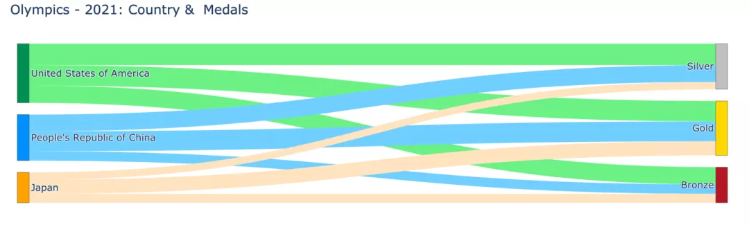
This is a very basic Sankey diagram. But have you noticed that the chart is too wide and the silver medals appear before the gold medals?
Here’s how to adjust the position and width of nodes.
Adjust node positions and chart width
Add x and y positions to nodes to explicitly specify the node's position. Value should be between 0 and 1.
NODES = dict(
# 0 1 23 4 5
label = ["United States of America", "People's Republic of China", "Japan", "Gold", "Silver", "Bronze"],
color = ["seagreen", "dodgerblue", "orange", "gold", "silver", "brown" ],)
x = [ 0,0,0,0.5,0.5,0.5],
y = [ 0,0.5,1,0.1,0.5,1],)
data = go.Sankey(node = NODES, link = LINKS)
fig = go.Figure(data)
fig.update_layout(title="Olympics - 2021: Country &Medals",font_size=16)
fig.show()
So we got a compact Sankey diagram:
Let’s take a look at how the various parameters passed in the code are mapped to the nodes and nodes in the graph. Link.
代码如何映射到桑基图
添加有意义的悬停标签
我们都知道plotly绘图是交互的,我们可以将鼠标悬停在节点和链接上以获取更多信息。
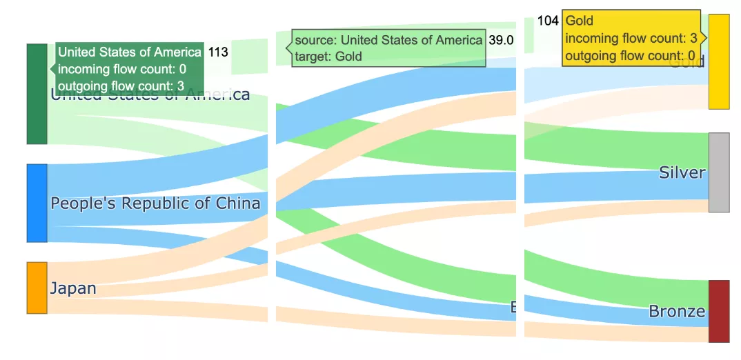
带有默认悬停标签的桑基图
当将鼠标悬停在图上,将会显示详细信息。悬停标签中显示的信息是默认文本:节点、节点名称、传入流数、传出流数和总值。
例如:
- 节点美国共获得11枚奖牌(=39金+41银+33铜)
- 节点金牌共有104枚奖牌(=美国39枚,中国38枚,日本27枚)
如果我们觉得这些标签太冗长了,我们可以对此进程改进。使用hovertemplate参数改进悬停标签的格式
- 对于节点,由于hoverlabels 没有提供新信息,通过传递一个空hovertemplate = ""来去掉hoverlabel
- 对于链接,可以使标签简洁,格式为-
- 对于节点和链接,让我们使用后缀"Medals"显示值。例如 113 枚奖牌而不是 113 枚。这可以通过使用具有适当valueformat和valuesuffix的update_traces函数来实现。
NODES = dict(
# 0 1 23 4 5
label = ["United States of America", "People's Republic of China", "Japan", "Gold", "Silver", "Bronze"],
color = ["seagreen", "dodgerblue","orange", "gold", "silver", "brown" ],
x = [ 0,0, 0,0.5,0.5,0.5],
y = [ 0,0.5, 1,0.1,0.5,1],
hovertemplate=" ",)

LINK_LABELS = []
for country in ["USA","China","Japan"]:
for medal in ["Gold","Silver","Bronze"]:
LINK_LABELS.append(f"{country}-{medal}")
LINKS = dict(source = [0,0,0,1,1,1,2,2,2],
 # 链接的起点或源节点
 target = [3,4,5,3,4,5,3,4,5],
 # 链接的目的地或目标节点
 value =[ 39, 41, 33, 38, 32, 18, 27, 14, 17],
 # 链接的宽度(数量)
 # 链接的颜色
 # 目标节点:3-Gold4 -Silver5-Bronze
 color = ["lightgreen", "lightgreen", "lightgreen", # 源节点:0 - 美国
"lightskyblue", "lightskyblue", "lightskyblue", # 源节点:1 - 中国
"bisque", "bisque", "bisque"],# 源节点:2 - 日本
 label = LINK_LABELS,
 hovertemplate="%{label}",)

data = go.Sankey(node = NODES, link = LINKS)
fig = go.Figure(data)
fig.update_layout(title="Olympics - 2021: Country &Medals",
font_size=16, width=1200, height=500,)
fig.update_traces(valueformat='3d',
valuesuffix='Medals',
selector=dict(type='sankey'))
fig.update_layout(hoverlabel=dict(bgcolor="lightgray",
font_size=16,
font_family="Rockwell"))
fig.show("png") #fig.show()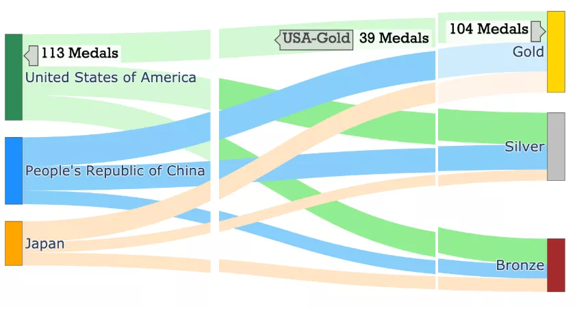
带有改进的悬停标签的桑基图
对多个节点和级别进行泛化相对于链接,节点被称为源和目标。作为一个链接目标的节点可以是另一个链接的源。
该代码可以推广到处理数据集中的所有国家。
还可以将图表扩展到另一个层次,以可视化各国的奖牌总数。
NUM_COUNTRIES = 5
X_POS, Y_POS = 0.5, 1/(NUM_COUNTRIES-1)
NODE_COLORS = ["seagreen", "dodgerblue", "orange", "palevioletred", "darkcyan"]
LINK_COLORS = ["lightgreen", "lightskyblue", "bisque", "pink", "lightcyan"]

source = []
node_x_pos, node_y_pos = [], []
node_labels, node_colors = [], NODE_COLORS[0:NUM_COUNTRIES]
link_labels, link_colors, link_values = [], [], []

# 第一组链接和节点
for i in range(NUM_COUNTRIES):
source.extend([i]*3)
node_x_pos.append(0.01)
node_y_pos.append(round(i*Y_POS+0.01,2))
country = df_medals['Country'][i]
node_labels.append(country)
for medal in ["Gold", "Silver", "Bronze"]:
link_labels.append(f"{country}-{medal}")
link_values.append(df_medals[f"{medal} Medals"][i])
link_colors.extend([LINK_COLORS[i]]*3)

source_last = max(source)+1
target = [ source_last, source_last+1, source_last+2] * NUM_COUNTRIES
target_last = max(target)+1

node_labels.extend(["Gold", "Silver", "Bronze"])
node_colors.extend(["gold", "silver", "brown"])
node_x_pos.extend([X_POS, X_POS, X_POS])
node_y_pos.extend([0.01, 0.5, 1])

# 最后一组链接和节点
source.extend([ source_last, source_last+1, source_last+2])
target.extend([target_last]*3)
node_labels.extend(["Total Medals"])
node_colors.extend(["grey"])
node_x_pos.extend([X_POS+0.25])
node_y_pos.extend([0.5])

for medal in ["Gold","Silver","Bronze"]:
link_labels.append(f"{medal}")
link_values.append(df_medals[f"{medal} Medals"][:i+1].sum())
link_colors.extend(["gold", "silver", "brown"])

print("node_labels", node_labels)
print("node_x_pos", node_x_pos); print("node_y_pos", node_y_pos)node_labels ['United States of America', "People's Republic of China", 'Japan', 'Great Britain', 'ROC', 'Gold', 'Silver', 'Bronze', 'Total Medals'] node_x_pos [0.01, 0.01, 0.01, 0.01, 0.01, 0.5, 0.5, 0.5, 0.75] node_y_pos [0.01, 0.26, 0.51, 0.76, 1.01, 0.01, 0.5, 1, 0.5]
# 显示的图
NODES = dict(pad= 20, thickness = 20,
 line = dict(color = "lightslategrey",
 width = 0.5),
 hovertemplate=" ",
 label = node_labels,
 color = node_colors,
 x = node_x_pos,
 y = node_y_pos, )
LINKS = dict(source = source,
 target = target,
 value = link_values,
 label = link_labels,
 color = link_colors,
 hovertemplate="%{label}",)
data = go.Sankey(arrangement='snap',
 node = NODES,
 link = LINKS)
fig = go.Figure(data)
fig.update_traces(valueformat='3d',
valuesuffix=' Medals',
selector=dict(type='sankey'))
fig.update_layout(title="Olympics - 2021: Country &Medals",
font_size=16,
width=1200,
height=500,)
fig.update_layout(hoverlabel=dict(bgcolor="grey",
font_size=14,
font_family="Rockwell"))
fig.show("png") 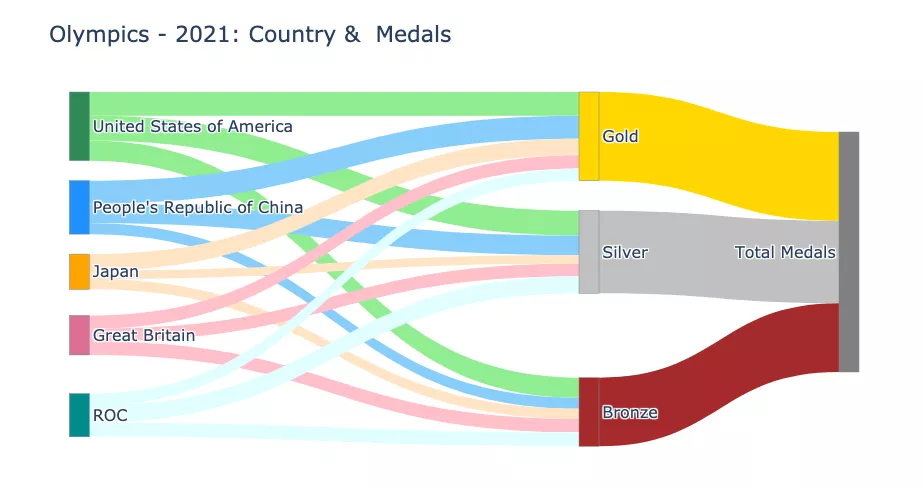
The above is the detailed content of Python draws stunning Sankey diagrams, have you learned it?. For more information, please follow other related articles on the PHP Chinese website!

Hot AI Tools

Undresser.AI Undress
AI-powered app for creating realistic nude photos

AI Clothes Remover
Online AI tool for removing clothes from photos.

Undress AI Tool
Undress images for free

Clothoff.io
AI clothes remover

AI Hentai Generator
Generate AI Hentai for free.

Hot Article
Hot Tools

Notepad++7.3.1
Easy-to-use and free code editor

SublimeText3 Chinese version
Chinese version, very easy to use

Zend Studio 13.0.1
Powerful PHP integrated development environment

Dreamweaver CS6
Visual web development tools

SublimeText3 Mac version
God-level code editing software (SublimeText3)
Hot Topics
 1378
1378
 52
52

 PHP and Python: Comparing Two Popular Programming Languages
Apr 14, 2025 am 12:13 AM
PHP and Python: Comparing Two Popular Programming Languages
Apr 14, 2025 am 12:13 AM
PHP and Python each have their own advantages, and choose according to project requirements. 1.PHP is suitable for web development, especially for rapid development and maintenance of websites. 2. Python is suitable for data science, machine learning and artificial intelligence, with concise syntax and suitable for beginners.
 How debian readdir integrates with other tools
Apr 13, 2025 am 09:42 AM
How debian readdir integrates with other tools
Apr 13, 2025 am 09:42 AM
The readdir function in the Debian system is a system call used to read directory contents and is often used in C programming. This article will explain how to integrate readdir with other tools to enhance its functionality. Method 1: Combining C language program and pipeline First, write a C program to call the readdir function and output the result: #include#include#include#includeintmain(intargc,char*argv[]){DIR*dir;structdirent*entry;if(argc!=2){
 Python and Time: Making the Most of Your Study Time
Apr 14, 2025 am 12:02 AM
Python and Time: Making the Most of Your Study Time
Apr 14, 2025 am 12:02 AM
To maximize the efficiency of learning Python in a limited time, you can use Python's datetime, time, and schedule modules. 1. The datetime module is used to record and plan learning time. 2. The time module helps to set study and rest time. 3. The schedule module automatically arranges weekly learning tasks.
 How to configure HTTPS server in Debian OpenSSL
Apr 13, 2025 am 11:03 AM
How to configure HTTPS server in Debian OpenSSL
Apr 13, 2025 am 11:03 AM
Configuring an HTTPS server on a Debian system involves several steps, including installing the necessary software, generating an SSL certificate, and configuring a web server (such as Apache or Nginx) to use an SSL certificate. Here is a basic guide, assuming you are using an ApacheWeb server. 1. Install the necessary software First, make sure your system is up to date and install Apache and OpenSSL: sudoaptupdatesudoaptupgradesudoaptinsta
 GitLab's plug-in development guide on Debian
Apr 13, 2025 am 08:24 AM
GitLab's plug-in development guide on Debian
Apr 13, 2025 am 08:24 AM
Developing a GitLab plugin on Debian requires some specific steps and knowledge. Here is a basic guide to help you get started with this process. Installing GitLab First, you need to install GitLab on your Debian system. You can refer to the official installation manual of GitLab. Get API access token Before performing API integration, you need to get GitLab's API access token first. Open the GitLab dashboard, find the "AccessTokens" option in the user settings, and generate a new access token. Will be generated
 What service is apache
Apr 13, 2025 pm 12:06 PM
What service is apache
Apr 13, 2025 pm 12:06 PM
Apache is the hero behind the Internet. It is not only a web server, but also a powerful platform that supports huge traffic and provides dynamic content. It provides extremely high flexibility through a modular design, allowing for the expansion of various functions as needed. However, modularity also presents configuration and performance challenges that require careful management. Apache is suitable for server scenarios that require highly customizable and meet complex needs.
 What language is apache written in?
Apr 13, 2025 pm 12:42 PM
What language is apache written in?
Apr 13, 2025 pm 12:42 PM
Apache is written in C. The language provides speed, stability, portability, and direct hardware access, making it ideal for web server development.
 PHP and Python: Code Examples and Comparison
Apr 15, 2025 am 12:07 AM
PHP and Python: Code Examples and Comparison
Apr 15, 2025 am 12:07 AM
PHP and Python have their own advantages and disadvantages, and the choice depends on project needs and personal preferences. 1.PHP is suitable for rapid development and maintenance of large-scale web applications. 2. Python dominates the field of data science and machine learning.
