 Web Front-end
 CSS Tutorial
 Detailed explanation of fixed properties of CSS positioning properties
Detailed explanation of fixed properties of CSS positioning properties
This article brings you relevant knowledge about css, which mainly introduces issues related to fixed positioning in CSS positioning attributes. Fixed positioning indicates that the position of the element relative to the browser window is Fixed position, it will not move even if the window is scrolled. Let’s take a look at it. I hope it will be helpful to everyone.

(Learning video sharing: css video tutorial, html video tutorial)
CSS positioning attribute Detailed explanation of the fixed attribute
fixed positioning
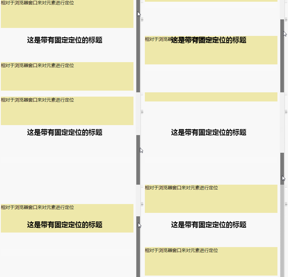
The position of the element is a fixed position relative to the browser window.
It will not move even if the window is scrolled:
Fixed positioning is the position where the element is fixed in the browser's viewable area. Main usage scenario: The position of the element will not change when the browser page is scrolled.
Syntax:
选择器{position:fixed;}
Description
Fixed positioning means the element is fixed in the browser view District location. Fixed positioning can also be regarded as a special kind of absolute positioning.
The usage scenario is that when the browser page scrolls, the position of the element will not change.
Characteristics of fixed positioning
Mobile elements that use the browser's visual window as the reference point.
has nothing to do with the parent element.
Do not scroll with the scroll bar.
Fixed positioning does not occupy the original position. Fixed positioning is also off-label.
fixed is the attribute value of the position attribute. When the position attribute of an element is set to fixed, the element is fixed, and the fixed element will not change its position as the scroll bar is dragged. The position of fixedly positioned elements does not change within the field of view.
Fixed fixed positioning and absolute positioning are similar. They both allow elements to be displaced and separated from the document flow.
Grammar:
position:fixed;
top:像素值;
bottom;像素值;
left:像素值;
right:像素值;
"position:fixed;" is used in conjunction with the four attributes top, bottom, left and right, among which "position:fixed;" makes the element a fixed position element, and then use the four attributes top, bottom, left, and right to set the position of the element relative to the browser.
Not all of the four attributes top, bottom, left and right are used. Note that the reference objects of these four values are the four edges of the browser.
Examples are as follows:
<!DOCTYPE html>
<html>
    <head>
        <meta charset="UTF-8">
        <style type="text/css">
            h2.pos_abs {
                position: fixed;
                left: 100px;
                top: 120px
            }
            p{
                height: 100px;
                background-color: palegoldenrod;
            }
            p.p2{
                margin-top:120px ;
            }
        </style>
    </head>

    <body style="height: 1200px;">
        <h2 class="pos_abs">这是带有固定定位的标题</h2>
        <p>相对于浏览器窗口来对元素进行定位</p>
        <p class="p2">相对于浏览器窗口来对元素进行定位</p>
    </body>

</html>
Output results:

Expand knowledge
How to position it on the right side of the main content
First let’s make the fixed positioning box left: 50%, and then go to the browser area General location.
Then let the fixed positioning and word margin-left: set the width of the main content to normal, so that we can see the fixed positioning and word on the right side of the center of the page
Note:
When we do not place the fixed box at the top, it will be covered by other divs. Be sure to Place the fixed box at the top
(Learning video sharing: css video tutorial, html video tutorial)
The above is the detailed content of Detailed explanation of fixed properties of CSS positioning properties. For more information, please follow other related articles on the PHP Chinese website!

Hot AI Tools

Undress AI Tool
Undress images for free

Undresser.AI Undress
AI-powered app for creating realistic nude photos

AI Clothes Remover
Online AI tool for removing clothes from photos.

Clothoff.io
AI clothes remover

Video Face Swap
Swap faces in any video effortlessly with our completely free AI face swap tool!

Hot Article

Hot Tools

Notepad++7.3.1
Easy-to-use and free code editor

SublimeText3 Chinese version
Chinese version, very easy to use

Zend Studio 13.0.1
Powerful PHP integrated development environment

Dreamweaver CS6
Visual web development tools

SublimeText3 Mac version
God-level code editing software (SublimeText3)
 How to use CSS gradients for backgrounds
Aug 17, 2025 am 08:39 AM
CSSgradientsprovidesmoothcolortransitionswithoutimages.1.Lineargradientstransitioncolorsalongastraightlineusingdirectionsliketobottomorangleslike45deg,andsupportmultiplecolorstopsforcomplexeffects.2.Radialgradientsradiatefromacentralpointusingcircleo
 How to create a dotted border in CSS
Aug 15, 2025 am 04:56 AM
Use CSS to create dotted borders, just set the border attribute to dotted. For example, "border:3pxdotted#000" can add a 3-pixel-wide black dot border to the element. By adjusting the border-width, the size of the point can be changed. The wider borders produce larger points. You can set dotted borders for a certain side, such as "border-top:2pxdottedred". Dotted borders are suitable for block-level elements such as div and input. They are often used in focus states or editable areas to improve accessibility. Pay attention to color contrast. At the same time, different from dashed's short-line style, dotted presents a circular dot shape. This feature is widely used in all mainstream browsers.
 How to create a glassmorphism effect with CSS
Aug 22, 2025 am 07:54 AM
To create a glass mimicry effect of CSS, you need to use backdrop-filter to achieve background blur, set a translucent background such as rgba(255,255,255,0.1), add subtle borders and shadows to enhance the sense of hierarchy, and ensure that there is enough visual content behind the elements; 1. Use backdrop-filter:blur(10px) to blur the background content; 2. Use rgba or hsla to define the transparent background to control the degree of transparency; 3. Add 1pxsolidrgba(255,255,255,0.3) borders and box-shadow to enhance the three-dimensionality; 4. Ensure that the container has rich backgrounds such as pictures or textures to present a blurred penetration effect; 5. It is compatible with old browsers
 How to change the list style in CSS
Aug 17, 2025 am 10:04 AM
To change the CSS list style, first use list-style-type to change the bullet or numbering style. 1. Use list-style-type to set the bullet of ul to disc, circle or square, and the number of ol is decimal, lower-alpha, upper-alpha, lower-roman or upper-roman. 2. Remove the tag completely with list-style:none. 3. Use list-style-image:url('bullet.png') to replace it with a custom image. 4. Use list-style-position:in
 How to change the cursor in CSS
Aug 16, 2025 am 05:00 AM
Usebuilt-incursortypeslikepointer,help,ornot-allowedtoprovideimmediatevisualfeedbackfordifferentinteractiveelements.2.ApplycustomcursorimageswiththecursorpropertyusingaURL,optionallyspecifyingahotspotandalwaysincludingafallbacklikeautoorpointer.3.Fol
 How to implement a dark mode theme with CSS
Aug 22, 2025 am 09:55 AM
There are two main ways to implement dark mode: one is to use prefers-color-scheme media to query automatically to adapt system preferences, and the other is to add manual switching function through JavaScript. 1. Use prefers-color-scheme to automatically apply dark themes according to the user system. There is no need for JavaScript, just define the styles in the media query; 2. To achieve manual switching, you need to define light-theme and dark-themeCSS classes, add toggle buttons, and use JavaScript to manage the theme status and localStorage to save user preferences; 3. You can combine both to read localSt first when the page is loaded.
 How to use grid-template-areas in CSS
Aug 22, 2025 am 07:56 AM
Thegrid-template-areaspropertyallowsdeveloperstocreateintuitive,readablelayoutsbydefiningnamedgridareas;eachstringrepresentsarowandeachwordacolumncell,withgrid-areanamesonchildelementsmatchingthoseinthetemplate,suchas"headerheaderheader"for
 How to add a box shadow in CSS
Aug 18, 2025 am 11:39 AM
To add box shadows, use box-shadow attribute; 1. The basic syntax is box-shadow: horizontal offset vertical offset blur radius expansion radius shadows in color; 2. The first three values are required, the rest are optional; 3. Use rgba() or hsla() to achieve transparent effect; 4. The positive expansion radius expands shadows and the negative value is reduced; 5. Multiple shadows can be added by commas separation; 6. Overuse should be avoided to ensure that visibility is tested on different backgrounds; this attribute is well supported by the browser, and reasonable use can improve the design texture.


