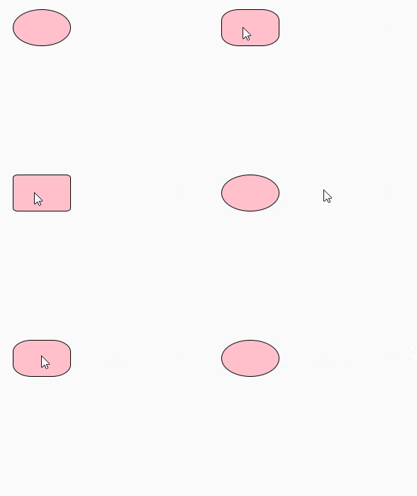
Method: 1. Use the ":hover" selector to set the style when the mouse passes over the element. The syntax is "element:hover{style code}"; 2. Use "element {" in the style code when the mouse passes over it. animation: name time}" statement to bind animation to the element; 3. Use the "@keyframes fadenum{100%{border-radius:0;}}" statement to set the effect of enlarging the rounded corners until they disappear.

The operating environment of this tutorial: Windows 10 system, CSS3&&HTML5 version, Dell G3 computer.
1. :hover pseudo-class selector setting style
In css:hover is a Pseudo-class selector, :hover pseudo-class selector adds a special style to this element when the mouse is moved over the element. The :hover selector applies to all elements.
:Hover is a special style added when the mouse moves over the link.
In IE, "" must be declared to ensure that the ":hover" selector can be effective
2. Use animation to bind animation
Theanimation property is a shorthand property for setting six animation properties:
animation-name
animation-duration
animation-timing-function
animation-delay
animation-iteration-count
animation-direction
3. Use @keyframes to set animations
Through @keyframes rules , you can create animations.
The principle of creating animation is to gradually change one set of CSS styles into another set of styles.
You can change this set of CSS styles multiple times during the animation process.
Specify the time when the change occurs as a percentage, or through the keywords "from" and "to", which are equivalent to 0% and 100%.
0% is the start time of the animation, 100% is the end time of the animation.
For best browser support, you should always define 0% and 100% selectors.
Examples are as follows:
Output results:

(Learning video sharing:css video tutorial,html video tutorial)
The above is the detailed content of How to set the mouse to zoom in and disappear after passing through the rounded corners in css3. For more information, please follow other related articles on the PHP Chinese website!