This article brings you relevant knowledge aboutexcel, which mainly introduces issues related to dynamic charts, including inserting column charts, modifying chart data sources, and creating dynamic titles. Let’s take a look at the content below, I hope it will be helpful to everyone.

Related learning recommendations:excel tutorial
How to set it so that the histogram does not reflect months without data?
Just like the picture below, the months on the right are completely empty, which is so ugly.
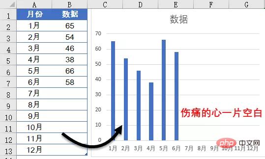
Some students may have said that when generating a chart, just select the range with data and then insert the chart.
However, if this is the case, after adding data every month, the data source of the chart must be changed. Is there a lazy way to automatically adjust the chart based on the actual data?
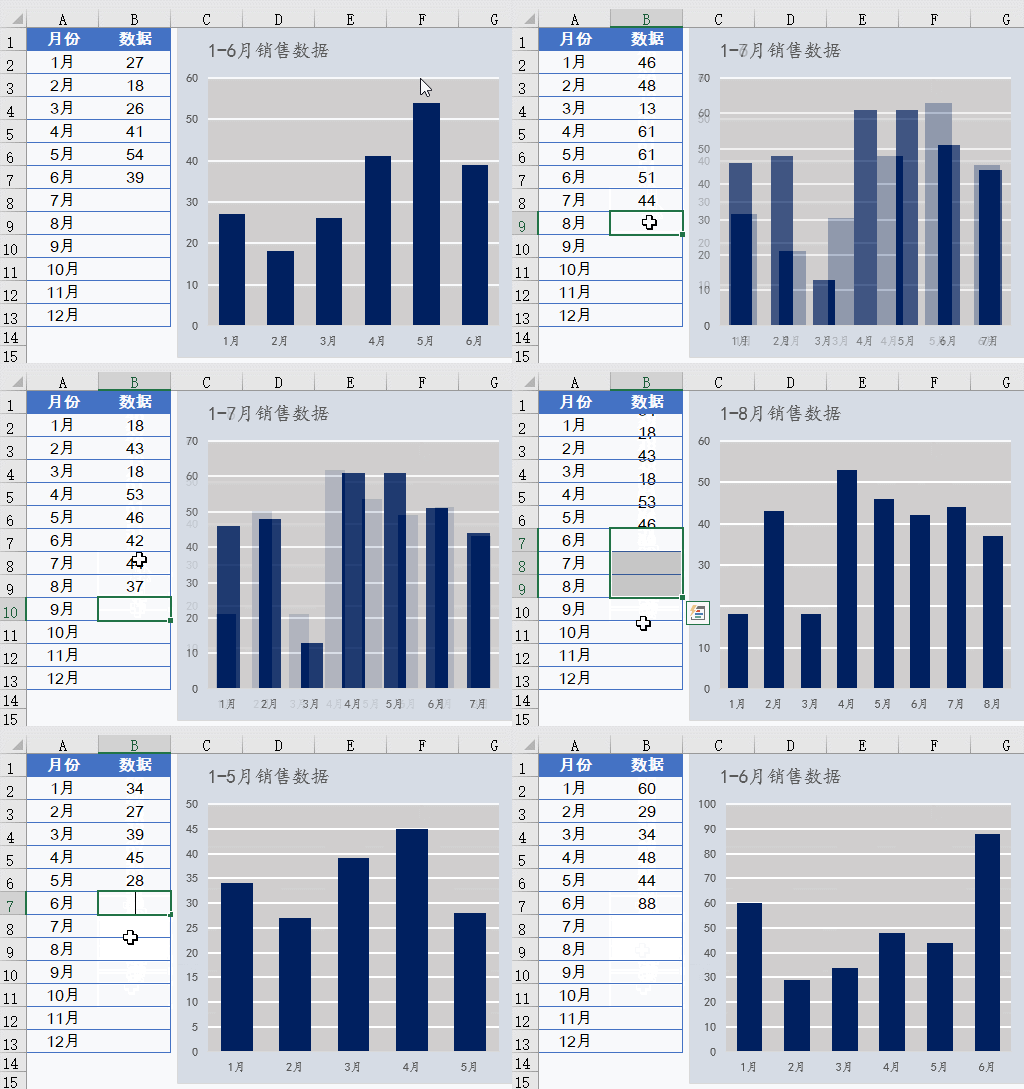
In fact, it is not complicated to achieve such an effect.
Date
=OFFSET($A$2,0,0,COUNT($B:$B))
Data
=OFFSET($B$2,0,0,COUNT($B:$B))
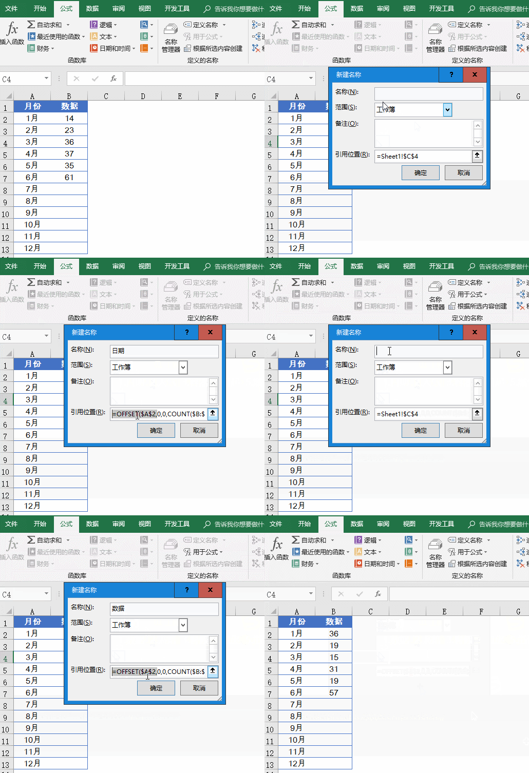
We use the formula named "Date" For example, let’s briefly talk about the meaning of the formula:
=OFFSET($A$2,0,0,COUNT($B:$B))
COUNT($B:$B) Part, first use the COUNT function to count the number of values in column B.
The OFFSET function takes cell A2 as the base point, offsets 0 rows downward and 0 columns right. The number of newly referenced rows is the statistical result of the COUNT function, that is, if there are several values, just quote few lines.
The formula idea of the name "data" is the same. Starting from cell B2, the number of referenced rows is determined based on the actual number of values.
If you want to know more about OFFSE, you can click here to see OFFSET in detail from the beginning
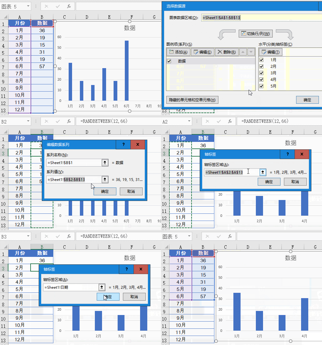
Click any cell in the data area , insert a column chart.
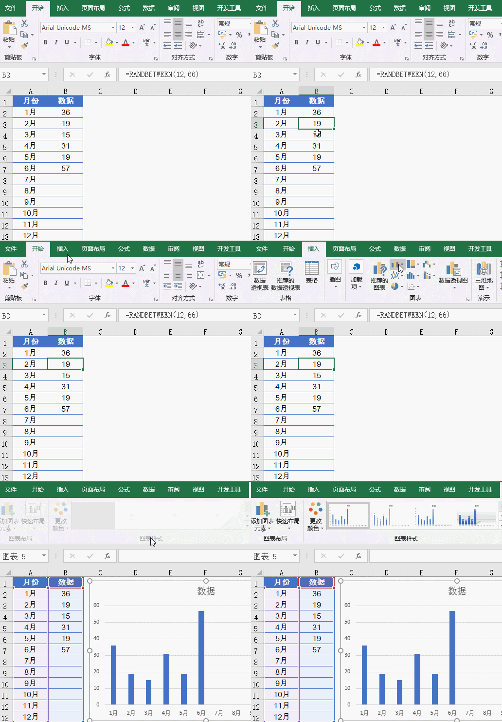
Right-click the chart→Select data
Click the [Edit] button on the left, Modify the series value to: =Sheet1!Data
"Sheet1" is the actual worksheet name, and "data" is the name we just defined. Remember to have an exclamation mark in the middle!.
Click the [Edit] button on the right and modify the axis label area to:
=Sheet1!Date
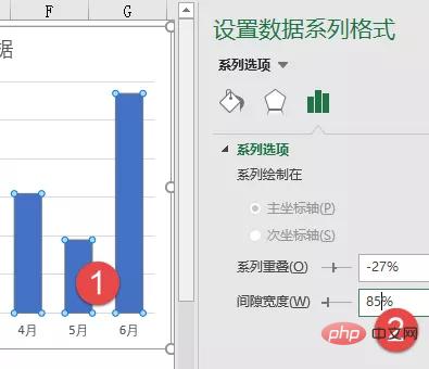
Double-click the column in the chart, set the format, and adjust the gap width to about 85%. The smaller the value here, the smaller the column spacing will be and it will not look too thin.
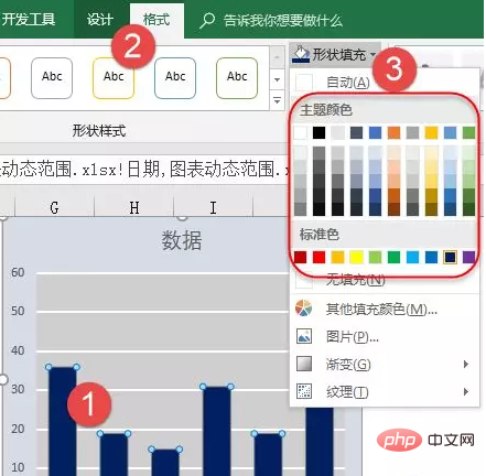
Then click
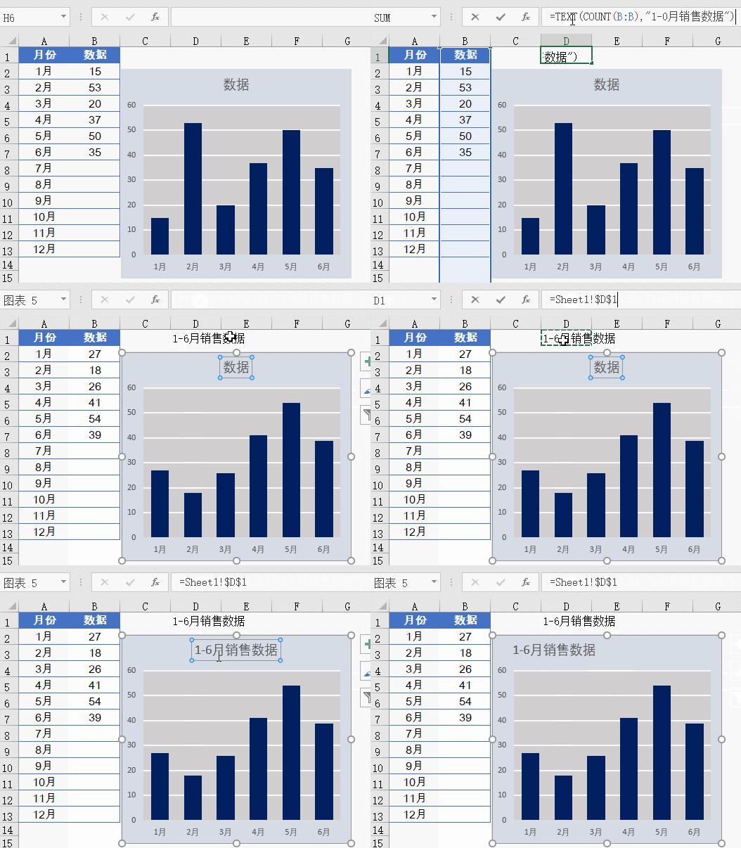
in a blank cell Enter the formula in:
=TEXT(COUNT(B:B),"1-0 Month Sales Data")
The formula first uses COUNT(B:B) to count the values in column B. Number n.
Use the TEXT function to change the formula result into the format of "1-n months sales data".
After entering the formula, click the border position of the chart title, enter the equal sign in the edit bar, then click the formula cell and press Enter:
Related learning recommendations:excel tutorial
The above is the detailed content of How to implement dynamic charts in Excel (detailed example). For more information, please follow other related articles on the PHP Chinese website!
 Compare the similarities and differences between two columns of data in excel
 excel duplicate item filter color
 How to copy an Excel table to make it the same size as the original
 Excel table slash divided into two
 Excel diagonal header is divided into two
 Absolute reference input method
 java export excel
 Excel input value is illegal


