In react, modal is used to cover the native view containing the root view, which can achieve the effect of masking. The syntax is "
" or "Modal.confirm()".

The operating environment of this tutorial: Windows 10 system, react17.0.1 version, Dell G3 computer.
Modal brief description
Modal dialog box. When the user needs to handle transactions but does not want to jump to the page and interrupt the workflow, Modal can be used to open a floating layer in the middle of the current page to carry the corresponding operations.
In addition, when you need a concise confirmation box to ask the user, you can use syntactic sugar methods such as Modal.confirm().
Core function point extraction
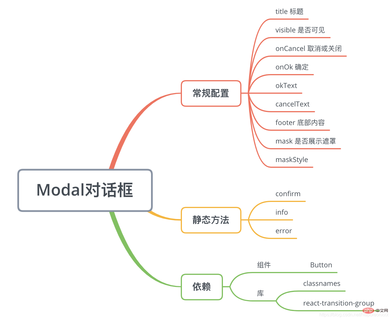
Implement Modal based on the interface provided by the Antd Modal document.

Core Implementation
The Modal component is special in that it has two usages:
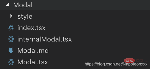
Modal.confirm({ title: 'After cancelling, the edited script information will not be saved, Please confirm whether to cancel.', okText: 'Confirm cancellation', cancelText: 'Do not cancel yet', onOk() { me.props.onCancel(); } })me The idea is that both calls are maintained uniformly ininternalModal.tsx

. Following this line of thinking, forModal.tsx.
1) The render method will not be maintained, butinternalModal.tsxwill be called in the componentDidMount / componentDidUpdate life cycle to complete rendering
2) Related static methods confirm, error, info are maintained in Modal.tsx wait.
// Modal.tsxexport default class Modal extends React.Component{ static propTypes = { ... }; static confirm(content) { const modal = new InternalModal(); const props = { ...Modal.defaultProps, title: '提示', children: content, cancelButton: true, okButton: true, okButtonText: '确定', cancelButtonText: '取消', closable: false, visible: true, onOk() { modal.destroy(); }, onCancel() { modal.destroy(); } }; modal.render(props); } private modal; constructor(props: ModalProps) { super(props); this.modal = new InternalModal(); } componentWillUnmount() { this.modal.destory(); this.modal = null; } componentDidMount() { this.modal.render(this.props); } componentDidUpdate() { this.modal.render(this.props); } componentWillReceiveProps(nextProps) { if (nextProps.visible) { this.modal.show(); } else { this.modal.hide(); } } render() { return null; }}
The next step is the most criticalinternalModal.tsx:
export default class InternalModal { private props; render(props) { const {...} = this.props; this.createContainer(); const icon = require('../../assets/icon/info.svg') as string; const modalDOM = ...; ReactDOM.render({modalDOM}, modalContainer, () => { if (visible) { this.show(); } }); } ... createContainer() { if (!modalContainer) { modalContainer = document.createElement('p'); document.body.appendChild(modalContainer); } } destroy() { if (modalContainer) { ReactDOM.unmountComponentAtNode(modalContainer); } } show() { if (modalContainer) { modalContainer.style.display = 'block'; } } hide() { if (modalContainer) { modalContainer.style.display = 'none'; } }}
You can find the implementation points ofinternalModalfrom the code:
As an ordinary js class (does not inherit React.Component), it provides a render method. In render, the pop-up window is rendered throughReactDOM.render(element, container[, callback])
Create a p container on the document to multiply the Modal and control the display/hide through css display. In fact, you can also use React Portal.
You can use some third-party libraries such as react-transition-group to enhance the Modal display/hide animation effect.
Recommended learning: "react video tutorial"
The above is the detailed content of What is the usage of modal in react. For more information, please follow other related articles on the PHP Chinese website!