


rem in css3 is a relative unit, which is the unit relative to the font size of the root element; the advantage of using rem is that when calculating the size related to sub-elements, it only needs to be calculated based on the font size of the html element.

The operating environment of this article: Windows 7 system, CSS3 version, Dell G3 computer.
What does rem mean in css3?
Detailed explanation of rem in css3
rem: It is a relative unit, relative to the unit of the font size of the root element. To put it more bluntly, it is relative to the font of the html element. size unit.
Advantages: When calculating the size of sub-elements, you only need to calculate it based on the font size of the html element. It is no longer like when using em, you have to go back and forth to find the font size of the parent element for frequent calculations, and you cannot do without a calculator at all.
I just finished a mobile terminal project and I have some small gains to share here. Maybe you have used it. If there are any deficiencies, please discuss them. The font size of
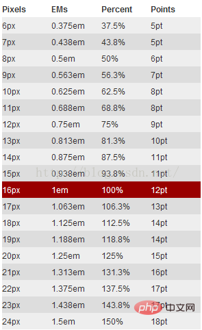
html is set to font-size:62.5%. Reason: The default font size of the browser is 16px. The relationship between rem and px is: 1rem = 10px, 10/16=0.625=62.5%, for child elements. The relevant dimensions are easy to calculate, so it is most appropriate to write them like this. Just divide the px size measured in the design draft by 10 to get the corresponding rem size, which is very convenient. Of course, it is also possible to directly set the html element to 10px. Just got used to 62.5%. I found a reference picture for easy reference. As follows:
# Let’s talk about the problems encountered in the project.
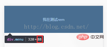
According to the customary writing method, the code is as follows:
html { font-size:62.5%; }
.menu{ width:100%; height:8.8rem; background:#000; line-height:8.8rem;color:#fff;font-size:3.2rem; text-align:center; }Debugging tool: chrome
The size of the rendering is as follows: 
Shouldn’t the height be 88? Why is it so much larger? Chrome treats fonts smaller than 12px as 12px. What a pitfall. 8.8*10=88,8.8*x=105.59, the calculation result is x=11.999, there will be an error in the browser calculation, it just happens to be 12px.
Bypass this pit, directly set the html font size to 625%, which is 100px. Let’s look at the effect again.
The lovely 88 is back, bypassing chrome’s 12px Achilles’ heel.
Device adaptation:
It’s very simple. The design draft of this project is 640, so just use 640 as a reference and set the html font to 625%. 88px can be directly converted to .88rem; it is suitable for devices of other sizes, such as: 320, 88px elements should be 44px. If the size of the element is calculated directly, then there is no point in introducing rem. Directly use media query to change the html font Just set the size to 312.5%, and you only need to write one set of element sizes. A set of design drafts is suitable for devices of multiple sizes, making it as fun as you want. Calculation method: 320/640*625%=312.5%. For other sizes, just change 320 to the corresponding size.
Recommended learning: "css video tutorial"
The above is the detailed content of What does rem mean in css3. For more information, please follow other related articles on the PHP Chinese website!


![[Web front-end] Node.js quick start](https://img.php.cn/upload/course/000/000/067/662b5d34ba7c0227.png)


