How to achieve ring rotation effect in css3
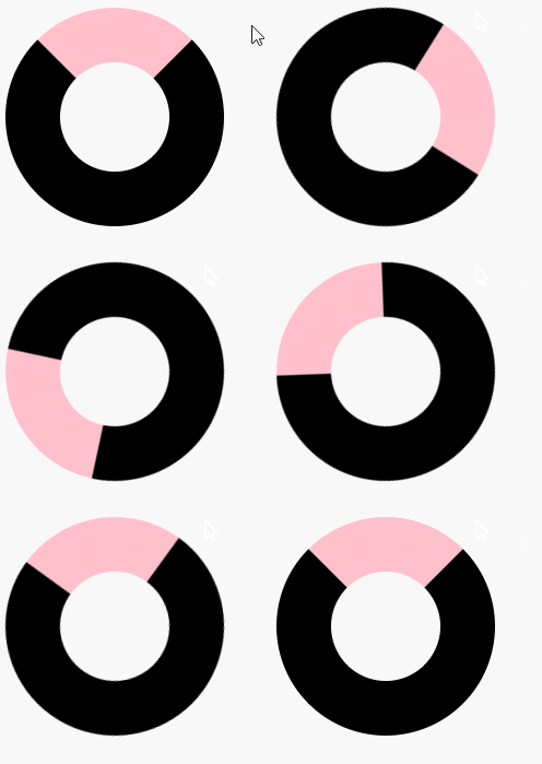
Method: 1. Use the border and border-radius attributes to turn the square element into a ring; 2. Use "ring element {animation: name time} @keyframes name {100%{transform:rotate(rotation Angle)}}" statement can rotate the ring element.

The operating environment of this tutorial: Windows 10 system, CSS3&&HTML5 version, Dell G3 computer.
How to achieve the ring rotation effect in css3
In css, you can first use the border attribute and border-radius attribute to set a square element Form a ring style, and then use the animation attribute, @keyframes rule and transform attribute to realize the ring rotation. The example is as follows:
<!DOCTYPE html>
<html lang="en">
<head>
    <meta charset="UTF-8">
    <meta name="viewport" content="width=device-width, initial-scale=1.0">
    <meta http-equiv="X-UA-Compatible" content="ie=edge">
    <title>Document</title>
    <style>
        div{
            width:200px;
            height:200px;
            border:100px solid black;
            border-top-color:pink;
            border-radius:50%;
            animation:fadenum 5s ;
        }
        @keyframes fadenum{
   100%{transform:rotate(360deg);}
}
    </style>
</head>
<body>
    <div></div>
</body>
</html>
Output result:

(Learning video sharing: css video tutorial)
The above is the detailed content of How to achieve ring rotation effect in css3. For more information, please follow other related articles on the PHP Chinese website!

Hot AI Tools

Undress AI Tool
Undress images for free

Undresser.AI Undress
AI-powered app for creating realistic nude photos

AI Clothes Remover
Online AI tool for removing clothes from photos.

Clothoff.io
AI clothes remover

Video Face Swap
Swap faces in any video effortlessly with our completely free AI face swap tool!

Hot Article

Hot Tools

Notepad++7.3.1
Easy-to-use and free code editor

SublimeText3 Chinese version
Chinese version, very easy to use

Zend Studio 13.0.1
Powerful PHP integrated development environment

Dreamweaver CS6
Visual web development tools

SublimeText3 Mac version
God-level code editing software (SublimeText3)
 How to use CSS gradients for backgrounds
Aug 17, 2025 am 08:39 AM
CSSgradientsprovidesmoothcolortransitionswithoutimages.1.Lineargradientstransitioncolorsalongastraightlineusingdirectionsliketobottomorangleslike45deg,andsupportmultiplecolorstopsforcomplexeffects.2.Radialgradientsradiatefromacentralpointusingcircleo
 How to create a dotted border in CSS
Aug 15, 2025 am 04:56 AM
Use CSS to create dotted borders, just set the border attribute to dotted. For example, "border:3pxdotted#000" can add a 3-pixel-wide black dot border to the element. By adjusting the border-width, the size of the point can be changed. The wider borders produce larger points. You can set dotted borders for a certain side, such as "border-top:2pxdottedred". Dotted borders are suitable for block-level elements such as div and input. They are often used in focus states or editable areas to improve accessibility. Pay attention to color contrast. At the same time, different from dashed's short-line style, dotted presents a circular dot shape. This feature is widely used in all mainstream browsers.
 How to create a glassmorphism effect with CSS
Aug 22, 2025 am 07:54 AM
To create a glass mimicry effect of CSS, you need to use backdrop-filter to achieve background blur, set a translucent background such as rgba(255,255,255,0.1), add subtle borders and shadows to enhance the sense of hierarchy, and ensure that there is enough visual content behind the elements; 1. Use backdrop-filter:blur(10px) to blur the background content; 2. Use rgba or hsla to define the transparent background to control the degree of transparency; 3. Add 1pxsolidrgba(255,255,255,0.3) borders and box-shadow to enhance the three-dimensionality; 4. Ensure that the container has rich backgrounds such as pictures or textures to present a blurred penetration effect; 5. It is compatible with old browsers
 How to change the list style in CSS
Aug 17, 2025 am 10:04 AM
To change the CSS list style, first use list-style-type to change the bullet or numbering style. 1. Use list-style-type to set the bullet of ul to disc, circle or square, and the number of ol is decimal, lower-alpha, upper-alpha, lower-roman or upper-roman. 2. Remove the tag completely with list-style:none. 3. Use list-style-image:url('bullet.png') to replace it with a custom image. 4. Use list-style-position:in
 How to change the cursor in CSS
Aug 16, 2025 am 05:00 AM
Usebuilt-incursortypeslikepointer,help,ornot-allowedtoprovideimmediatevisualfeedbackfordifferentinteractiveelements.2.ApplycustomcursorimageswiththecursorpropertyusingaURL,optionallyspecifyingahotspotandalwaysincludingafallbacklikeautoorpointer.3.Fol
 How to implement a dark mode theme with CSS
Aug 22, 2025 am 09:55 AM
There are two main ways to implement dark mode: one is to use prefers-color-scheme media to query automatically to adapt system preferences, and the other is to add manual switching function through JavaScript. 1. Use prefers-color-scheme to automatically apply dark themes according to the user system. There is no need for JavaScript, just define the styles in the media query; 2. To achieve manual switching, you need to define light-theme and dark-themeCSS classes, add toggle buttons, and use JavaScript to manage the theme status and localStorage to save user preferences; 3. You can combine both to read localSt first when the page is loaded.
 How to use grid-template-areas in CSS
Aug 22, 2025 am 07:56 AM
Thegrid-template-areaspropertyallowsdeveloperstocreateintuitive,readablelayoutsbydefiningnamedgridareas;eachstringrepresentsarowandeachwordacolumncell,withgrid-areanamesonchildelementsmatchingthoseinthetemplate,suchas"headerheaderheader"for
 How to add a box shadow in CSS
Aug 18, 2025 am 11:39 AM
To add box shadows, use box-shadow attribute; 1. The basic syntax is box-shadow: horizontal offset vertical offset blur radius expansion radius shadows in color; 2. The first three values are required, the rest are optional; 3. Use rgba() or hsla() to achieve transparent effect; 4. The positive expansion radius expands shadows and the negative value is reduced; 5. Multiple shadows can be added by commas separation; 6. Overuse should be avoided to ensure that visibility is tested on different backgrounds; this attribute is well supported by the browser, and reasonable use can improve the design texture.


