How to draw a polyline with two columns of data in excel: First open the excel software and enter the data; then select the data that will be used as the ordinate of the chart; then select insert chart and select the line chart; finally set the abscissa data. .

The operating environment of this article: windows7 system, Microsoft Office Excel2007 version, DELL G3 computer
First, open the excel2007 software and enter the data (the following is Example, please enter according to actual situation)
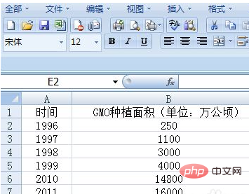
#Then select the data that will be used as the ordinate of the chart.
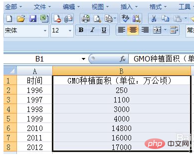
Select Insert Chart and select Line Chart.

The software automatically generates charts.

It can be found that the ordinate of the chart is now as we want. But the abscissa is wrong. You can perform the following operations: select the abscissa data in the chart area, right-click, and select the "Select Data" button.
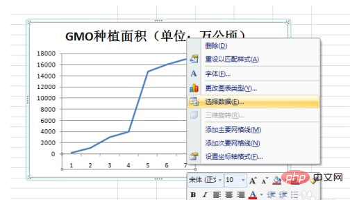
In the pop-up dialog box, click the "Edit" button under "Horizontal (Category) Axis Label".

#A new dialog box will pop up. At this time, use the mouse to directly select the data that will be used as the abscissa in the data area (do not select the project name), and click OK.

Returning to the previous dialog box, you can find that the data under "Horizontal (Category) Axis Label" has changed.
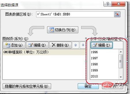
Click OK and you can see that the chart meets the requirements.

Recommended study: "Excel Tutorial"
The above is the detailed content of How to draw a polyline between two columns of data in Excel. For more information, please follow other related articles on the PHP Chinese website!
 Compare the similarities and differences between two columns of data in excel
 excel duplicate item filter color
 How to copy an Excel table to make it the same size as the original
 Excel table slash divided into two
 Excel diagonal header is divided into two
 Absolute reference input method
 java export excel
 Excel input value is illegal


