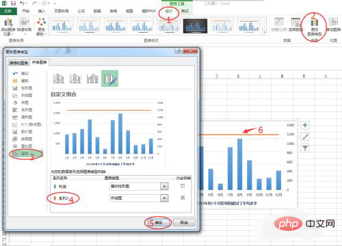
Add method: First add a reference column to the data and generate a new chart; then right-click the data series of the reference column, select "Format Data Series" in the pop-up right-click menu, and select "Secondary Axis "; Then click "Design" - "Change Icon Type" at the top of the page; finally set the "Secondary Axis" to "Line Chart" and click "OK".

The operating environment of this tutorial: Windows 7 system, Microsoft Office Excel 2010 version, Dell G3 computer.
After opening Excel, create a new data table, and then click the chart icon on the [Insert] panel to generate a column chart.
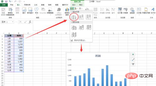
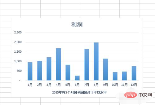
The above is a profit statement for 12 months in a year. The profits in 5 months exceeded the average level, but it is difficult to see from the chart. Which months are they, so we need to add a horizontal reference line to the chart.
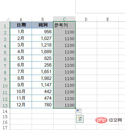
Create using the line chart method. First, we need to add a reference column to the data table. Here we create it in column C, and then enter the profit standard of 1100.
Select the C2:C13 data content, press the shortcut key Ctrl C to copy, then select the chart, press Ctrl v to paste, you can see that a new chart column is generated .
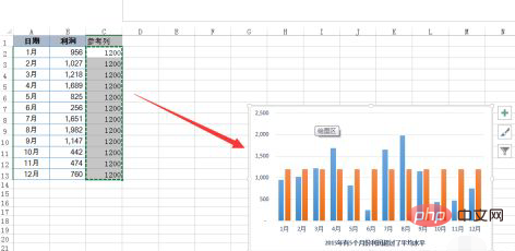
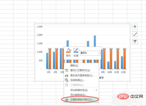
Click the mouse to select the data series just inserted, right-click and select the [Format Data Series] command, then click to select [Secondary Axis] in the right panel, and click above [Design] in the menu, select [Change Chart Type], then set the secondary axis in the combination to a line chart, and click OK.
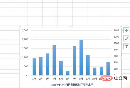
In order to make the secondary coordinate axis and the primary coordinate axis have the same values, click to select the secondary coordinate axis and then set the maximum value to 2500. At this point, the precise chart reference line is completed.
Related learning recommendations:excel tutorial
The above is the detailed content of How to add auxiliary lines to excel chart. For more information, please follow other related articles on the PHP Chinese website!
 Compare the similarities and differences between two columns of data in excel
 excel duplicate item filter color
 How to copy an Excel table to make it the same size as the original
 Excel table slash divided into two
 Excel diagonal header is divided into two
 Absolute reference input method
 java export excel
 Excel input value is illegal