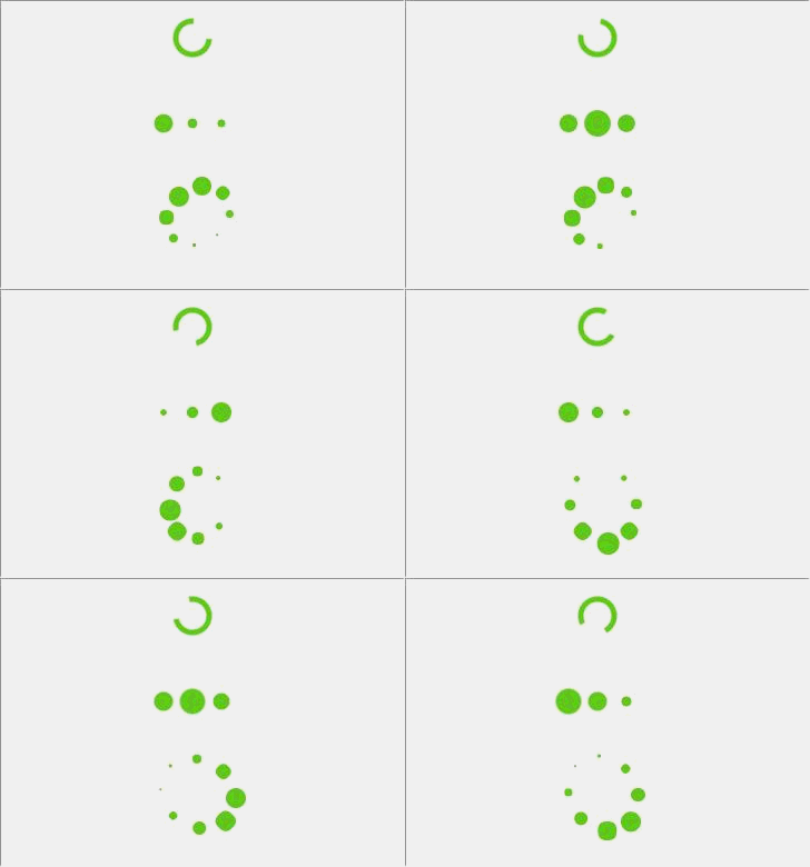
css3 loading refers to the loading and buffering effect of css3. The css method of loading is: 1. Loading is achieved through the transform attribute; 2. Loading is achieved through the animation-direction attribute, etc.

The operating environment of this tutorial: windows7 system, HTML5&&CSS3 version, Dell G3 computer.
Recommended:css video tutorial
What does css3 loading animation mean?
The loading animation means loading and buffering.
When many people are playing games, animations will appear. At this time, it will indicate loading, or buffering when the network is not connected. The animations appear either when the game appears, or there is a problem with the player. .
Perhaps due to the large size of the web page, or due to the use of front-end libraries such as vue, viewers will often see a white screen for a period of time when opening the web page. The usual approach is to wait until the first page of the web page is completed. When the screen is rendered, a loading animation is shown to the user, and the loading animation is hidden after the page is rendered.
Several loading animations implemented in pure CSS
Let’s introduce several very simple CSS animations

First of all, the first one is the simplest. HTML only requires one tag and CSS is only a few lines. Let’s briefly talk about the idea: set equal values for width and height for an element, set border-radius to 50% to make it a circle, set the background color to transparent, add a border of a few pixels to the element, and match it with The color you like. It should be noted that here you need to set the border of one side to be transparent to make it look like a ring with only three quarters, and then animate it to make it move. . Setting transform:translate(-50%,-50%) for a positioned element, combined with 50% of top and left, can center the element horizontally and vertically. The reason why translate(-50%,-50%) is written in form and to is because if you write "transform:translate(-50%,-50%)" directly on the element, you will also write "translate:translate(-50%,-50%)" in the animation. transform:rotate(0deg)" will overwrite the transform attribute on the element and prevent it from being centered.
The second idea is to construct three circles side by side, and set a certain animation delay to make the three circles have the feeling of one after another. infinite means that the animation will be played infinitely, and alternate means that the animation will be played from beginning to end. And then from the end to the beginning.
The third type is slightly more complicated than the first two. Here, eight absolutely positioned circles are used, and the transform attribute is used to move them one by one from the center to the edge. The gap between the two and the center of the circle is The angle is 45 degrees, so by rotating by a multiple of 45 degrees and then translating a certain distance to the The impact of different orders on the results). Then just set the animation delay for each circle rule. The animation here uses changes in width and height without using scale, because transform:scale() will overwrite the previously set transform attribute and cause the circles to not spread out.
The above is the detailed content of css3 loading what does it mean. For more information, please follow other related articles on the PHP Chinese website!