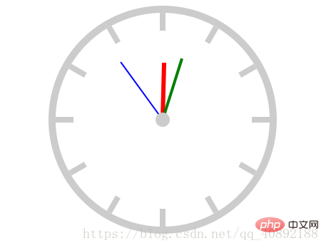

Let’s take a look at the renderings first (regardless of color matching):
(Learning video sharing: html5 video tutorial)

We must first understand how to implement this clock. Don’t think about animation for the time being, learn to dismantle the problem and implement it step by step.
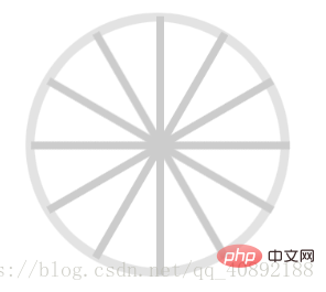
First we need to draw a square with a border, give a rounded corner to achieve the outermost ring, and then rotate a long rectangle multiple times to achieve the scale

Just draw another white circle to cover it to achieve the standard scale

Finally add three rectangles and the small circle in the middle The initial state of the clock can be realized
Code implementation
After understanding the above process, the code implementation is much simpler. The only thing that needs to be considered is the optimization of the code. In order to make it simple and clear, below How to implement the first step, there is a lot of repeated code.
Regarding animation, we only need to set the rotation animation, and the animation of the hour, minute and second hands only need to change different times.
Please see the code for specific details:
<!DOCTYPE html>
<html>
<head>
    <meta charset="UTF-8">
    <title>时钟</title>
    <style>
        *{
            padding: 0;
            margin: 0;
        }
        .clock{
            width: 300px;
            height: 300px;
            border: 10px solid #ccc;
            /*百分比参照的是实际宽高*/
            border-radius: 50%;
            margin: 20px auto;
            position: relative;
        }
        .line{
            width: 8px;
            height: 300px;
            background-color: #ccc;
            position: absolute;

            /*实现居中*/
            /*参照父元素的宽*/
            left: 50%;
            top: 0;
            /*参照元素本身*/
            transform: translate(-50%,0);

            /*保留,否则会被覆盖*/


        }
        .line2{
            transform: translate(-50%,0) rotate(30deg);
        }
        .line3{
            transform: translate(-50%,0) rotate(60deg);
        }
        .line4{
            transform: translate(-50%,0) rotate(90deg);
        }
        .line5{
            transform: translate(-50%,0) rotate(120deg);
        }
        .line6{
            transform: translate(-50%,0) rotate(150deg);
        }

        .cover{
            width: 250px;
            height: 250px;
            border-radius: 50%;
            background-color: #fff;
            position: absolute;
            left: 50%;
            top: 50%;
            transform: translate(-50%,-50%);
        }
        .hour{
            width: 6px;
            height: 80px;
            background-color: red;
            position: absolute;
            left: 50%;
            top: 50%;
            transform: translate(-50%,-100%);

            /*设置轴心*/
            transform-origin: center bottom;
            /*动画*/
            -webkit-animation: move 43200s linear infinite;

        }
        .minute{
            width: 4px;
            height: 90px;
            background-color: green;
            position: absolute;
            left: 50%;
            top: 50%;
            transform: translate(-50%,-100%);

            /*设置轴心*/
            transform-origin: center bottom;
            /*动画*/
            -webkit-animation: move 3600s linear infinite;


        }
        .second{
            width: 2px;
            height: 100px;
            background-color: blue;
            position: absolute;
            left: 50%;
            top: 50%;
            transform: translate(-50%,-100%);

            /*设置轴心*/
            transform-origin: center bottom;
            /*动画*/
            -webkit-animation: move 60s infinite steps(60);
            /*linear与step(60)重复*/

        }
        .center{
            width:20px;
            height:20px;
            background-color: #ccc;
            border-radius: 50%;
            position: absolute;
            left: 50%;
            top: 50%;
            transform: translate(-50%,-50%);

        }

        /*创建移动动画*/
        @keyframes move{
            0%{
                transform: translate(-50%,-100%) rotate(0deg);
            }
            100%{
                transform: translate(-50%,-100%) rotate(360deg);
            }

        }
    </style>
</head>
<body>
<div>
    <div class="line line1"></div>
    <div class="line line2"></div>
    <div class="line line3"></div>
    <div class="line line4"></div>
    <div class="line line5"></div>
    <div class="line line6"></div>
    <div></div>
    <div></div>
    <div></div>
    <div></div>
    <div></div>
</div>
</body>
</html>Related recommendations: html5 tutorial
The above is the detailed content of Use html5 to create a clock animation effect. For more information, please follow other related articles on the PHP Chinese website!
 What are the production methods of html5 animation production?
 The difference between HTML and HTML5
 Introduction to the usage of vbs whole code
 What are the differences between Eclipse version numbers?
 cdn server security protection measures
 How to undo after gitcommit
 microsoft project
 Recommended hard drive detection tools