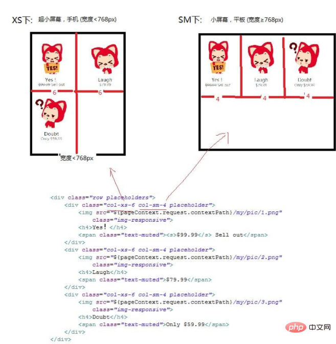
In bootstrap, the grid system can be used to implement responsive layout. The implementation method is: 1. Create a page layout through a series of combinations of rows and columns; 2. Choose different layouts according to different screen sizes. Grid option, and then realize automatic layout.

The operating environment of this tutorial: Windows7 system, bootstrap3 version, Dell G3 computer
bootstrap implements responsive layout:
You can use the grid system in bootstrap to implement responsive layout.
Bootstrap provides a responsive, mobile-first fluid grid system that automatically divides into up to 12 columns as the screen or viewport size increases. It contains easy-to-use predefined classes, as well as powerful mixins for generating more semantic layouts.
Principle of grid system:
First, the grid system is used to create a page layout through a series of combinations of rows and columns. Bootstrap selects different grid options according to different screen sizes. There are four grid options, ultra-small screen (mobile phone), small screen (tablet), medium screen (desktop), and large screen (extra large desktop). The grid system is divided into 12 columns, i.e. each row can hold up to 12 columns. If the number of columns contained in a .row is greater than 12 (that is, the grid cells in a row exceed 12 cells), it will be automatically typed. In short, a row can only have a maximum of 12 columns. Read the detailed analysis later.
In Bootstrap3, the screen is mainly divided into three types (here explained by rows):
.col-xs-* Ultra-small screen, mobile phone (width
.col-sm-* Small screen, tablet (width ≥768px)
.col-md-* Medium screen, desktop monitor (width≥992px)
No matter what kind of screen it is on, the grid system will automatically divide it into 12 columns
.col-xs-* and .col-sm- and .col-md-. The following parameters are represented in the current screen. The number of columns occupied.

When using the grid system, you need to do the following processing in the section:
1. In order to ensure proper drawing and touch screen scaling, you need to do the following in the Add viewport metadata tag
width=device-width width equal to device width
initial-scale=1.0 Initial display size - original size, that is, no scaling
2 , import bootstrap.css file [bootstrap core CSS file, must be imported], there are two ways to import:
First, directly import the local .css file:
Second, use CDN Acceleration service:
3. Compatibility:
bootstrap is based on CSS3 and is not supported for IE8.
IE8 requires the cooperation of Response.js to achieve media query ( media query) support.
Recommended: "bootstrap video tutorial" "css video tutorial"
The above is the detailed content of How to implement responsive layout in bootstrap. For more information, please follow other related articles on the PHP Chinese website!