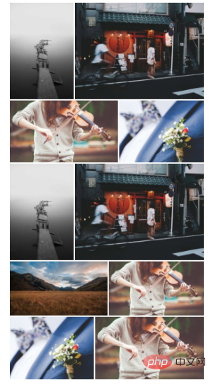

Recently I am working on a small program project, and I have borrowed the UI from other App designs. Among them, there is a UI with a horizontal layout of pictures, which looks very nice, similar to a traditional waterfall. The flow layout is the same horizontally. So I implemented it myself, and expanded the original method of two horizontal pictures into a method that can customize the number of pictures displayed. The following is the basic display effect:

Display two pictures in a single line

Display five pictures in a single line
Let’s first talk about the idea when writing this method:
Effect analysis
As you can see in the above picture, no matter how many pictures are displayed in a single line, It is almost guaranteed that the picture will be displayed completely, and the height of each row is different - this is to ensure that each picture can be displayed almost completely, so the row height must be dynamically adjusted according to the actual picture to be displayed.
Since pixel rendering must be rounded, there will be an error of 1~2px in calculating the width and height of the image. This error can be directly ignored and will not cause the image to be visually stretched.
After analyzing the effect, we have the following questions:
1. How to ensure that each row can fully display the pictures inside? You must know that the width and height of each picture are different
2. How to dynamically calculate the height of each row?
3. How to layout the pictures in the last row when the remaining number of pictures in the end does not meet the number of pictures displayed in a single line?
4,...
Problem Analysis
Let’s first look at the first question: How to ensure that every picture in a single line can be displayed completely .
First of all, we can determine the number of pictures displayed in a single line. This is preset, such as the above single line of 5 pictures, numberInLine = 5. Each picture in the same row has the same height, so you can calculate the width of a single row when the picture is actually rendered based on the ratio of the width of the picture to the total width of all pictures. The formula is as follows:
imageRenderWidth = (imageWidth / imagesTotalWidth) * lineWidth
Although the actual width and height of the pictures are different, since the height of a single row of pictures is the same, we can first assume a standard height stdHeight, and scale the width of each picture proportionally through this standard height, so that the calculation can be smooth Get the ratio of the width of a single picture to the total width of all pictures
How to calculate the height of each row
On the premise that the width of the picture can be determined, each row must be determined The height is relatively simple. Based on the first picture in each row, first calculate the rendering width of the first picture, then calculate the rendering height of this picture, and use this as the row height. Each subsequent picture will calculate its own height through the row height. The rendering width. However, it should be noted that in order to fill a single line, the last picture needs to be calculated by the total width - the sum of the widths of all previous pictures, otherwise there will be gaps. The expression formula is as follows:
// 第一张图片渲染宽度 firstImageRenderWidth = (firstImageWidth / imagesTotalWidth) * lineWidth // 第一张图片渲染高度,即行高,即该行所有图片高度 lineHeight = imagesRenderHeight = firstImageRenderWidth / (firstImageWidth / firstImageHeight) // 中间图片渲染宽度 middleImageRenderWidth = lineHeight * (middleImageWidth / middleImageHeight) // 最后一张图片渲染宽度 lastImageRenderWidth = lineWidth - otherImagesTotalRenderWidth
How to layout when the number of remaining pictures is less than the number of single rows?
This problem needs to be considered in two situations:
1. When a single line requires 5 pictures, and the remaining number is less than 5 but greater than 1 (such as 4 pictures) : This row can be laid out according to the number of remaining pictures, and the algorithm is still the same as above. Therefore, for this point, the code needs to be reusable;
2. When there is only 1 picture left, there are several processing methods:
This picture can be filled up The entire line width is displayed completely, but if this picture is a very high height picture, it will seriously affect the aesthetics of the layout.
The picture will still fill the line width, but given a maximum height, when the height When it is less than the maximum height, it will be displayed completely, and when it exceeds, only part of it will be displayed. This can ensure the beauty of the layout, but there will be flaws in the display of the last picture.
Take the row height of the previous row as the row height of the last row, so The image can still be displayed completely while ensuring the consistency of the overall layout, but this will leave a lot of blank space in the last line.
For the above three processing methods, the author uses the second one. Interested friends can try the other two methods on their own. Or if you have a better layout method, you can also tell the author in the comments!
I don’t know if you guys understand the explanations of the above three questions? It’s okay if you don’t understand. You can learn how to solve these problems directly through the code.
Code implementation
/* imagesLayout.js */ /* * 图片横向瀑布流布局 最大限度保证每张图片完整显示 可以获取最后计算出来的图片布局宽高信息 最后的瀑布流效果需要配合 css 实现(作者通过浮动布局实现)当然你也可以对代码进行修改 让其能够直接返回一段已经布局完成的 html 结构 * 需要先提供每张图片的宽高 如果没有图片的宽高数据 则可以在代码中添加处理方法从而获取到图片宽高数据后再布局 但是并不推荐这样做 * 尽量保证图片总数能被单行显示的数量整除 避免最后一行单张显示 否则会影响美观 * 每张图由于宽高取整返回的宽高存在0-2px的误差 可以通过 css 保证视觉效果 */ /* * @param images {Object} 图片对象列表,每一个对象有 src width height 三个属性 * @param containerWidth {Integer} 容器宽度 * @param numberInLine {Integer} 单行显示图片数量 * @param limit {Integer} 限制需要进行布局的图片的数量 如果传入的图片列表有100张 但只需要对前20张进行布局 后面的图片忽略 则可以使用此参数限制 如果不传则默认0(不限制) * @param stdRatio {Float} 图片标准宽高比 */ class ImagesLayout { constructor(images, containerWidth, numberInLine = 10, limit = 0, stdRatio = 1.5) { // 图片列表 this.images = images // 布局完毕的图片列表 通过该属性可以获得图片布局的宽高信息 this.completedImages = [] // 容器宽度 this.containerWidth = containerWidth // 单行显示的图片数量 this.numberInLine = numberInLine // 限制布局的数量 如果传入的图片列表有100张 但只需要对前20张进行布局 后面的图片忽略 则可以使用此参数限制 如果不传则默认0(不限制) this.limit = limit // 图片标准宽高比(当最后一行只剩一张图片时 为了不让布局看上去很奇怪 所以要有一个标准宽高比 当图片实际宽高比大于标准宽高比时会发生截取 小于时按照实际高度占满整行显示) this.stdRatio = stdRatio // 图片撑满整行时的标准高度 this.stdHeight = this.containerWidth / this.stdRatio this.chunkAndLayout() } // 将图片列表根据单行数量分块并开始计算布局 chunkAndLayout () { // 当图片只有一张时,完整显示这张图片 if (this.images.length === 1) { this.layoutFullImage(this.images[0]) return } let temp = [] for (let i = 0; i < this.images.length; i++) { if (this.limit && i >= this.limit) return temp.push(this.images[i]) // 当单行图片数量达到限制数量时 // 当已经是最后一张图片时 // 当已经达到需要布局的最大数量时 if (i % this.numberInLine === this.numberInLine - 1 || i === this.images.length - 1 || i === this.limit - 1) { this.computedImagesLayout(temp) temp = [] } } } // 完整显示图片 layoutFullImage (image) { let ratio = image.width / image.height image.width = this.containerWidth image.height = parseInt(this.containerWidth / ratio) this.completedImages.push(image) } // 根据分块计算图片布局信息 computedImagesLayout(images) { if (images.length === 1) { // 当前分组只有一张图片时 this.layoutWithSingleImage(images[0]) } else { // 当前分组有多张图片时 this.layoutWithMultipleImages(images) } } // 分组中只有一张图片 该张图片会单独占满整行的布局 如果图片高度过大则以标准宽高比为标准 其余部分剪裁 否则完整显示 layoutWithSingleImage (image) { let ratio = image.width / image.height image.width = this.containerWidth // 如果是长图,则布局时按照标准宽高比显示中间部分 if (ratio < this.stdRatio) { image.height = parseInt(this.stdHeight) } else { image.height = parseInt(this.containerWidth / ratio) } this.completedImages.push(image) } // 分组中有多张图片时的布局 // 以相对图宽为标准,根据每张图的相对宽度计算占据容器的宽度 layoutWithMultipleImages(images) { let widths = [] // 保存每张图的相对宽度 let ratios = [] // 保存每张图的宽高比 images.forEach(item => { // 计算每张图的宽高比 let ratio = item.width / item.height // 根据标准高度计算相对图宽 let relateWidth = this.stdHeight * ratio widths.push(relateWidth) ratios.push(ratio) }) // 计算每张图片相对宽度的总和 let totalWidth = widths.reduce((sum, item) => sum + item, 0) let lineHeight = 0 // 行高 let leftWidth = this.containerWidth // 容器剩余宽度 还未开始布局时的剩余宽度等于容器宽度 images.forEach((item, i) => { if (i === 0) { // 第一张图片 // 通过图片相对宽度与相对总宽度的比值计算出在容器中占据的宽度与高度 item.width = parseInt(this.containerWidth * (widths[i] / totalWidth)) item.height = lineHeight = parseInt(item.width / ratios[i]) // 第一张图片布局后的剩余容器宽度 leftWidth = leftWidth - item.width } else if (i === images.length - 1) { // 最后一张图片 // 宽度为剩余容器宽度 item.width = leftWidth item.height = lineHeight } else { // 中间图片 // 以行高为标准 计算出图片在容器中的宽度 item.height = lineHeight item.width = parseInt(item.height * ratios[i]) // 图片布局后剩余的容器宽度 leftWidth = leftWidth - item.width } this.completedImages.push(item) }) } }
// 水平布局瀑布流容器