What are the bootstrap modal boxes?
Bootstrap modal is a lightweight, multipurpose JavaScript popup that is customizable and responsive. You can use it to display warning windows, videos, and images in your website. Websites built with Bootstrap can use modals to display terms and conditions (as part of the registration process), videos, and even social media widgets.

In order to understand it better, let’s take a look at the various components of the Bootstrap modal box.
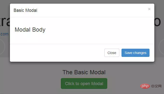
Bootstrap modal box is mainly divided into three parts: header, body and footer. Each part has its own meaning, so we should use them correctly. We will discuss these later. What's most exciting about Bootstrap modals? You don't need to write any JavaScript code to use it! All code and styles are predefined by Bootstrap. All you need to do is use the right tags and attributes to trigger it.
Default modal box
The default modal box is as follows:

To trigger the modal box status box, you need to add a link or button. The tag that triggers the element might look like this:
<a href="#" class="btn btn-lg btn-success"
   data-toggle="modal"
   data-target="#basicModal">Click to open Modal</a>
Note that the link element has two custom data attributes: data-toggle and data-target. The toggle tells Bootstrap what to do, and the target tells Bootstrap which element to open. So whenever such a link is clicked, a modal box with the id "basicModal" will appear.
Now let’s look at the code required to define the modal box:
<div class="modal fade" id="basicModal" tabindex="-1" role="dialog" aria-labelledby="basicModal" aria-hidden="true">
<div class="modal-dialog">
<div class="modal-content">
<div class="modal-header">
<button type="button" class="close" data-dismiss="modal" aria-hidden="true">×</button>
<h4 class="modal-title" id="myModalLabel">Modal title</h4>
</div>
<div class="modal-body">
<h3>Modal Body</h3>
</div>
<div class="modal-footer">
<button type="button" class="btn btn-default" data-dismiss="modal">Close</button>
<button type="button" class="btn btn-primary">Save changes</button>
</div>
</div>
</div>
</div>The parent div of the modal box should have the same ID as used in the trigger element above. In our case it's id="basicModal".
Note: The custom attributes aria-labelledby and aria-hidden in the parent modal box element make it accessible. It's a good practice to make your website accessible to everyone, so you should use these attributes as they won't negatively affect the normal functionality of the modal.
In the HTML code of the modal box, we can see an encapsulating div nested within the parent modal box div. This div's class modal-content tells bootstrap.js where to look for the modal's content. Inside this div, we need to place the three parts mentioned earlier: header, body, and footer.
The modal box header, as the name suggests, is used to add a title or other elements such as an "x" close button to the modal. These elements should also have a data-dismiss attribute telling Bootstrap which element to hide.
Then let’s look at the text of the modal box. Think of it as an open canvas into which you can add any type of data, including embedded YouTube videos, images, or any other content.
Finally, let’s take a look at the footer of the modal box. This area is right-aligned by default. In this area, you can place operation buttons such as "Save", "Close", "Accept", etc. These buttons are associated with the behavior that the "modal box" needs to display.
Now we have completed our first modal! You can check it out on our demo page.
Related recommendations: "bootstrap Getting Started Tutorial"
Change the size of the modal box
Bootstrap modal box is responsive Styled and flexible.
The modal box in Bootstrap 3.3.7 has two new styles: large and small. Add a modifier class modal-lg to divmodal-dialogdiv to get a larger modal box, and add modal-sm to get a smaller modal box.
Use jQuery to activate the modal box
The modal box is a jQuery plug-in, so if you want to use jQuery to control the modal box, you need to Call the .modal() method on the selector. For example:
$('#basicModal').modal(options);
The "options" here are JavaScript objects that can be passed to custom behaviors. For example:
var options = {
    "backdrop" : "static"
}
Available options include:
backdrop: This can be true or static. This defines whether you want the user to be able to close the modal by clicking on the background.
keyboard: If set to true the modal box will be closed via the ESC key.
show: used to open and close the modal box. It can be true or false.
remote: This is one of the coolest options. It can be used to load remote content using jQuery's load() method. You need to specify external pages in this option. The default setting is false.
Events for Bootstrap modals
You can further customize the normal behavior of Bootstrap modals by using various events that are triggered when the modal is opened and closed. Behavior. These events must be bound using jQuery's .on() method.
Available events are:
show.bs.modal: Triggered before the modal box is opened.
shown.bs.modal: Triggered after the modal box is shown.
hide.bs.modal: Triggered before the modal box is hidden.
hidden.bs.modal: Triggered after the modal is closed.
loaded.bs.modal: Use the above remote option to trigger when the remote content is successfully loaded into the content area of the modal box.
You can use one of the above events like this:
$('#basicModal').on('shown.bs.modal', function (e) {
    alert('Modal is successfully shown!');
});
Loading remote content in a modal
在Bootstrap模式中加载远程内容有三种不同的方法。
第一种方法,如上所述,是使用对象options中的remote选项。其他两种方式都是没有JavaScript的,如下所示。
你可以为模态框的触发元素中的href属性提供一个值。在我们的例子中,触发器是一个链接。例如,我们可以不使用我们之前提到的值#而将URL包含在特定页面中:
<a class="btn btn-lg btn-default"
   data-toggle="modal"
   data-target="#largeModal"
   href="remote-page.html">Click to open Modal</a>
你还可以为触发元素提供data-remote的自定义数据属性,而不是使用href属性。例如:
<a class="btn btn-lg btn-default" data-toggle="modal"
   data-target="#largeModal"
   data-remote="remote-page.html">Click to open Modal</a>
结论
模态框是Bootstrap 3提供的最好的插件之一。对于初级设计师来说,它是不需要任何JavaScript代码而在弹出式画面中加载内容的最佳方式之一。
The above is the detailed content of What are the bootstrap modal boxes?. For more information, please follow other related articles on the PHP Chinese website!

Hot AI Tools

Undress AI Tool
Undress images for free

Undresser.AI Undress
AI-powered app for creating realistic nude photos

AI Clothes Remover
Online AI tool for removing clothes from photos.

Clothoff.io
AI clothes remover

Video Face Swap
Swap faces in any video effortlessly with our completely free AI face swap tool!

Hot Article

Hot Tools

Notepad++7.3.1
Easy-to-use and free code editor

SublimeText3 Chinese version
Chinese version, very easy to use

Zend Studio 13.0.1
Powerful PHP integrated development environment

Dreamweaver CS6
Visual web development tools

SublimeText3 Mac version
God-level code editing software (SublimeText3)
 How to use bootstrap in vue
Apr 07, 2025 pm 11:33 PM
Using Bootstrap in Vue.js is divided into five steps: Install Bootstrap. Import Bootstrap in main.js. Use the Bootstrap component directly in the template. Optional: Custom style. Optional: Use plug-ins.
 How to write split lines on bootstrap
Apr 07, 2025 pm 03:12 PM
There are two ways to create a Bootstrap split line: using the tag, which creates a horizontal split line. Use the CSS border property to create custom style split lines.
 How to verify bootstrap date
Apr 07, 2025 pm 03:06 PM
To verify dates in Bootstrap, follow these steps: Introduce the required scripts and styles; initialize the date selector component; set the data-bv-date attribute to enable verification; configure verification rules (such as date formats, error messages, etc.); integrate the Bootstrap verification framework and automatically verify date input when form is submitted.
 How to view the date of bootstrap
Apr 07, 2025 pm 03:03 PM
Answer: You can use the date picker component of Bootstrap to view dates in the page. Steps: Introduce the Bootstrap framework. Create a date selector input box in HTML. Bootstrap will automatically add styles to the selector. Use JavaScript to get the selected date.
 How to set up the framework for bootstrap
Apr 07, 2025 pm 03:27 PM
To set up the Bootstrap framework, you need to follow these steps: 1. Reference the Bootstrap file via CDN; 2. Download and host the file on your own server; 3. Include the Bootstrap file in HTML; 4. Compile Sass/Less as needed; 5. Import a custom file (optional). Once setup is complete, you can use Bootstrap's grid systems, components, and styles to create responsive websites and applications.
 How to insert pictures on bootstrap
Apr 07, 2025 pm 03:30 PM
There are several ways to insert images in Bootstrap: insert images directly, using the HTML img tag. With the Bootstrap image component, you can provide responsive images and more styles. Set the image size, use the img-fluid class to make the image adaptable. Set the border, using the img-bordered class. Set the rounded corners and use the img-rounded class. Set the shadow, use the shadow class. Resize and position the image, using CSS style. Using the background image, use the background-image CSS property.
 10 latest tools for web developers
May 07, 2025 pm 04:48 PM
Web development design is a promising career field. However, this industry also faces many challenges. As more businesses and brands turn to the online marketplace, web developers have the opportunity to demonstrate their skills and succeed in their careers. However, as demand for web development continues to grow, the number of developers is also increasing, resulting in increasingly fierce competition. But it’s exciting that if you have the talent and will, you can always find new ways to create unique designs and ideas. As a web developer, you may need to keep looking for new tools and resources. These new tools and resources not only make your job more convenient, but also improve the quality of your work, thus helping you win more business and customers. The trends of web development are constantly changing.
 How to use bootstrap button
Apr 07, 2025 pm 03:09 PM
How to use the Bootstrap button? Introduce Bootstrap CSS to create button elements and add Bootstrap button class to add button text


