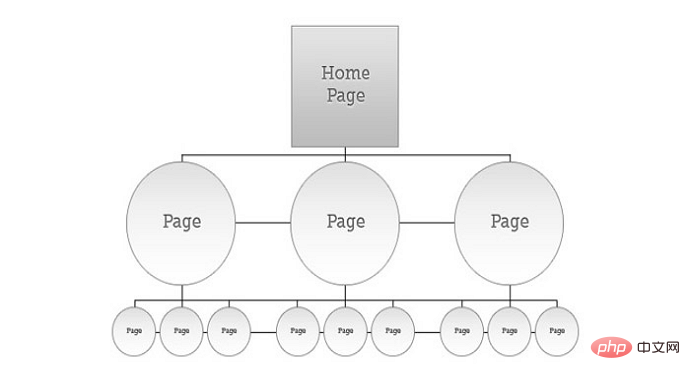
Navigation specifications: 1. Use text-based navigation, and the navigation text must be prominent and conspicuous; 2. The navigation area must be maintained at a certain size so that it is easy for users to find it; 3. The navigation location must be a customary location, such as The top of the page, the left side, etc.; 4. The operation must be simple; 5. Ensure that all navigation elements are clickable; 6. The navigation menu text must be clearly described.

The navigation menu of the website is the most important indicator for users to learn more about other parts of the website after reading the web page, and is crucial to retaining users. There are many ways to design a navigation menu, and every website must have its own navigation menu. To design an excellent navigation menu, designers must break through traditional limitations to express their creativity. Website navigation is one of the main factors that determine the usability of the site. If visitors can find what they are looking for easily and effortlessly, they will be more likely to stay on your site rather than leaving. Effective navigation can help a website increase page views, improve user experience, and even increase sales and profits.
In the process of doing SEO, what should we pay attention to when standardizing navigation?
Be careful to use text-based navigation
It is recommended to use text-based navigation for website navigation. If you use pictures or FLASH format, search engines will recognize it. If your website navigation is not available, then it will definitely not be able to recognize the directories in the navigation, so it is not conducive to crawling by spiders at all, so the navigation is expressed in text. If you need a good-looking navigation style, it is recommended to use DIV CSS can create beautiful styles.
Suggestions for navigation structure:
Make the website structure flatter (Which is better, the tree structure or the flat tree structure of the website?) It will make it easier for spiders to crawl Get the directory.
● Containing keywords in the anchor text
can increase the frequency of keywords, but not too many, which is beneficial to ranking.
● Breadcrumb navigation
Let both users and spiders see clearly where they are currently. Try to avoid too much repetitive navigation in the footer.
Designing an excellent navigation menu is not that difficult, but you still need to grasp the following key points:
1. Easy to find
Be visually distinguishable and easy for users to find at a glance. Navigation text should not use the same color, font, and size as your body text. Navigation text should be prominent and visible. For menu buttons, use high-contrast colors and clear text. The navigation area should be kept to a certain size so that it is easy for users to find it. The location of navigation should use the usual location, such as the top of the page, the left side, etc.
2. Simple
It must be simple and easy to use, helping your users quickly see what information is available and where to find what they are looking for. Users need to be able to predict how your website will work without having to learn how! If they need to think about what to do, you've lost them! Avoid having users click on a small inverted triangle to expand a secondary menu, which they may not find at all.
3. Clickable
Make sure all elements in the navigation are clickable. When using multiple categories in the navigation, all heading elements should be clickable links. Even with a drop-down menu, clicking on a subcategory link may be a visitor's natural inclination. Don't think this is ridiculous, I often find that the navigation of some websites cannot jump after clicking.
4. Consistency
Try to use the same navigation pattern across all pages. This is very important because without a consistent design, users may think he on another website. Make sure to use the same navigation pattern so users can easily access your site without getting lost.
5. Be clear
Your menu text must be clearly descriptive, use simple and clear terms, don’t make the user think about what the text here means, keep your text Be brief, descriptive and to the point. If it takes more than five seconds to think about the meaning of the text before clicking the link, it will create a poor user experience.

#6. Keep it simple
You can add more items to the vertical navigation, but the items in the main menu don’t have to be too many. Too many will distract the user. It is generally best not to exceed 8 items.
The above is the detailed content of What are the navigation specifications?. For more information, please follow other related articles on the PHP Chinese website!
 How to implement line break in alert
 Association rules apriori algorithm
 How to open win11 control panel
 How to reinstall the computer system
 504 Gateway Time-out
 How to delete index in mysql
 vivox100s parameter configuration details
 The difference between official replacement phone and brand new phone