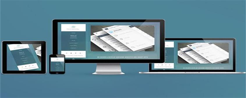
Today I will share with you the knowledge about responsive layout. It has a certain reference function and I hope it will be helpful to everyone.
Concept
Responsive design is a web development method by which a website is planned, designed and developed so that it displays optimally in a variety of devices, whether using a desktop, tablet or mobile device, Web page layouts defined in CSS can be allowed to expand to the width of the browser, and Javascript and jQuery will also accompany this behavior

Responsive Design Basics
Breakpoints
are created when a CSS3 media query is used to create a conditional boundary and then trigger the width to an alternate style in the browser for a specific device type. We typically use max-width breakpoints for mobile-first (scaling up) builds as well as creating desktop-first (shrinking) builds and min-width bounds. Media queries can also be used to determine height and even device orientation. The breakpoint size, which is the width, can be set by px or em. As new technology continues to improve, it will be discovered that two different devices can match the same breakpoint
fluidity
Fluid scaling can be achieved though several different way to do it, but it always involves percentages or em values that make the container expand within the scope of its parent element, and ultimately the browser. Fluid scaling is necessary to achieve responsiveness between breakpoints and maintain column flow in a responsive grid. For example, if a div is set to have a width of 100% and a height of auto, then we will find that the div will always be centered no matter whether the browser is enlarged or reduced. This is the benefit of fluidity
Responsive web design in action
Responsive sites use a fluid grid i.e. all page elements will resize proportionally, not pixels. For example, if we want to write three columns, we will not define a specific width for each column, but how wide it is relative to other columns. You can use a percentage to set it, and media such as images must also be resized relatively. This allows the image to remain within its column or relative design element.
Example
Use the viewport meta tag to control the layout on the mobile browser
<!DOCTYPE html>
<html>
<head>
<meta charset="UTF-8">
<meta content="initial-scale=1.0,user-scalable=no,maximum-scale=1,width=device-width" name="viewport" />
<title>Document</title>
<style>
*{
padding:0;
left:0;
list-style: none;
}
.box li{
width:25%;
height: 100%;
margin-bottom: 1%;
background-color: pink;
color:#fff;
text-align: center;
}
}
</style>
</head>
<body>
<div>
<ul>
<li>盒子1</li>
<li>盒子2</li>
<li>盒子3</li>
<li>盒子4</li>
</ul>
</div>
</body>
</html>When the browser window is the largest

When the browser window is reduced

Summary: The above is the entire content of this article. I hope that through this article everyone will understand the responsive layout.
The above is the detailed content of What is responsive layout. For more information, please follow other related articles on the PHP Chinese website!