css color: introduction to different definitions of color in css
Color is widely used in CSS, whether it is text color, background color, gradient, shadow, border... all require a method of defining color, and each color definition method has its own advantages and disadvantages. This article will share with you the different definitions of color in CSS.
The color attribute is very simple to define the color of text. More importantly, the definition of color can use different types of color units. (Recommended course: css video tutorial)
Color Name
CSS provides more than 140 color names, starting from the most basic Colors are some richer colors can be said to be colorful.
body{ color: black;}
a{ color: orange;}
The above example is defined with specific color names, but because color names are difficult to remember, and maybe you want a very specific color, the color name may not be easy to use, Let's take a look at other ways to define colors
RGB
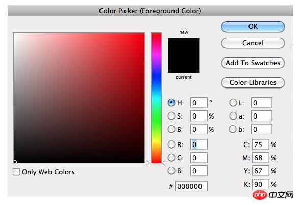
Computer monitors, TVs, and mobile phones all use the RGB color model to display colors. Basically, every color is defined by a combination of red, green, and blue. There are 256 possible values for red, green or blue. Since computers start counting at 0 (zero), the maximum value is 255.
Considering that color is the result of the combination of red, green and blue, and since each of these 3 colors has 256 possible values, 256 * 256 * 256 = 16,777,216 colors can be used .
Because the RGB model is directly related to the way colors are physically rendered, it has become a CSS color unit.
For example, you could define red as 219 red, 78 green, and 68 blue:
a{ color: rgb(219, 78, 68);}Black is not red, green, or blue:
body{ color: rgb(0, 0, 0);}in the spectrum On the other side, white is the full amount of each red, green and blue:
body{ color: rgb(255, 255, 255);}RGBA
rgba color unit is rgb, which is the alpha we added Value (ranging from 0 to 1, in decimal values) that defines what the color transparency is:
body{ color: rgba(0, 0, 0, 0.8);}A slightly transparent black.
The purpose of color transparency is to blend with the background, so it looks slightly different depending on the context. It's especially useful for background colors.
HSL and HSLA
HSL is another way to define colors. Think of it like a color wheel.
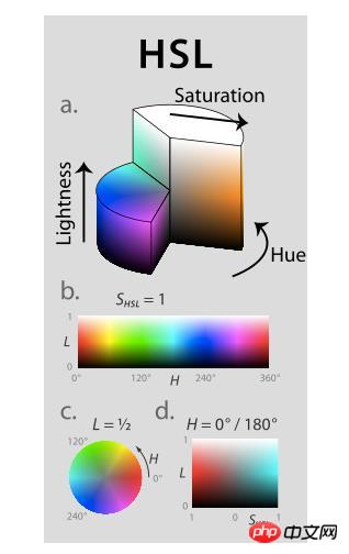
You can define it this way: Instead of combining colors as red, green and blue.
Hue values range from 0 to 360, limiting them to specific colors.
Saturation is a percentage, ranging from 0% to 100%, that defines how dark or light you want the color to be.
Brightness is a percentage, ranging from 0% to 100%, that defines how bright you want the color to be.
Similarly, you can define it this way in HSL:
a{ color: hsl(4, 68%, 56%);}4 means red 68% means red is very prominent 56% means it is between black and white
## The #hsl color unit is easier to understand than rgb because the expected result is clear. You basically define the color in 3 separate steps and can use each value to render the color you want. If you wanted a yellow shade, you could start with values like hsl(50, 68%, 56%) and change the saturation and brightness values to find the specific shade you're looking for. I think hsl is more readable for humans, while rgb is more computer readable. hsla is the same as hsl, only adding the ability to define the alpha value of transparency:body{ color: hsla(4, 68%, 56%, 0.5);}Transparent red.
Hex
Colors in CSS can also be defined with hexadecimal values, such as #db4e44. To understand what a hexadecimal value is, let’s look at how binary and decimal work:| Binary | 0 | 1 | ||||||||||||||
| 0 | 1 | 2 | 3 | 4 | 5 | 6 | 7 | 8 | 9 | |||||||
| 1 | 2 | 3 | 4 | 5 | 6 | 7 | 8 | 9 | A | B | C | D | E | F |
The above is the detailed content of css color: introduction to different definitions of color in css. For more information, please follow other related articles on the PHP Chinese website!

Hot AI Tools

Undress AI Tool
Undress images for free

Undresser.AI Undress
AI-powered app for creating realistic nude photos

AI Clothes Remover
Online AI tool for removing clothes from photos.

Clothoff.io
AI clothes remover

Video Face Swap
Swap faces in any video effortlessly with our completely free AI face swap tool!

Hot Article

Hot Tools

Notepad++7.3.1
Easy-to-use and free code editor

SublimeText3 Chinese version
Chinese version, very easy to use

Zend Studio 13.0.1
Powerful PHP integrated development environment

Dreamweaver CS6
Visual web development tools

SublimeText3 Mac version
God-level code editing software (SublimeText3)
 How to use vw and vh units in CSS
Aug 07, 2025 pm 11:44 PM
vw and vh units achieve responsive design by associating element sizes with viewport width and height; 1vw is equal to 1% of viewport width, and 1vh is equal to 1% of viewport height; commonly used in full screen area, responsive fonts and elastic spacing; 1. Use 100vh or better 100dvh in the full screen area to avoid the influence of the mobile browser address bar; 2. Responsive fonts can be limited with 5vw and combined with clamp (1.5rem, 3vw, 3rem) to limit the minimum and maximum size; 3. Elastic spacing such as width:80vw, margin:5vhauto, padding:2vh3vw, can make the layout adaptable; pay attention to mobile device compatibility, accessibility and fixed width content conflicts, and it is recommended to give priority to using dvh first;
 What is the CSS aspect-ratio property and how to use it?
Aug 04, 2025 pm 04:38 PM
Theaspect-ratioCSSpropertydefinesthewidth-to-heightratioofanelement,ensuringconsistentproportionsinresponsivedesigns.1.Itisapplieddirectlytoelementslikeimages,videos,orcontainersusingsyntaxsuchasaspect-ratio:16/9.2.Commonusecasesincludemaintainingres
 How to use the CSS :empty pseudo-class?
Aug 05, 2025 am 09:48 AM
The:emptypseudo-classselectselementswithnochildrenorcontent,includingspacesorcomments,soonlytrulyemptyelementslikematchit;1.Itcanhideemptycontainersbyusing:empty{display:none;}tocleanuplayouts;2.Itallowsaddingplaceholderstylingvia::beforeor::after,wh
 How to create a vertical line with CSS
Aug 11, 2025 pm 12:49 PM
Use a div with border to quickly create vertical lines, and define styles and heights by setting border-left and height; 2. Use ::before or ::after pseudo-elements to add vertical lines without additional HTML tags, suitable for decorative separation; 3. In Flexbox layout, by setting the width and background color of the divider class, adaptive vertical dividers between elastic containers can be achieved; 4. In CSSGrid, insert vertical lines as independent columns (such as autowidth columns) into grid layout, which is suitable for responsive design; the most appropriate method should be selected according to the specific layout needs to ensure that the structure is simple and easy to maintain.
 What are CSS pseudo-classes and how to use them?
Aug 06, 2025 pm 01:06 PM
CSS pseudo-class is a keyword used to define the special state of an element. It can dynamically apply styles based on user interaction or document location; 1.:hover is triggered when the mouse is hovered, such as button:hover changes the button color; 2.:focus takes effect when the element gets focus, improving form accessibility; 3.:nth-child() selects elements by position, supporting odd, even or formulas such as 2n 1; 4.:first-child and :last-child select the first and last child elements respectively; 5.:not() excludes elements that match the specified conditions; 6.:visited and:link set styles based on the link access status, but:visited is restricted by privacy.
 How to use the filter property in CSS
Aug 11, 2025 pm 05:29 PM
TheCSSfilterpropertyallowsvisualeffectslikeblur,brightness,andgrayscaletobeapplieddirectlytoHTMLelements.1)Usethesyntaxfilter:filter-function(value)toapplyeffects.2)Combinemultiplefilterswithspaceseparation,e.g.,blur(2px)brightness(70%).3)Commonfunct
 How to create a glassmorphism effect with CSS
Aug 22, 2025 am 07:54 AM
To create a glass mimicry effect of CSS, you need to use backdrop-filter to achieve background blur, set a translucent background such as rgba(255,255,255,0.1), add subtle borders and shadows to enhance the sense of hierarchy, and ensure that there is enough visual content behind the elements; 1. Use backdrop-filter:blur(10px) to blur the background content; 2. Use rgba or hsla to define the transparent background to control the degree of transparency; 3. Add 1pxsolidrgba(255,255,255,0.3) borders and box-shadow to enhance the three-dimensionality; 4. Ensure that the container has rich backgrounds such as pictures or textures to present a blurred penetration effect; 5. It is compatible with old browsers
 How to create a dotted border in CSS
Aug 15, 2025 am 04:56 AM
Use CSS to create dotted borders, just set the border attribute to dotted. For example, "border:3pxdotted#000" can add a 3-pixel-wide black dot border to the element. By adjusting the border-width, the size of the point can be changed. The wider borders produce larger points. You can set dotted borders for a certain side, such as "border-top:2pxdottedred". Dotted borders are suitable for block-level elements such as div and input. They are often used in focus states or editable areas to improve accessibility. Pay attention to color contrast. At the same time, different from dashed's short-line style, dotted presents a circular dot shape. This feature is widely used in all mainstream browsers.


