Today I will give you a piece of useful information: Bootstrap. I hope you will learn it patiently.
Zero. Written in front
Bootstrap is a very good front-end framework. In small front-end projects, Bootstrap needs to be used as the front end, so I studied it and found it very useful. Easy to use, recommended to novices.
[Related video recommendations: Bootstrap tutorial]
Bootstrap, from Twitter, is currently the most popular front-end framework. Bootstrap is based on HTML, CSS, and JAVASCRIPT. It is simple and flexible, making web development faster. At the same time, Bootstrap is also the most popular HTML, CSS and JS framework for developing responsive layout, mobile-first WEB projects. As a framework, like jQuery EasyUI and WeUI, it helps front-end development. In short, use Bootstrap to make front-end development simple and efficient.
Notes:
1. jQuery EasyUI: jQuery EasyUI is a jQuery-based framework that integrates various User interface plugin.
2. WeUI: WeUI is a basic style library that is consistent with WeChat’s native visual experience. It is designed by the WeChat official design team for WeChat Web development, which can make users’ usage perception more unified. Contains various elements such as button, cell, dialog, toast, article, icon, etc.
To use the Bootstrap framework, you must have basic knowledge of HTML, CSS and JavaScript. If you haven't mastered it, you can go to [Rookie Tutorial] to learn.
2.1 Environment Configuration
You have two ways to use Bootstrap, local call and network call.
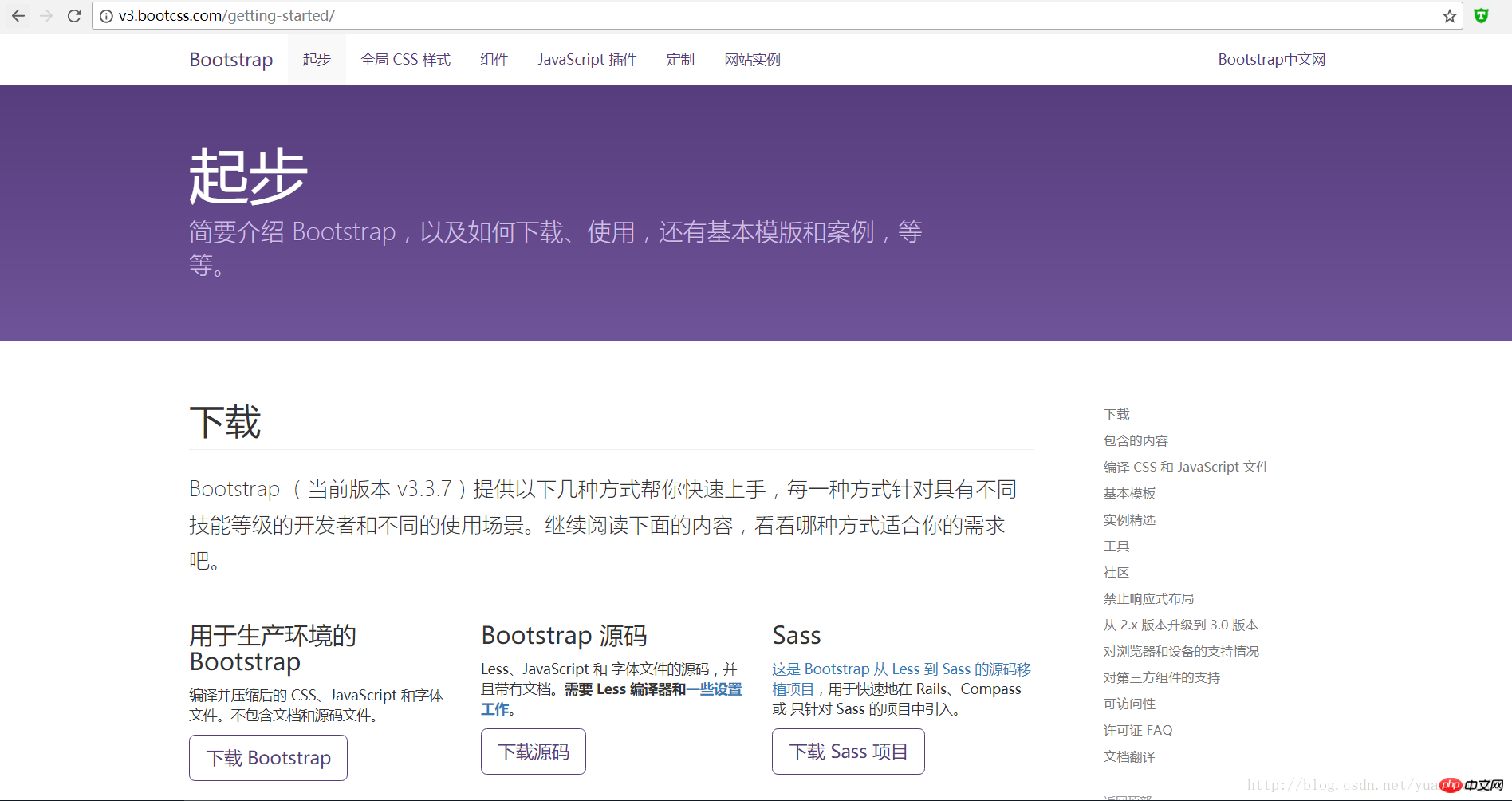
Local calls need to download [Bootstrap for production environment] from the Internet, download address: http://v3.bootcss.com/getting-started.  After the download is complete, unzip the file and obtain three folders as shown below. These three folders are used to store style files, font files, and js script files respectively.
  Only use the free CDN acceleration service provided by BootCDN for network calls. Just write the following link in your web page file.
<!-- 最新版本的 Bootstrap 核心 CSS 文件 --> <link rel="stylesheet" href="https://cdn.bootcss.com/bootstrap/3.3.7/css/bootstrap.min.css" integrity="sha384-BVYiiSIFeK1dGmJRAkycuHAHRg32OmUcww7on3RYdg4Va+PmSTsz/K68vbdEjh4u" crossorigin="anonymous">
 <!-- 可选的 Bootstrap 主题文件(一般不用引入) --> <link rel="stylesheet" href="https://cdn.bootcss.com/bootstrap/3.3.7/css/bootstrap-theme.min.css" integrity="sha384-rHyoN1iRsVXV4nD0JutlnGaslCJuC7uwjduW9SVrLvRYooPp2bWYgmgJQIXwl/Sp" crossorigin="anonymous"> <!-- 最新的 Bootstrap 核心 JavaScript 文件 --> <script src="https://cdn.bootcss.com/bootstrap/3.3.7/js/bootstrap.min.js" integrity="sha384-Tc5IQib027qvyjSMfHjOMaLkfuWVxZxUPnCJA7l2mCWNIpG9mGCD8wGNIcPD7Txa" crossorigin="anonymous"></script>
Some HTML elements and CSS properties used by Bootstrap require the page to be set to an HTML5 document type. Every page in your project should be formatted according to the following.
<!DOCTYPE html> <html lang="zh-CN"> ... </html>
Bootstrap 3 is mobile friendly. Rather than simply adding some optional styles for mobile devices, it is directly integrated into the core of the framework. That said, Bootstrap is mobile-first. Mobile-specific styles are integrated into every corner of the frame, rather than adding an extra file.
To ensure proper drawing and touch scaling, the viewport metadata tag needs to be added to .
<meta name="viewport" content="width=device-width, initial-scale=1">
On mobile device browsers, the zooming function can be disabled by setting the meta attribute of the viewport to user-scalable=no. By disabling the zoom function, users can only scroll the screen, making your website look more like a native application. Note that we do not recommend this method for all websites, it still depends on your own situation.
<meta name="viewport" content="width=device-width, initial-scale=1, maximum-scale=1, user-scalable=no">
Bootstrap provides a responsive, mobile-first fluid grid system. As the screen or viewport size increases, The system will automatically divide it into up to 12 columns. It contains easy-to-use predefined classes, as well as powerful mixins for generating more semantic layouts.
The grid system is used to create page layouts through a series of rows and columns, and your content can be placed into these created layouts. Here's an introduction to how the Bootstrap grid system works:
"Row" must be contained in .container (fixed width) or .container-fluid (100%
width) in order to give it proper alignment and padding.
Create a group of "columns" in the horizontal direction through "rows".
Your content should be placed within "column", and only "column" can be a direct child element of row.
Predefined classes like .row and .col-xs-4 can be used to quickly create grid layouts. Mixins defined in the Bootstrap source code can also be used to create semantic layouts .
Create a gutter between columns by setting the padding attribute for "column". By setting a negative value for the .row element
margin Thus, the
padding set for the .container element is offset, and the padding is indirectly offset for the "column" contained in the "row".
The negative margin is why the following example protrudes outward. Contents in grid columns line up.
Columns in the grid system represent the range they span by specifying a value from 1 to 12. For example, three equal-width columns can be created using three .col-xs-4.
If the "column" contained in a "row" is greater than 12, the elements where the extra "column" is located will be treated as a whole. Arrange in a row.
The grid class is suitable for devices with a screen width greater than or equal to the dividing point size, and the grid class is overridden for small screen devices. Therefore, any
.col-md-* grid class applied to an element applies to devices with screen widths greater than or equal to the breakpoint size, and overrides the grid class for small screen devices. Therefore, applying any
.col-lg-* on the element does not exist and also affects large screen devices.
Apply these principles to your code by studying the examples that follow.
The picture below helps to understand Bootstrap's grid system.

Related recommendations:
Chapter 2 unit 1 of Bootstrap-Bootstrap CSS_html/css_WEB-ITnose
bootstrap study notes bootstrap component_html/css_WEB-ITnose
The above is the detailed content of Web front-end framework learning—Bootstrap. For more information, please follow other related articles on the PHP Chinese website!