


This article mainly introduces in detail the method of customizing the ring LoadingView effect in Android. It has certain reference value. Interested friends can refer to it.
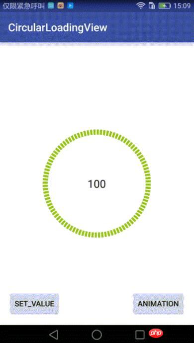
There are recent projects that need to use the ring. Progress bar, there is a similar DashedCircularProgress control on Github, but the progress it draws is spaced by setting the dotted line effect of the brush: progressPaint.setPathEffect(new DashPathEffect(new float[]{dashWith, dashSpace}, dashSpace)); If there is another layer of rings in the inner layer, there will be a slight deviation between the inner layer and the outer layer during dynamic setting. So I changed one on the original basis to achieve the effect I wanted (you can choose to add animation or not when setting the progress) Add animation):
Control implementation:
This control inherits RelativeLayout and does two things during onDraw :
1. First draw the black ring at the bottom;
2. Draw the outer green ring of corresponding proportion according to the current progress value.
Provide an interface to the outside world to call back the current Progress value:
public interface OnValueChangeListener {
  void onValueChange(float value);
} Core drawing class:
InternalCirclePainterImp2, drawing the inner black ring:
/**
 * @author Chuck
 */
public class InternalCirclePainterImp2 implements InternalCirclePainter {

  private RectF internalCircle;//画出圆弧时,圆弧的外切矩形
  private Paint internalCirclePaint;
  private int color;
  private float startAngle = 270f;
  int arcQuantity=100;//等分(圆弧加间隔),比如arcQuantity=100时,表示将有100个圆弧,和100个空白间隔
  float ratio=0.5f;//每段圆弧与圆弧加间隔之和的比例,ratio=0.5表示每个圆弧与相邻的间隔弧度比是1:1
  private int width;
  private int height;
  private int internalStrokeWidth = 48;//圆环宽度

  public InternalCirclePainterImp2(int color, int progressStrokeWidth, int arcQuantity,float ratio) {
    this.color = color;
    this.internalStrokeWidth = progressStrokeWidth;
    this.arcQuantity = arcQuantity;
    if(ratio>0&&ratio<1){
      this.ratio = ratio;
    }

    init();
  }

  private void init() {
    initExternalCirclePainter();
  }

  private void initExternalCirclePainter() {
    internalCirclePaint = new Paint();
    internalCirclePaint.setAntiAlias(true);
    internalCirclePaint.setStrokeWidth(internalStrokeWidth);
    internalCirclePaint.setColor(color);
    internalCirclePaint.setStyle(Paint.Style.STROKE);

  }

  //圆弧外切矩形
  private void initExternalCircle() {
    internalCircle = new RectF();
    float padding = internalStrokeWidth * 0.5f;
    internalCircle.set(padding, padding , width - padding, height - padding);
    initExternalCirclePainter();
  }


  @Override
  public void draw(Canvas canvas) {

    float eachAngle=360f/arcQuantity;

    float eachArcAngle=eachAngle*ratio;

    for(int i=0;iCopy after login
ProgressPainterImp2, draw the inner black ring:
/**
 * @author Chuck
 */
public class ProgressPainterImp2 implements ProgressPainter {

  private RectF progressCircle;
  private Paint progressPaint;
  private int color = Color.RED;
  private float startAngle = 270f;
  private int internalStrokeWidth = 48;
  private float min;
  private float max;
  private int width;
  private int height;

  private int currentPecent;//当前的百分比

  int arcQuantity=100;//等分(圆弧加间隔),比如arcQuantity=100时,表示将有100个圆弧,和100个空白间隔
  float ratio=0.5f;//每段圆弧与圆弧加间隔之和的比例,ratio=0.5表示每个圆弧与相邻的间隔弧度比是1:1

  public ProgressPainterImp2(int color, float min, float max, int progressStrokeWidth, int arcQuantity,float ratio) {
    this.color = color;
    this.min = min;
    this.max = max;
    this.internalStrokeWidth = progressStrokeWidth;
    this.arcQuantity = arcQuantity;
    this.ratio = ratio;
    init();
    Log.e("ProgressPainterImp","构造函数执行");
  }

  private void init() {
    initInternalCirclePainter();

  }

  private void initInternalCirclePainter() {
    progressPaint = new Paint();
    progressPaint.setAntiAlias(true);
    progressPaint.setStrokeWidth(internalStrokeWidth);
    progressPaint.setColor(color);
    progressPaint.setStyle(Paint.Style.STROKE);

  }

  //初始化外切的那个矩形
  private void initInternalCircle() {
    progressCircle = new RectF();
    float padding = internalStrokeWidth * 0.5f;
    progressCircle.set(padding, padding , width - padding, height - padding);

    initInternalCirclePainter();
  }

  @Override
  public void draw(Canvas canvas) {

    float eachAngle=360f/arcQuantity;

    float eachArcAngle=eachAngle*ratio;

    int quantity=2*arcQuantity*currentPecent/100;
    for(int i=0;iCopy after login
Can be customized Attribute:
Call:
main_activity.xml:
MainActivity:
findViewById(R.id.button).setOnClickListener(new View.OnClickListener() {
  @Override
  public void onClick(View view) {
    try {
      mDashedCircularProgress.setValue(66);//没有动画的,直接设置
    } catch (Exception e) {
      e.printStackTrace();
    }
  }
});
findViewById(R.id.button3).setOnClickListener(new View.OnClickListener() {
  @Override
  public void onClick(View view) {
    try {
      mDashedCircularProgress.setValue(0);//无动画,归零
      mDashedCircularProgress.setValueWithAnimation(100,2000);//带动画
    } catch (Exception e) {
      e.printStackTrace();
    }
  }
});Github address: https://github.com/506954774/AndroidCircularLoadingView
Above That’s the entire content of this article. I hope it will be helpful to everyone’s study. For more related content, please pay attention to the PHP Chinese website!
Related recommendations:
AJAX simple pop-up layer effect implemented by jQuery
How to download blob files using jQuery's ajax
The above is the detailed content of Android custom circular LoadingView effect. For more information, please follow other related articles on the PHP Chinese website!
 Three major frameworks for android development
 What system is android
 How to unlock android permission restrictions
 What are the methods for restarting applications in Android?
 Android voice playback function implementation method
 What software is ig
 Solution to split word table into two pages
 What to do if 302 found


![[Web front-end] Node.js quick start](https://img.php.cn/upload/course/000/000/067/662b5d34ba7c0227.png)


