This time I will show you how to output a small triangle before :after, what are the precautions for before :after to output a small triangle, the following is a practical case, let's take a look.
The triangles written before are always in the same color and have no border style. As follows:
.tri-up{width: 0;height:0;border-left:20px solid transparent;border-right: 20px solid transparent;border-bottom: 20px solid red;  }
.tri-left{width: 0;height:0;border-top:20px solid transparent;border-bottom: 20px solid transparent;border-left: 20px solid red;}
.tri-right{width: 0;height:0;border-top:20px solid transparent;border-bottom: 20px solid transparent;border-right: 20px solid red;}
.tri-down{width: 0;height:0;border-left:20px solid transparent;border-right: 20px solid transparent;border-top: 20px solid red; }:before :after

#demo {
            margin: 100px;;
            width: 100px;
            height: 100px;
            background-color: #fff;
            position: relative;
            border: 2px solid #333;
        } //方框的样式
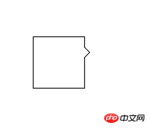
        #demo:after, #demo:before {
            border: solid transparent;
            content: ' ';
            height: 0;
            left: 100%;    //根据三角形的位置,可以随意更改。
            position: absolute;
            width: 0;
        }
        #demo:after {
            border-width: 10px;
            border-left-color: #fff;
            top: 20px;//根据三角的位置改变
        }//此处是一个白色的三角
        #demo:before {
            border-width: 12px;
            border-left-color: #000;
            top: 18px;
        }此处是一个黑色的三角
//当#demo:after和#demo:before的样式重合以后,由于top值的大小不同,就可以得到中间是白色,但是边框的三角形。如上图。<p id="demo"></p>

#demo {
            margin: 100px;;
            width: 100px;
            height: 100px;
            background-color: #fff;
            position: relative;
            border: 2px solid #333;
        }
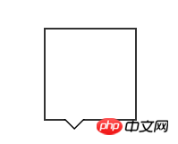
        #demo:after, #demo:before {
            border: solid transparent;
            content: ' ';
            height: 0;
            top: 100%;
            position: absolute;
            width: 0;
        }
        #demo:after {
            border-width: 10px;
            border-top-color: #fff;
            left: 20px;
        }
        #demo:before {
            border-width: 12px;
            border-top-color: #000;
            left: 18px;
}h5 implements multiple image preview uploads and clickable drag controls
Detailed explanation of the use of CSS3 mixed mode
The above is the detailed content of before :after how to output a small triangle. For more information, please follow other related articles on the PHP Chinese website!
 The difference between insertbefore and before
 How to read files and convert them into strings in java
 Why is there no sound in Tencent meetings?
 What types of css selectors are there?
 What does edge computing gateway mean?
 How to check ports in Linux
 The difference between router and cat
 The difference between ms card and sd card


