This article mainly introduces the use of picker in vue mint-ui study notes. The editor thinks it is quite good. Now I will share it with you and give you a reference. Let’s follow the editor to take a look, I hope it can help everyone.
This article introduces the use of vue mint-ui picker, share it with everyone, and leave a study note for yourself
Use of Picker
import { Picker } from 'mint-ui';
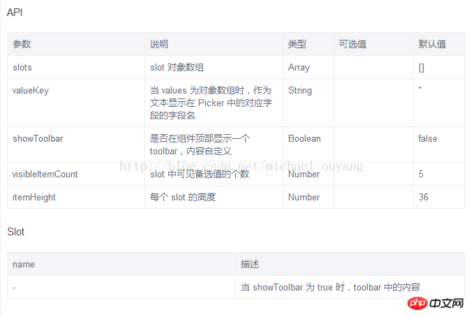
Vue.component(Picker.name, Picker);API


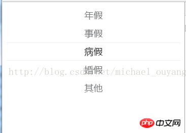
##Example 1: Simple use of picker
<template>
<p id="app">
<mt-picker :slots="slots" ></mt-picker>
<router-view></router-view>
</p>
</template>
<script>
export default {
data () {
return {
slots:[{values: ['年假', '事假', '病假', '婚假', '其他']}]
}
},
mounted:function(){
}
}
</script>
<style>
</style> show:

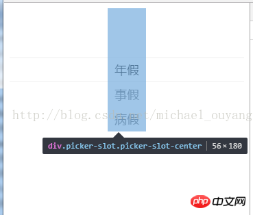
The pinker display will leave half of the white space at the top.
 When dragging, the options will move to the blank space reserved at the top

xxx.vue:
<template>
<p id="app">
<mt-picker :slots="slots" ></mt-picker>
<router-view></router-view>
</p>
</template>
<script>
export default {
data () {
return {
slots:
[
{
flex: 1,
values: ['年假', '事假', '病假', '婚假', '其他'],
className: 'slot1',
textAlign: 'left'
}, {
pider: true,
content: '-',
className: 'slot2'
}, {
flex: 1,
values: ['2015-11', '2015-02', '2015-03', '2015-04', '2015-05', '2015-06'],
className: 'slot3',
textAlign: 'right'
}
]
}
},
mounted:function(){
}
}
</script>
<style>
</style> Analysis:
1.picker can also be split into left, middle and right 3 parts - for details, you can see the attributes of the slot object above
By setting the corresponding data of the slots attribute, an array is received, and the array is divided into 3 objects
In addition to using values within the object, you can also use flex (the flex value of the flexible box, 1 is to fill the remaining space), className (use slot1, slot2, slot3), textAlign (set the horizontal position of the text, you can use left, center , right)
2. The default height of each picker is 36px

xxx.vue:
<template>
<p id="app">
<mt-picker :slots="slots" @change="onValuesChange" ></mt-picker>
<router-view></router-view>
</p>
</template>
<script>
export default {
name: 'app',
data () {
return {
slots:
[
{
flex: 1,
values: ['年假', '事假', '病假', '婚假', '其他'],
className: 'slot1',
textAlign: 'left'
}, {
pider: true,
content: '-',
className: 'slot2'
}, {
flex: 1,
values: ['2015-11', '2015-02', '2015-03', '2015-04', '2015-05', '2015-06'],
className: 'slot3',
textAlign: 'right'
}
]
}
},
mounted:function(){
},
methods: {
onValuesChange(picker, values) {
console.log(picker)
console.log(values)
}
}
}
</script>
<style>
</style>
After running, the change event will automatically Output the content twice
This is because there are two pickers that can select the content
 Analysis:
When scrolling one of the columns, the change event will be triggered


xxx.vue:
<template>
<p id="app">
<mt-picker :slots="slots" @change="onValuesChange" ></mt-picker>
<router-view></router-view>
</p>
</template>
<script>
export default {
name: 'app',
data () {
return {
value:'',
slots:
[
{
values: ['年假', '事假', '病假', '婚假', '其他', '婚假']
}
]
}
},
mounted:function(){
},
methods: {
onValuesChange(picker, values) {
this.value = values[0];
console.log(this.value)
}
}
}
</script>
<style>
</style>
When the picker is turned on, when there is no operation, a change event will be automatically executed first, and the content of the first option will be selected
 Change the selected content and output the data Data

xxx.vue:
<template>
<p id="app">
<mt-picker :slots="slots" @change="onValuesChange" :visible-item-count="1"></mt-picker>
<router-view></router-view>
</p>
</template>
<script>
export default {
name: 'app',
data () {
return {
value:'',
slots:
[
{
values: ['年假', '事假', '病假', '婚假', '其他', '婚假']
}
],
}
},
mounted:function(){
},
methods: {
onValuesChange(picker, values) {
this.value = values[0];
console.log(this.value)
}
}
}
</script>
<style>
</style>
After using:visible-item-count="1", the number of displayable pickers becomes 1
 Related recommendations:
The above is the detailed content of Introduction to the use of picker in vue mint-ui. For more information, please follow other related articles on the PHP Chinese website!
 The difference between heap and stack
 How to open iso file
 What system is qad?
 What plug-ins are needed for vscode to run HTML?
 What is the difference between php7 and php8
 CMD close port command
 What are the calling methods of java reflection
 How to solve the problem of 400 bad request when the web page displays


