This article mainly introduces the WeChat applet to achieve the combined effect of tab and swiper switching in detail. It has certain reference value. Interested friends can refer to it. I hope it will help everyone.
The example in this article shares with you the specific code for displaying the tab and swiper switching effects of the mini program for your reference. The specific content is as follows
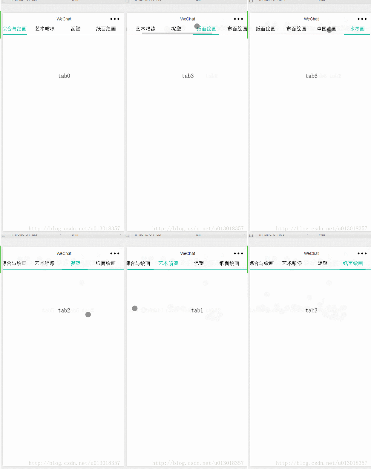
First, the renderings:

The implementation code is as follows:
wxml page
<scroll-view scroll-x="true" class="weui-navbar">
<block wx:for-items="{{tabs}}">
<view id="{{index}}" class="{{activeIndex == index ?'item_on':''}} default-item" bindtap="tabClick" style="width:{{tabW}}px">
{{item}}
</view>
</block>
<view class="weui-navbar-slider" style="transform:translateX({{slideOffset}}px);"></view>
</scroll-view>
<view class="rec" />
<swiper current="{{activeIndex}}" class="swiper-box" duration="100" bindchange="bindChange">
<swiper-item class="swiper-item">
<view class="slide-view">tab0</view>
</swiper-item>
<swiper-item class="swiper-item">
<view class="slide-view">tab1</view>
</swiper-item>
<swiper-item class="swiper-item">
<view class="slide-view">tab2</view>
</swiper-item>
<swiper-item class="swiper-item">
<view class="slide-view">tab3</view>
</swiper-item>
<swiper-item class="swiper-item">
<view class="slide-view">tab4</view>
</swiper-item>
<swiper-item class="swiper-item">
<view class="slide-view">tab5</view>
</swiper-item>
<swiper-item class="swiper-item">
<view class="slide-view">tab6</view>
</swiper-item>
</swiper>wxss style:
page {
 height: 100%;
}
view , scroll-view{
 padding: 0px;
 margin: 0px;
}
.weui-navbar{
 width: 100%;
 position: fixed;
 border-bottom: 1px solid #00bba1;
 box-sizing: border-box;
 white-space: nowrap;
 z-index: 100;
 background: white;
}
.rec{
 width: 100%;
 height: 7%;
}
.weui-navbar .default-item{
 /*width:25%;*/
 display: inline-block;
 text-align: center;
 font-size: 32rpx;
 box-sizing: border-box;
 height: 7%;
 padding-bottom: 20rpx;
}
.weui-navbar .item_on{
 color: #00bba1;
}
.weui-navbar-slider{
 position: absolute;
 width: 160rpx;
 height: 2px;
 content:"";
 background: #00bba1;
 bottom: 0px;
 left: 12.5rpx;
 transition: transform .3s;
}
.swiper-box{
 height: 900px;
 border-bottom: 1px solid #d1d1d1;
}
.swiper-box .swiper-item{
 text-align: center;
 padding-top: 200rpx;
 height: 100%;
}js code:
//index.js
//获取应用实例
var app = getApp();
var mtabW;
Page({
 data: {
 tabs:["综合与绘画","艺术喷漆","泥塑","纸面绘画","布面绘画","中国油画","水墨画"],
 activeIndex:0,
 slideOffset:0,
 tabW:0
 },
 //事件处理函数
 onLoad: function () {
  var that = this;
  wx.getSystemInfo({
   success: function (res) {
    mtabW = res.windowWidth / 4; //设置tab的宽度
    that.setData({
     tabW:mtabW
    })
   }
  });

 },
 bindViewTap: function() {
 wx.navigateTo({
  url: '../logs/logs'
 })
 },
 tabClick:function(e){
  var that = this;
  var idIndex = e.currentTarget.id;
  var offsetW = e.currentTarget.offsetLeft; //2种方法获取距离文档左边有多少距离
  this.setData({
  activeIndex:idIndex,
  slideOffset:offsetW
  });
 },
 bindChange:function(e){
  var current = e.detail.current;
  if((current+1)%4 == 0){

  }
  var offsetW = current * mtabW; //2种方法获取距离文档左边有多少距离
  this.setData({
   activeIndex:current,
   slideOffset:offsetW
  });

 }

})Related recommendations :
vue swiper implements component-based development detailed explanation
WeChat Xiaocheng swiper component implements image carousel switching function tutorial
Example of how the WeChat applet implements the non-swiper effect of the normal tab at the top
The above is the detailed content of Implementation of the combined effect of WeChat mini program tab and swiper. For more information, please follow other related articles on the PHP Chinese website!
 Mini program path acquisition
 Reasons why css loading failed
 What to do if loading dll fails
 What is the difference between a router and a cat?
 The difference between mysql and sql_server
 Minimum configuration requirements for win10 system
 What to do with the video card
 How to buy and sell Bitcoin on okex


