

The traditional layout scheme is based on the boxed model and relies on the display attribute + position attribute + float attribute. It is very inconvenient for those special layouts. For example, vertical centering is not easy to achieve.
In 2009, W3C proposed a new solution - Flex layout, which can realize various page layouts simply, completely and responsively. Currently, it is supported by all browsers, which means it is now safe to use this feature.
The elements that adopt Flex layout are called Flex containers (flex containers), referred to as "containers". All its child elements automatically become container members, called Flex items (flex items), referred to as "items".
Today I will share my insights and experience on the flexible box model. If there are any shortcomings, please leave a message to correct me.
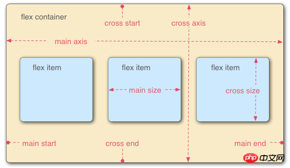
I have read some knowledge about the elastic box model on the Internet. I believe that people with knowledge in this area at Baidu have seen the picture below. They were confused when they saw it for the first time. If you understand the experiment first After that, it will be clear when you look at the picture below. Today I will separate the main axis and the cross axis. I will write some findings later, but I still need to look at the main axis and the cross axis. To put it simply, we can think of it first. The main axis is the horizontal axis, and the cross axis is the vertical axis. Let’s look directly at the code and effects. I hope you will experiment after seeing it. I believe you will have a great understanding of the knowledge of elastic boxes and be able to apply elasticity. Boxes for layout.
1. The initial code and style are as follows. Next, we add code and modify the code to see the difference in style.
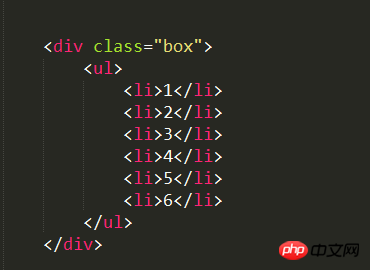
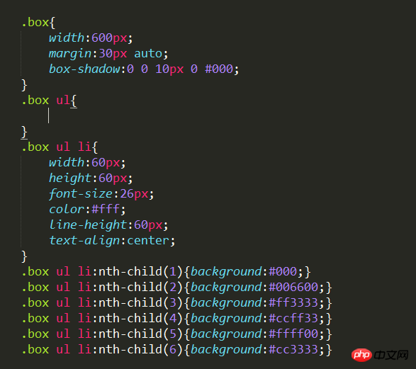
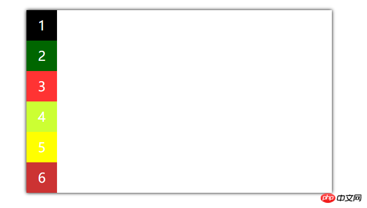
As for the flexible box, the first condition is to talk about the container and project. For us, The container is ul in the code, and the project is li. Okay, let's start adding code to see the magical style.
The first condition for a flexible box is to add display:flex;
The following properties are container properties and are added to ul.
1. flex-direction: determines the direction of the spindle.
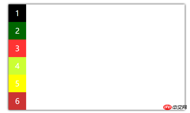
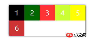
1. flex-direction:row; (Main axis direction: horizontal/row arrangement from left to right)
Add this attribute to the container ul, and you will find that the style is as follows, and it can be displayed horizontally.
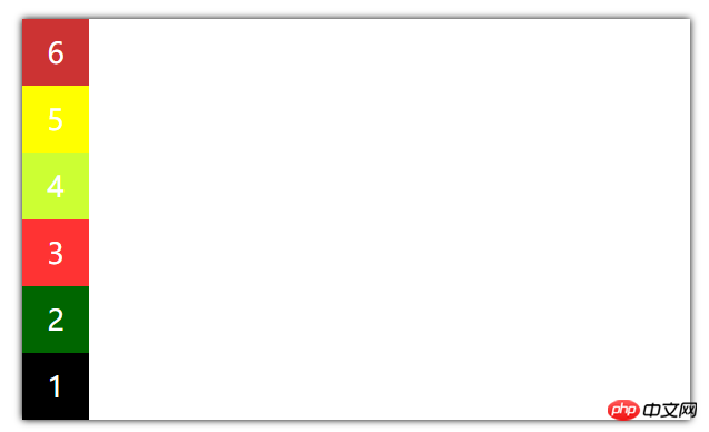
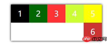
Speaking of elasticity, let’s test this effect and reduce the width of the outer container
We Reduce it to this first. If the width continues to be small, you will find that it will be different. Even after the width is reduced, it will not wrap, and its width will maintain the width of the content inside it after reducing it.
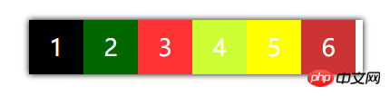
1.flex-wrap:nowrap;(default value, no line wrapping)
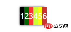
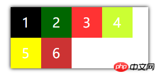
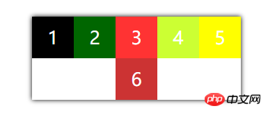
Just like what we experimented with at the beginning, even if his width is set to Then he won’t be able to wrap lines 2.flex-wrap:wrap; (Line wrap) as shown below
三、flex-flow; The composite abbreviation of flex-direction and flex-wrap, the default is row nowrap;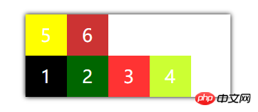
Just write a combination attribute and try other styles yourself.
4. justify-content defines the arrangement of items on the main axis
Note: In the following experiment, I added the flex-wrap:wrap; line break attribute (easy to identify)
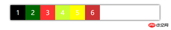
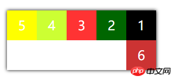
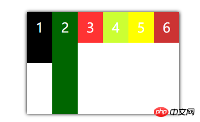
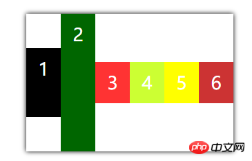
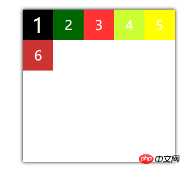
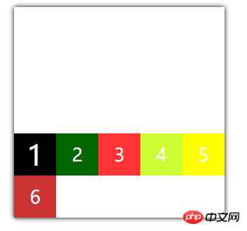
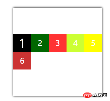
1.justify-content: flex-start; (left-justified)
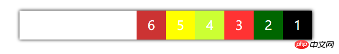
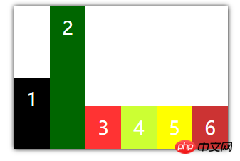
2.justify-content:flex-end;(right-aligned)
3.justify-content:center;(center alignment)
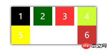
4.justify -content:space-between; (Align both ends, equal spacing between items)
Here I have made the width smaller. See the picture below. Do you think it is easy to just use this attribute? The implementation layout has been completed.
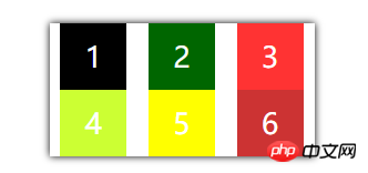
5.justify-content:space-around;(equally spaced on both sides of each item)
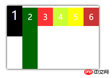
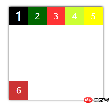
5. align-item specifies how to align the flexible box on the cross axis
This time, adjust the first and second heights to be larger, like this, the default in the picture below Value, stipulates that no line breaks are required
1.align-items:stretch; (default value)
2. align-items:flex-end; (aligned with the end point of the cross axis)
3. align-items:center;(aligned with the midpoint of the cross axis Alignment)
 4. align-items:baseline;(Baseline alignment of the first line of text of the item)
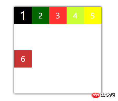
Defines the alignment of multiple axes. If the project has only one axis, it will not work.
Here I adjusted the height of a container attribute to 300px; line break display 1. align-content: stretch (default value, the axis occupies the entire cross axis) 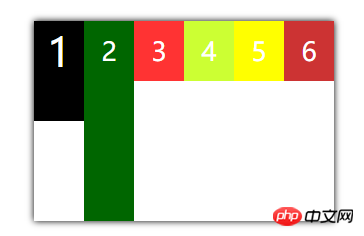
2. align-content: flex-star (aligned with the starting point of the cross axis)
The above is the detailed content of Flexible box model-understanding of container properties. For more information, please follow other related articles on the PHP Chinese website!
 c language else if statement usage
 The difference between server and cloud host
 What plug-ins are needed for vscode to run HTML?
 How to delete blank pages in word
 Usage of #include in C language
 linux view network card
 How to solve the problem of dns server not responding
 How to read files and convert them into strings in java


![[Web front-end] Node.js quick start](https://img.php.cn/upload/course/000/000/067/662b5d34ba7c0227.png)


