The following editor will bring you an article based on the Python data visualization tool Matplotlib, an introduction to drawing, and a detailed explanation of Pyplot. The editor thinks it is quite good, so I will share it with you now and give it as a reference for everyone. Let’s follow the editor and take a look.
Pyplot
matplotlib.pyplot is a collection of imperative functions, which allows us to use MATLAB like Use matplotlib as well. Each function in pyplot will make corresponding changes to the canvas image, such as creating a canvas, creating a drawing area in the canvas, drawing several lines on the drawing area, adding text descriptions to the image, etc. Below we will appreciate its charm through example code.
import matplotlib.pyplot as plt
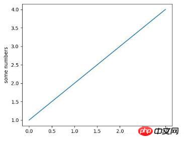
plt.plot([1,2,3,4])
plt.ylabel('some numbers')
plt.show()

The above picture is drawn by the line of code plt.plot([1,2,3,4]) Image, at this time some friends may have a question, "Why is the coordinate range of the X-axis 0-3, and the coordinate range of the Y-axis is 1-4?"
This is because , when we use the plot() command function, if we only pass a value list or array as a parameter to the function, matplotlib will treat this value list as the value of the Y-axis, and then automatically generate it based on the number N of values on the Y-axis. A list of values [0,N-1] as the X-axis value. So the Y-axis value in the above picture is the list we gave [1,2,3,4], and the X-axis value is the automatically generated list [0,1,2,3].
Some friends who see this may think that this is too weak. Don't worry, let's learn step by step. The above picture is just a very simple example. In fact, the plot() command is very powerful. Through this command, we can pass multiple image parameters at the same time. For example, if we want to give the values of the X-axis and Y-axis at the same time, we can achieve it through the following line of code:
##
plt.plot([1, 2, 3, 4], [1, 4, 9, 16]) #X:[1, 2, 3, 4],Y:[1, 4, 9, 16]
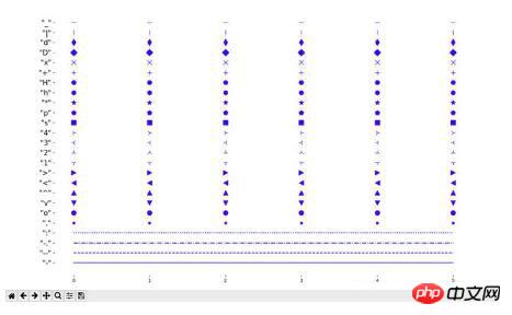
command are:
'b': blue'g': green
'r': red
'c': cyan
'm': magenta
'y': yellow
'k': black
'w': white
Command support Line characters:

import matplotlib.pyplot as plt
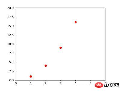
plt.plot([1,2,3,4], [1,4,9,16], 'ro')
plt.axis([0, 6, 0, 20])
plt.show()

import matplotlib.pyplot as plt
import numpy as np
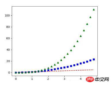
t = np.arange(0., 5., 0.2)
plt.plot(t, t, 'r--', t, t**2, 'bs', t, t**3, 'g^')
plt.show()

The above is the detailed content of Detailed explanation of Python data visualization tool Matplotlib. For more information, please follow other related articles on the PHP Chinese website!


