


css3 box-shadow shadow graphic tutorial
This article mainly introduces the css3 box-shadow shadow (outer shadow and outer glow). Through five tests, the pictures show the different effects of the shadow in different positions. Friends in need can refer to it
Basic description:
Outer shadow: box-shadow: X axis Y axis Rpx color;
Attribute description (corresponding order): Shadow X axis (negative values can be used) Y axis of the shadow (negative values can be used) Shadow blur value (size) Color of the shadow
Inner shadow: box-shadow: X axis Y axis Rpx color inset;
Default is outer shadow Inner shadow: inset can be set to inner shadow
Note (PS): This attribute is used in box models such as (p,p,h1,h2,h3,h4,h5, h6, etc.) is not used to set text shadow. If you want to set text shadow, please refer to the knowledge point: text-shadow (same reason)
Because it is a new attribute, in order to be compatible with major browsers and support the latest version of these major browsers In the lower version, when using the box-shadow attribute on mainstream browsers, we need to write the attribute name in the form -webkit-box-shadow. Firefox browser needs to be written in the form of -moz-box-shadow, and Open browser -o-box-shadow IE>9 -ms-box-shadow
Basic exercises:
In order to better understand the characteristics of box-shadow, do a few small tests: (For convenience and directness Nesting styles within tags)
Test 1:
box-shadow: 0 0 10px #f00 (Because the X-axis and Y-axis movement setting values are not moved, the radius range and color will be affected)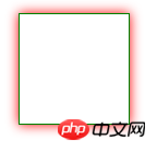
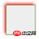
Test 2:
box-shadow:4px 4px 10px #f00; Different from test 1, the X-axis and Y-axis changed positive values (positive value to the right and down) So it becomes like this
Test 5: --Inner shadow box-shadow : 0px 0px 10px red inset; The only difference is the addition of an inset. The other attributes are the same as the outer shadow. , once you understand it, you will know the principle, and you can rewrite it at will. With the animation effect of CSS3, the flash layer (word) is very easy to implement. . Hope it helps you. .
The above is the detailed content of css3 box-shadow shadow graphic tutorial. For more information, please follow other related articles on the PHP Chinese website!

Hot AI Tools

Undresser.AI Undress
AI-powered app for creating realistic nude photos

AI Clothes Remover
Online AI tool for removing clothes from photos.

Undress AI Tool
Undress images for free

Clothoff.io
AI clothes remover

AI Hentai Generator
Generate AI Hentai for free.

Hot Article
Hot Tools

Notepad++7.3.1
Easy-to-use and free code editor

SublimeText3 Chinese version
Chinese version, very easy to use

Zend Studio 13.0.1
Powerful PHP integrated development environment

Dreamweaver CS6
Visual web development tools

SublimeText3 Mac version
God-level code editing software (SublimeText3)
Hot Topics
 1381
1381
 52
52

 How to achieve wave effect with pure CSS3? (code example)
Jun 28, 2022 pm 01:39 PM
How to achieve wave effect with pure CSS3? (code example)
Jun 28, 2022 pm 01:39 PM
How to achieve wave effect with pure CSS3? This article will introduce to you how to use SVG and CSS animation to create wave effects. I hope it will be helpful to you!
 Use CSS skillfully to realize various strange-shaped buttons (with code)
Jul 19, 2022 am 11:28 AM
Use CSS skillfully to realize various strange-shaped buttons (with code)
Jul 19, 2022 am 11:28 AM
This article will show you how to use CSS to easily realize various weird-shaped buttons that appear frequently. I hope it will be helpful to you!
 How to hide elements in css without taking up space
Jun 01, 2022 pm 07:15 PM
How to hide elements in css without taking up space
Jun 01, 2022 pm 07:15 PM
Two methods: 1. Using the display attribute, just add the "display:none;" style to the element. 2. Use the position and top attributes to set the absolute positioning of the element to hide the element. Just add the "position:absolute;top:-9999px;" style to the element.
 How to implement lace borders in css3
Sep 16, 2022 pm 07:11 PM
How to implement lace borders in css3
Sep 16, 2022 pm 07:11 PM
In CSS, you can use the border-image attribute to achieve a lace border. The border-image attribute can use images to create borders, that is, add a background image to the border. You only need to specify the background image as a lace style; the syntax "border-image: url (image path) offsets the image border width inward. Whether outset is repeated;".
 It turns out that text carousel and image carousel can also be realized using pure CSS!
Jun 10, 2022 pm 01:00 PM
It turns out that text carousel and image carousel can also be realized using pure CSS!
Jun 10, 2022 pm 01:00 PM
How to create text carousel and image carousel? The first thing everyone thinks of is whether to use js. In fact, text carousel and image carousel can also be realized using pure CSS. Let’s take a look at the implementation method. I hope it will be helpful to everyone!
 How to enlarge the image by clicking the mouse in css3
Apr 25, 2022 pm 04:52 PM
How to enlarge the image by clicking the mouse in css3
Apr 25, 2022 pm 04:52 PM
Implementation method: 1. Use the ":active" selector to select the state of the mouse click on the picture; 2. Use the transform attribute and scale() function to achieve the picture magnification effect, the syntax "img:active {transform: scale(x-axis magnification, y Axis magnification);}".
 How to set animation rotation speed in css3
Apr 28, 2022 pm 04:32 PM
How to set animation rotation speed in css3
Apr 28, 2022 pm 04:32 PM
In CSS3, you can use the "animation-timing-function" attribute to set the animation rotation speed. This attribute is used to specify how the animation will complete a cycle and set the speed curve of the animation. The syntax is "element {animation-timing-function: speed attribute value;}".
 Does css3 animation effect have deformation?
Apr 28, 2022 pm 02:20 PM
Does css3 animation effect have deformation?
Apr 28, 2022 pm 02:20 PM
The animation effect in css3 has deformation; you can use "animation: animation attribute @keyframes ..{..{transform: transformation attribute}}" to achieve deformation animation effect. The animation attribute is used to set the animation style, and the transform attribute is used to set the deformation style. .
