
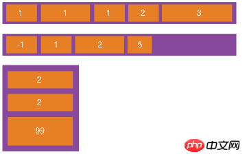
WeChat Mini ProgramPage layout adopts Flex Layout. Flex layout is a new solution proposed by W3c in 2009, which can implement various page layouts in a simple, complete and responsive manner. Flex layout provides the alignment, direction and order of elements in the container, and they can even be dynamic or indefinitely sized.
The main feature of Flex layout is the ability to adjust its child elements to be used in different screen sizes. The most suitable method to fill the appropriate space
#flex layout
layout. Let’s briefly introduce the use of Flex layout in WeChat mini program . An element whose container
display:flex<a href="//m.sbmmt.com/wiki/927.html" target="_blank"> or </a>display:block is a flex container (flexible container) , the child elements inside are called flex item (flexible items), and the child elements in flex container are laid out using Flex.
container of the WeChat applet (view, scroll-view and swiper ) are dispaly:block by default. ##display:flex
attribute to specify whether it should wrap. flex-wrap has three values: nowrap (no line wrap),wrap(line wrap),wrap-reverse(the first line of wrap is below)Code using display:block(default value):<view class="flex-row" style="display: block;">
<view class="flex-view-item">1</view>
<view class="flex-view-item">2</view>
<view class="flex-view-item">3</view>
</view>

Change to
flex
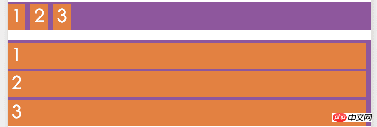
You can see  block
block
and
view
is displayed in a new line (block) or inline (flex). Main axis and cross axisFlexThe flex container of the layout can be laid out in any direction. The container has two axes by default:
and cross axis(cross axis).
The starting position of the spindle is spindle starting point(main start), the end position of the spindle isspindle end point(main end), and the length of the spindle is
Spindle length(main size). Similarly, the starting point of the cross axis is the starting point of the cross axis (cross start), the end position is the end point of the cross axis (cross end), and the length is the length of the cross axis(cross size). See the picture below for details:##Flex-direction
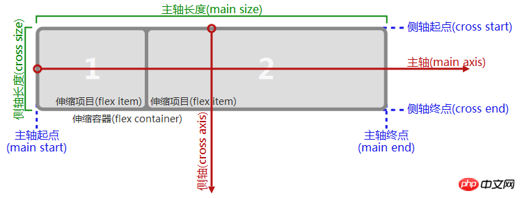 Note,
Note,
spindle
from left to right, similarly side axis
is not necessarilyfrom top to bottom
, the direction of the main axis is flex-directionAttribute control, it has 4 optional values: row: The horizontal direction from left to right is the main axis
: The horizontal direction from right to left is the main axis
: From top The vertical direction from bottom to top is the main axis
The vertical direction from bottom to top is the main axis
Example diagram
The example in the picture shows the use of different The
value is the difference in the arrangement direction. 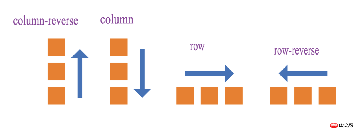 Example code:
<view >
    <view class="flex-row" style="display: flex;flex-direction: row;">
        <view class="flex-view-item">1</view>
        <view class="flex-view-item">2</view>
        <view class="flex-view-item">3</view>
    </view>
    <view class="flex-column" style="display:flex;flex-direction: column;" >
        <view class="flex-view-item">c1</view>
        <view class="flex-view-item">c2</view>
        <view class="flex-view-item">c3</view>
    </view>
</view>
flex-direction
There are two alignment methods for child elements:
just<a href="//m.sbmmt.com/wiki/109.html" target="_blank">if</a>y-conentDefine the alignment of child elements on the main axisalign-itemsDefine the alignment of child elements on the side axis
justify-contentThere are 5 optional alignment methods:
##flex-start Spindle starting point alignment (default Value)
flex-end Spindle end point alignment
center Centered in the spindle Alignment
space-between Alignment at both ends, except that the child elements at both ends are leaning towards the containers at both ends, the intervals between other child elements are equal
space-around The distance between each child element is equal, and the distance between the child elements at both ends of the container is also the same as the distance between other child elements The distance is the same. The alignment of
justify-content is related to the direction of the main axis. In the figure below, flex-direction is row, and the main axis method is from the left. Go to the right and describe the display effect of js<a href="//m.sbmmt.com/wiki/48.html" target="_blank">tify-content</a>5 values:

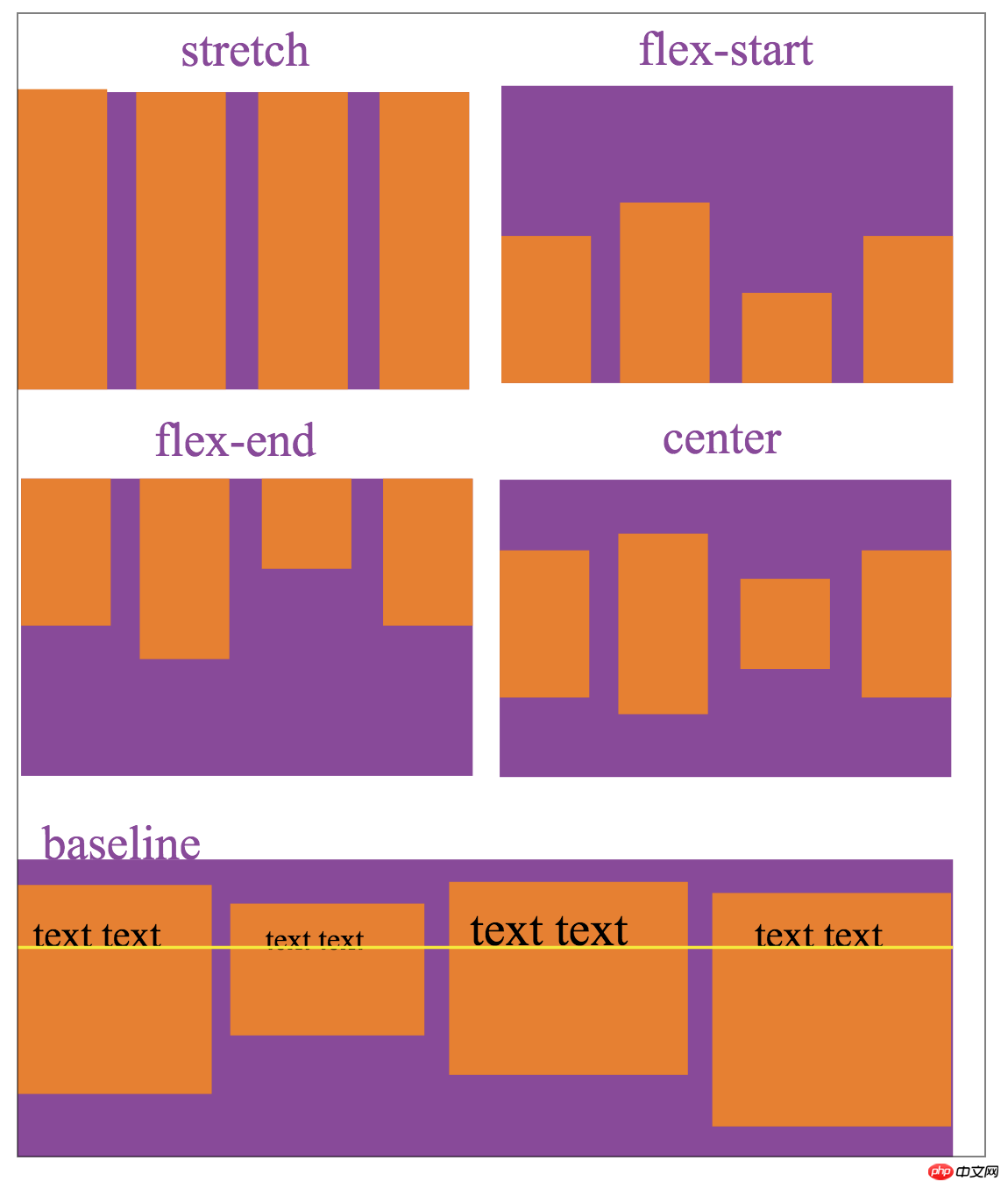
align-items represents the alignment on the cross axis:
stretch Fill the entire container (default value)
flex-start Align the starting point of the cross axis
flex-end Align the end of the cross axis
center Align the center in the cross axis
baseline Align the first line of text of the child element
align-tiems The alignment set is related to the direction of the cross-axis. The following figure is flex-direction is row, the side axis direction is from top to bottom, describing the display effect of the 5 values of align-items:
The above is the detailed content of WeChat Mini Program Flex Layout. For more information, please follow other related articles on the PHP Chinese website!


