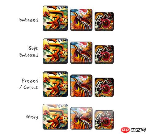
In the previous tutorial "HTML5 Practice - css3 Image Style", I introduced how to add background-image packaging to the image, using box-shadow and border-radius to create the image Set up a variety of styles, interested friends can read back. But recently I encountered a problem when designing the PhotoTouch theme. The background-image size cannot be adjusted, which is not ideal for responsive design. Today we will try to solve the problem.
Most browsers do not render the border-radius and embedded box-shadow effects of images perfectly. This means that you cannot create effects such as embossing, highlights, and compression for images.

to the packaging of the image. Attribute , solves the above problem.
 ##
##
New solution
jquery will query all the pictures under #demo and then make them dynamic Add span packaging. <script type="text/javascript" src="http://ajax.googleapis.com/ajax/libs/jquery/1.5/jquery.min.js"></script>
<script type="text/javascript">$(document).ready(function(){
$('#demo img').each(function() {
var imgClass = $(this).attr('class');
$(this).wrap('<span class="image-wrap ' + imgClass + '" style="width: auto; height: auto;"/>');
$(this).removeAttr('class');
});
});</script>
<span class="image-wrap " style="width: auto; height: auto;">
<img src="image.jpg"></span>css skills
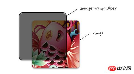
The css technique is very simple. The mask effect is used on .image-wrap:after, and border-radius is used on both the image and .image-wrap:after to achieve the style effect.
##  css
css
.image-wrap {
    position: relative;
    display: inline-block;
    max-width: 100%;
    vertical-align: bottom;
}.image-wrap:after {
    content: ' ';
    width: 100%;
    height: 100%;
    position: absolute;
    top: -1px;
    left: -1px;
    border: solid 1px #1b1b1b;

    -wekbit-box-shadow: inset 0 0 1px rgba(255,255,255,.4), inset 0 1px 0 rgba(255,255,255,.4), 0 1px 2px rgba(0,0,0,.3);
    -moz-box-shadow: inset 0 0 1px rgba(255,255,255,.4), inset 0 1px 0 rgba(255,255,255,.4), 0 1px 2px rgba(0,0,0,.3);
    box-shadow: inset 0 0 1px rgba(255,255,255,.4), inset 0 1px 0 rgba(255,255,255,.4), 0 1px 2px rgba(0,0,0,.3);

    -webkit-border-radius: 7px;
    -moz-border-radius: 7px;
    border-radius: 7px;
}.image-wrap img {
    vertical-align: bottom;

    -webkit-box-shadow: 0 1px 2px rgba(0,0,0,.4);
    -moz-box-shadow: 0 1px 2px rgba(0,0,0,.4);
    box-shadow: 0 1px 2px rgba(0,0,0,.4);

    -webkit-border-radius: 6px;
    -moz-border-radius: 6px;
    border-radius: 6px;
} 
The above is the detailed content of HTML5 practice-detailed explanation of how to use css3 to enrich image styles (2). For more information, please follow other related articles on the PHP Chinese website!
 css3 tutorial
 What are the production methods of html5 animation production?
 What are the css3 gradient properties?
 The difference between HTML and HTML5
 ppt insert page number
 Introduction to the meaning of cloud download windows
 Win10 does not support the disk layout solution of Uefi firmware
 How to use require


