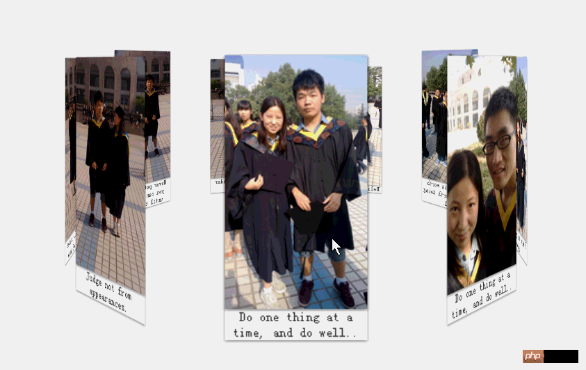
The purpose of this blog is because in the classic case of the previous HTML5/CSS3 special topic CSS3 to create the 3D flip effect of Baidu Tieba, there is a more important knowledge point about the CSS 3D effect that was not mentioned, which is perspective and tranlateY
Rendering: Hehe, I made some photos of my graduation from college into a merry-go-round, spinning around my liberal arts major, not forgetting the nurturing grace of my alma mater~

1. perspective
The perspective attribute includes two attributes: none and the length value with unit.
The default value of the perspective attribute is none, which means that the 3D object looks flat from infinite angles. Another value,
2. transform: translateZ(length)
Assume that when perspective is set to 300px, the smaller the value of translateZ is set, the smaller the size of the sub-element will be. When the setting value is close to 300px, it will appear as if This element is in front of you. When it exceeds 300px, it reaches the back of your field of view and the element becomes invisible.
The core of the above example:
1. First, all the image containers have position:absolute, superimpose them together, and then set rotateY to 40*i respectively, i= 0, 1, 2 ...9; All pictures will intersect into a flower-like shape
2. Then set translateZ for the container of each picture. All pictures will move outward from the corresponding angle and expand into a large circle, that is The effect of the above picture.
html:
<!DOCTYPE html>
<html>
<head>
    <title></title>
    <meta charset="utf-8"/>
    <link href="css/reset.css" rel="stylesheet" type="text/css"/>
    <script type="text/javascript" src="../../jquery-1.8.3.js"></script>

    <script type="text/javascript">
        // alert( 64 / Math.tan(20 / 180 * Math.PI));
        var transform = function (element, value, key)
        {
            key = key || "Transform";
            ["Moz", "O", "Ms", "Webkit", ""].forEach(function (prefix)
            {
                element.style[prefix + key] = value;
            });

            return element;
        }


        $(function ()
        {
            var deg = -40 , i = 1;
            $("#container").click(function ()
            {
                transform($(this)[0], "rotateY(" + (deg * i++) + "deg)")
            });
        });

    </script>


</head>
<body>
<p id="stage">
    <ul id="container">
        <li>
            <img src="img/1.jpg"/>
            <span>Do one thing at a time, and do well..</span>
        </li>
        <li>
            <img src="img/2.jpg"/> <span>Do one thing at a time, and do well..</span>
        </li>
        <li>
            <img src="img/3.jpg"/> <span>Keep on going never give up.</span>
        </li>
        <li>
            <img src="img/4.jpg"/> <span>Whatever is worth doing is worth doing well.</span>
        </li>
        <li>
            <img src="img/5.jpg"/> <span>Believe in yourself.</span>
        </li>
        <li>
            <img src="img/6.jpg"/> <span>Action speak louder than words.</span>
        </li>
        <li>
            <img src="img/7.jpg"/> <span>Never put off what you can do today until tomorrow.</span>
        </li>
        <li>
            <img src="img/8.jpg"/> <span>Jack of all trades and master of none.</span>
        </li>
        <li>
            <img src="img/9.jpg"/> <span>Judge not from appearances.</span>
        </li>
    </ul>
</p>
</body>
</html>CSS:
        li
        {
            width: 128px;
            box-shadow: 0 1px 3px rgba(0, 0, 0, .5);
            position: absolute;
            bottom: 0;
        }

        li img
        {
            width: 128px;
            box-shadow: 0 1px 3px rgba(0, 0, 0, .5);
            vertical-align: middle;
        }

        li span
        {
            display: block;
            width: 128px;
            text-align: center;
            color: #333;
            font-size: 8px;
        }

        #stage
        {

            width: 900px;
            min-height: 100px;
            margin-left: auto;
            margin-right: auto;
            padding: 100px 50px;
            -webkit-perspective: 1200px;
            position: relative;
        }

        #container
        {
            background: url("img/xawl.jpg") no-repeat 0 0;
            margin-top: 200px;
            width: 128px;
            box-shadow: 0 1px 3px rgba(0, 0, 0, .5);
            height: 100px;
            margin-left: -64px;
            -webkit-transition: -webkit-transform 1s;
            transition: transform 1s;
            -webkit-transform-style: preserve-3d;
            position: absolute;
            left: 50%;
        }

        li:nth-child(0)
        {
            -webkit-transform: rotateY(0deg) translateZ(300px);
        }

        li:nth-child(1)
        {
            -webkit-transform: rotateY(40deg) translateZ(300px);
        }

        li:nth-child(2)
        {
            -webkit-transform: rotateY(80deg) translateZ(300px);
        }

        li:nth-child(3)
        {
            -webkit-transform: rotateY(120deg) translateZ(300px);
        }

        li:nth-child(4)
        {
            -webkit-transform: rotateY(160deg) translateZ(300px);
        }

        li:nth-child(5)
        {
            -webkit-transform: rotateY(200deg) translateZ(300px);
        }

        li:nth-child(6)
        {
            -webkit-transform: rotateY(240deg) translateZ(300px);
        }

        li:nth-child(7)
        {
            -webkit-transform: rotateY(280deg) translateZ(300px);
        }

        li:nth-child(8)
        {
            -webkit-transform: rotateY(320deg) translateZ(300px);
        }

        li:nth-child(9)
        {
            -webkit-transform: rotateY(360deg) translateZ(300px);
}p#stage is used as the stage, set perspective, set rotateY and translateZ for each li respectively; then we will set p#container -webkit-transform-style: preserve-3d;
transform-style: flat | preserve-3d
The flat value is the default value, which means that all child elements are rendered on a 2D plane. preserve-3d means that all child elements are rendered in 3D space. If the transform-style value is set to preserve-3d for an element, it means that
does not perform a flattening operation and all its child elements are located in 3D space. Under normal circumstances, this attribute is used for the execution element of 3D animation effects, that is, it is to apply 3D animation effects, so its child elements should all be in 3D space.
One thing to note: In this example, the actual animation effect lies in the mouse click, p#container is changing rotateY inappropriately, and all picture elements are in p#container and have been displayed. For the carousel effect, what you need to do now is to rotate the carousel, so you only need to change the rotateY 40 angle of p#container each time.
The above is the detailed content of HTML5/CSS3 Special Topic 3D Carousel Effect Album Sample Code. For more information, please follow other related articles on the PHP Chinese website!


