The purpose of this blog is because there is a more important knowledge point about CSS 3D effects that was not mentioned in the attractive example of CSS3 in the previous HTML5 CSS3 topic to create a 3D flop effect in Baidu Tieba, which is perspective and tranlateY
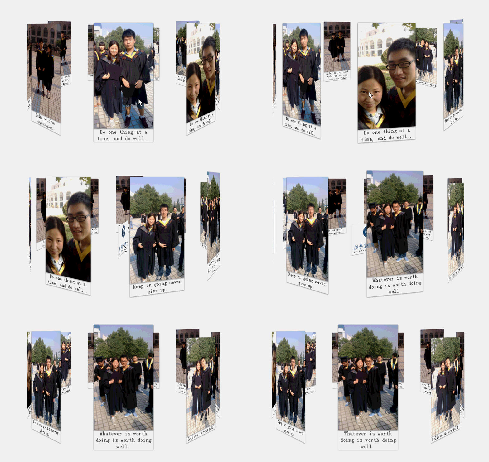
Rendering: Hehe, I made some photos of my graduation from college into a merry-go-round, spinning around my liberal arts major, not forgetting the nurturing grace of my alma mater~
1. perspective
The perspective attribute includes two attributes: none and the length value with unit.
The default value of the perspective attribute is none, which means that the 3D object looks flat from infinite angles. Another value,
2. transform: translateZ(length)
Assuming that perspective: 300px is set, the smaller the value of translateZ is set, the smaller the size of the sub-element will be. When the value is set When it is close to 300px, it seems that the element is in front of you. When it exceeds 300px, it reaches the back of your field of view and the element is invisible.
The core of the above example:
1. First, all the image containers have position:absolute, superimpose them together, and then set rotateY to 40*i and i respectively. = 0, 1, 2...9; all pictures will intersect into a flower-like shape
2. Then set translateZ for the container of each picture, and all pictures will move outward from the corresponding angle. Expand it into a big circle, which is the effect in the picture above.
html:
<!DOCTYPE html>
<html>
<head>
    <title></title>
    <meta charset="utf-8"/>
    <link href="css/reset.css" rel="stylesheet" type="text/css"/>
    <script type="text/javascript" src="../../jquery-1.8.3.js"></script>

    <script type="text/javascript">
        // alert( 64 / Math.tan(20 / 180 * Math.PI));
        var transform = function (element, value, key)
        {
            key = key || "Transform";
            ["Moz", "O", "Ms", "Webkit", ""].forEach(function (prefix)
            {
                element.style[prefix + key] = value;
            });

            return element;
        }


        $(function ()
        {
            var deg = -40 , i = 1;
            $("#container").click(function ()
            {
                transform($(this)[0], "rotateY(" + (deg * i++) + "deg)")
            });
        });

    </script>


</head>
<body>
<p id="stage">
    <ul id="container">
        <li>
            <img src="img/1.jpg"/>
            <span>Do one thing at a time, and do well..</span>
        </li>
        <li>
            <img src="img/2.jpg"/> <span>Do one thing at a time, and do well..</span>
        </li>
        <li>
            <img src="img/3.jpg"/> <span>Keep on going never give up.</span>
        </li>
        <li>
            <img src="img/4.jpg"/> <span>Whatever is worth doing is worth doing well.</span>
        </li>
        <li>
            <img src="img/5.jpg"/> <span>Believe in yourself.</span>
        </li>
        <li>
            <img src="img/6.jpg"/> <span>Action speak louder than words.</span>
        </li>
        <li>
            <img src="img/7.jpg"/> <span>Never put off what you can do today until tomorrow.</span>
        </li>
        <li>
            <img src="img/8.jpg"/> <span>Jack of all trades and master of none.</span>
        </li>
        <li>
            <img src="img/9.jpg"/> <span>Judge not from appearances.</span>
        </li>
    </ul>
</p>
</body>
</html>
CSS:
li
{
    width: 128px;
    box-shadow: 0 1px 3px rgba(0, 0, 0, .5);
    position: absolute;
    bottom: 0;
}

li img
{
    width: 128px;
    box-shadow: 0 1px 3px rgba(0, 0, 0, .5);
    vertical-align: middle;
}

li span
{
    display: block;
    width: 128px;
    text-align: center;
    color: #333;
    font-size: 8px;
}

#stage
{

    width: 900px;
    min-height: 100px;
    margin-left: auto;
    margin-right: auto;
    padding: 100px 50px;
    -webkit-perspective: 1200px;
    position: relative;
}

#container
{
    background: url("img/xawl.jpg") no-repeat 0 0;
    margin-top: 200px;
    width: 128px;
    box-shadow: 0 1px 3px rgba(0, 0, 0, .5);
    height: 100px;
    margin-left: -64px;
    -webkit-transition: -webkit-transform 1s;
    transition: transform 1s;
    -webkit-transform-style: preserve-3d;
    position: absolute;
    left: 50%;
}

li:nth-child(0)
{
    -webkit-transform: rotateY(0deg) translateZ(300px);
}

li:nth-child(1)
{
    -webkit-transform: rotateY(40deg) translateZ(300px);
}

li:nth-child(2)
{
    -webkit-transform: rotateY(80deg) translateZ(300px);
}

li:nth-child(3)
{
    -webkit-transform: rotateY(120deg) translateZ(300px);
}

li:nth-child(4)
{
    -webkit-transform: rotateY(160deg) translateZ(300px);
}

li:nth-child(5)
{
    -webkit-transform: rotateY(200deg) translateZ(300px);
}

li:nth-child(6)
{
    -webkit-transform: rotateY(240deg) translateZ(300px);
}

li:nth-child(7)
{
    -webkit-transform: rotateY(280deg) translateZ(300px);
}

li:nth-child(8)
{
    -webkit-transform: rotateY(320deg) translateZ(300px);
}

li:nth-child(9)
{
    -webkit-transform: rotateY(360deg) translateZ(300px);
}
p# stage is used as the stage, set perspective, and set rotateY and translateZ for each li respectively; then we set p#container -webkit-transform-style: preserve-3d; transform-style: flat | preserve-3d where the flat value is the default Value, indicating that all child elements are rendered on a 2D plane. preserve-3d means that all child elements are rendered in 3D space. If the transform-style value is set to preserve-3d for an element, it means that the flattening operation is not performed and all its child elements are located in 3D space. Under normal circumstances, this attribute is used for the execution element of 3D animation effects, that is, it is to apply 3D animation effects, so its child elements should all be in 3D space.
One thing to note: In this example, the actual animation effect is due to mouse click, p#Container is changing rotateY inappropriately, all picture elements are in p#container, and have been displayed as a carousel Effect, what you need to do now is to rotate the Trojan, so you only need to change the rotateY 40 angle of p#container each time.
The above is the content of HTML5 css3: 3D Carousel Effect Album. For more related content, please pay attention to the PHP Chinese website (m.sbmmt.com)!
 css3 tutorial
 What are the production methods of html5 animation production?
 What are the css3 gradient properties?
 The difference between HTML and HTML5
 Why webstorm cannot run the file
 Where is the login entrance for gmail email?
 How to solve problems when parsing packages
 How to start mysql service


