The WeChat applet page layout adopts Flex layout. Flex layout is a new solution proposed by W3c in 2009, which can realize various page layouts simply, completely and responsively. Flex layout provides the alignment, direction, and order of elements within a container, and they can even be dynamic or indefinitely sized. The main feature of Flex layout is the ability to adjust its child elements to fill the appropriate space in the most suitable way on different screen sizes.
The WeChat applet page layout adopts Flex layout.
Flex layout is a new solution proposed by W3c in 2009, which can realize various page layouts simply, completely and responsively.
Flex layout provides the alignment, direction, and order of elements in the container, and they can even be dynamic or indefinitely sized.
The main feature of Flex layout is the ability to adjust its child elements to fill the appropriate space in the most suitable way on different screen sizes.
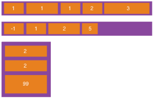
Features of Flex layout:
Telescopic in any direction, left, right, down, up
The order can be exchanged and rearranged in the style layer
The main axis and side axis are convenient to configure
Child elements The space is stretched and filled
Aligned along the container
The WeChat applet implements Flex layout. Let’s briefly introduce the Flex layout in the WeChat applet. Use in the program.
Flexible container
An element with display:flex or display:block is a flex container (flexible container), and the sub-elements inside are called flex items (flexible project), the sub-elements in the flex container are all typed using Flex layout.
display:block is designated as the block container mode, and always starts displaying with a new line. The view containers (view, scroll-view and swiper) of the WeChat applet are all display by default: block.
display:flex: Specify the in-line container mode to display the child elements in one line. You can use the flex-wrap attribute to specify whether it wraps in another line. flex-wrap has three values: nowrap( No line break), wrap (line break), wrap-reverse (the first line of line break is below)
Code using display:block (default value):
<view> <view>1</view> <view>2</view> <view>3</view> </view>
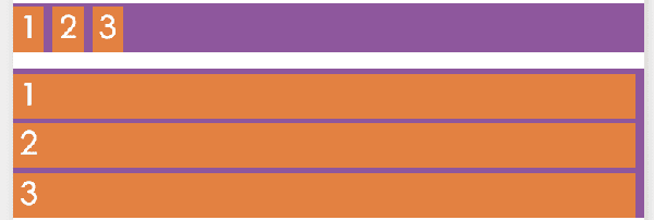
Display effect:

#Change to display:flex display effect:

You can see the block from the renderings The difference with flex is whether the child element view is displayed in a new line (block) or inline (flex).
Main axis and cross axis
Flex layout's scalable container can be laid out in any direction.
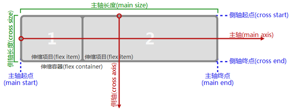
The container has two axes by default: main axis and cross axis.
The starting position of the main axis is the main start point (main start), the end position of the main axis is the main end point (main end), and the length of the main axis is the main axis length (main size).
Similarly, the starting point of the cross axis is the cross start (cross start), the end position is the cross end (cross end), and the length is the cross size. See the picture below for details:
# Note that the main axis does not necessarily run from left to right. Similarly, the side axis does not necessarily run from top to bottom. Use the direction of the main axis. flex-direction attribute control, which has 4 optional values:
row: the horizontal direction from left to right is the main axis
row -reverse: The horizontal direction from right to left is the main axis
column: The vertical direction from top to bottom is the main axis
column-reverse The vertical direction from bottom to top is the main axis
#If the horizontal direction is the main axis, that vertical direction is the side axis, and vice versa.
Renderings of four spindle direction settings:

The examples in the picture show the use of different flex-direction values The difference in arrangement direction.
Example code:
<view> <view> <view>1</view> <view>2</view> <view>3</view> </view> <view> <view>c1</view> <view>c2</view> <view>c3</view> </view> </view>
Running effect:
##Alignment
There are two alignment methods for child elements:
justify-conent defines the alignment of child elements on the main axis
align-items Define how child elements are aligned on the cross axis
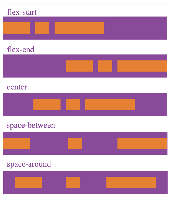
jstify-content has 5 optional alignment methods:
flex-start main axis Start point alignment (default)
flex-end Main axis end point alignment
center Center alignment in the main axis
space-between aligns both ends, except that the child elements at both ends are leaning towards the containers at both ends, the intervals between other child elements are equal
space-around The distance between each child element is equal, and the distance between the child elements at both ends of the container is the same as the distance between other child elements.
The alignment of justify-content is related to the direction of the main axis. The following figure uses flex-direction as row and the main axis is from left to right to describe the display effect of the five values of jstify-content. :
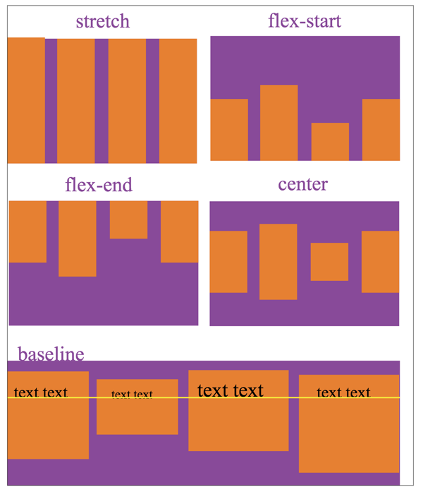
align-items indicates the alignment on the cross axis:
stretch fills the entire container (default value)
flex-start Alignment of the starting point of the cross axis
flex-end Alignment of the end point of the cross axis
