Matplotlib is a Python toolbox for data visualization in scientific computing. With it, Python can draw a variety of data graphics such as Matlab and Octave. The following article mainly introduces the tutorial on how to draw a line chart using matplotlib in python. Friends in need can refer to it.
Introduction to matplotlib
matplotlib is the most famous drawing library in Python. It provides a set of command APIs similar to matlab, which is very suitable for interaction. Cartographically. And it can also be easily used as a drawing control and embedded in GUI applications.
Its documentation is quite complete, and there are hundreds of thumbnails in the Gallery page, and there are source programs after opening them. So if you need to draw a certain type of diagram, just browse/copy/paste on this page and you'll basically be done.
The more famous data graph tool under Linux is gnuplot. This is free. Python has a package that can call gnuplot, but the syntax is not familiar and the drawing quality is not high.
Matplotlib is relatively strong: Matlab’s syntax, python language, and latex’s drawing quality (you can also use mathematical formulas drawn by the built-in latex engine).
How to install the drawing library Matplotlib: Click here
matplotlib draws a line chart
1. line chart
import numpy as np
import matplotlib.pyplot as plt

x = np.linspace(0, 2 * np.pi, 100)
y1, y2 = np.sin(x), np.cos(x)

plt.plot(x, y1)
plt.plot(x, y2)

plt.title('line chart')
plt.xlabel('x')
plt.ylabel('y')

plt.show()

##2. Legend
Specify label when plotting, and then call the legend method to draw the legend. For example:import numpy as np import matplotlib.pyplot as plt x = np.linspace(0, 2 * np.pi, 100) y1, y2 = np.sin(x), np.cos(x) plt.plot(x, y1, label='y = sin(x)') plt.plot(x, y2, label='y = cos(x)') plt.legend() plt.show()

3. Line style
(1) ColorThe keyword parameter color (or c) of the plot method is used to set the color of the line. Possible values are: 1, color name or abbreviation
Set the keyword parameter linewidth (or lw) of the plot method to change the thickness of the line, and its value is a floating point number.
import numpy as np
import matplotlib.pyplot as plt

x = np.linspace(0, 2 * np.pi, 100)
y1, y2 = np.sin(x), np.cos(x)

plt.plot(x, y1, c='r', ls='--', lw=3)
plt.plot(x, y2, c='#526922', ls='-.')
plt.show()

##4. marker
The following keyword parameters Can be used to set the marker style:
marker##markerfacecolor or mfc
markerfacecoloralt or mfcalt
markersize or ms
The possible values of marker are:
'.': point marker
',': pixel marker
'o': circle marker
'v': triangle_down marker
'>': triangle_right marker
'1': tri_down marker
'2': tri_up marker
'3': tri_left marker
'4': tri_right marker
's': square marker
'p': pentagon marker
'*': star marker
'h': hexagon1 marker
'H': hexagon2 marker
'+': plus marker
'x': x marker
'D': diamond marker
'd': thin_diamond marker
'|': vline marker
'_': hline marker
例如:
import numpy as np
import matplotlib.pyplot as plt

x = np.linspace(0, 2 * np.pi, 10)
y1, y2 = np.sin(x), np.cos(x)

plt.plot(x, y1, marker='o', mec='r', mfc='w')
plt.plot(x, y2, marker='*', ms=10)
plt.show()

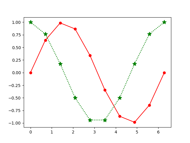
另外,marker关键字参数可以和color以及linestyle这两个关键字参数合并为一个字符串。例如:
import numpy as np
import matplotlib.pyplot as plt

x = np.linspace(0, 2 * np.pi, 10)
y1, y2 = np.sin(x), np.cos(x)

plt.plot(x, y1, 'ro-')
plt.plot(x, y2, 'g*:', ms=10)
plt.show()

更多python tutorial on using matplotlib to draw a line chart相关文章请关注PHP中文网!


