From 2012 to 2014, everyone mentioned responsive design in their web design trend predictions; in 2015, responsiveness continues in their web design trend predictions. This responsive style, which has been popular for several years, has quickly consolidated its position in the past few years and set off a wave of new standards for web design. Here I will talk about some current status and trends of responsive design based on some documents and my own opinions.
Origin
In May 2010, Ethan Marcotte wrote a groundbreaking article (titled "Responsive Web Design") in "A List Apart". He used three existing Tools like fluid grids, media queries, and scalable images create a website that looks beautiful on screens of varying resolutions. Ethan Marcotte urges designers to take advantage of the unique features of the Web: "We can treat the many experiences on different Internet-connected devices as different aspects of the same website experience, rather than designing for each device. Separate tailoring to disconnect designs is the way forward. Although we have been able to design the best visual experience, we also need to embed standards-based technology into our designs so that we can make it happen. Our designs are not only flexible, but also adaptable to the various mediums in which they are rendered." Ethan Marcotte demonstrates that there is a way to deliver a great experience across multiple devices, and one that doesn't ignore the differences between devices. , will not emphasize the designer's control, but choose to let nature take its course and embrace the flexibility of the Web.
Here is a brief introduction to the three concepts mentioned above: fluid grids, media queries and scalable images originally refer to some existing technical means, but in response In the process of formula design research, these concepts still have broader meanings, and designers should also understand them:
Flow layout: originally refers to the implementation of layout technology with percentages as the unit of measurement. Various concepts such as fluid layout, elastic layout, fluid grid, etc. will not be explained one by one here. The author summarizes this into one big concept: in the layout of responsive design, pixels (px) are no longer used as the only unit, but percentages or mixed percentages and pixels are used as units to design a more flexible layout.
Media query: Media query allows you to decide what style to apply based on various attribute values queried in a specific environment - such as device type, resolution, screen physical size and color, etc. By using media query, you can obtain the device and its characteristics, and provide solutions to seek common ground while reserving differences, thereby solving the problems left in the previous simple layout design.
Flexible pictures: With the flexibility of layout, pictures, as one of the important forms of information, must also have a more flexible way to adapt to layout changes. Personally, I think elastic pictures are a concept proposed by Ethan Marcotte when he proposed designing products. In subsequent research, we can use pictures as a model to expand the scope of research: in addition to pictures, we should also include research on the response methods of information content such as icons, charts, and videos.
Popular
The concept of responsive design has been spreading since it was proposed and has been recognized by all parties. The main reasons are:
External environment: The rapid growth and increasing diversification of Internet-connected devices have made today's There are also standard screen sizes;
Own features: Strictly defined responsiveness generally refers to responsive Web design, and the Web, with its unique flexibility and plasticity, can adapt to devices of various sizes and configurations and can be used everywhere .
Internal demand: As soon as the concept of responsive design was proposed, major websites and platforms hope to adopt this one-for-all model so that they can adapt to more devices more flexibly, especially in this era of overwhelming mobile devices.

Of course, not all situations should adopt responsive design. So under what circumstances is responsive design more suitable?
You want to adapt to more scenarios cost-effectively:> Resources are limited, but you always hope to use limited resources to obtain greater value. Although the manpower and time resources required to build a responsive site will increase compared to developing and designing an ordinary website, the cost is still much lower than building multiple versions for different devices; From a maintenance perspective, it will also be much easier.
You don’t know which scenario the new product you want to design and develop is more suitable for:> Instead of selecting core devices through prediction and then designing them separately, it is better to spend some time making the website more flexible so that it can be used on various devices All have the best possible experience. Because when all aspects are unknown, making predictions will increase process risks and make the results extremely challenging.
You want the website to be compatible with new devices in the future:> New devices are emerging in an endless stream. Instead of passively updating and maintaining them, it is better to proactively respond to changes and become responsive. Of course, this is just to say that it is more suitable. In fact, I personally think that as long as project resources and time allow, basically most websites can try to implement responsive design; and for those who are trying responsive design for the first time, they can also start with a "simple browsing page".
Mode
There are currently two main design modes that are chosen to be responsive in most websites:
Based on device: determine the layout break point (break point) through the type and size of mainstream devices, design multiple sets of styles, and then separate them Cast to the responding device.

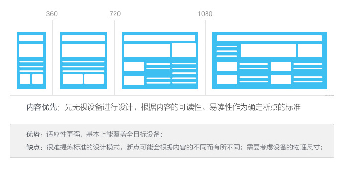
Content first: The readability and legibility of the content are used as the criteria for determining break points, that is, when laying out the content, the device can be ignored, and the content determines when it is needed. Different

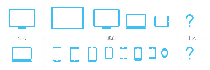
I still prefer the content-first approach. This is a model that truly conforms to the core strategy of responsive design and is also future-friendly. In the past, it was basically based on several PC sizes, choosing the best standard size to design the page; now mobile devices have become dazzling, and TVs and wearable devices have also slowly begun to use them, and there is no longer a fixed size; In the future, there will be an even more unpredictable equipment environment; so what is the right approach? ——It’s the content itself! Changes always come fast and hard, all we have to do is to grasp the thread that can connect the whole situation!

In the content-first strategy, there are three thinking modes that can run through the entire responsive design process:
Forget the device: Because we don’t know what kind of device users will use to access the website, therefore, we must try our best to Cover everything possible; everything (layouts, components, etc.) is compatible with different types of devices and platforms.
Elegant degradation: Although this concept was originally a compromise in technical implementation when new features could not be implemented well on old browsers, I only want to express here that when designing the layout flexibly, the content changes from The presentation of changes from wide to narrow must be carefully screened to retain the core content blocks. This mode is very suitable for responsive design transformation of existing PC page products.
Progressive Enhancement: This concept was proposed by Steven at the SXSW event in 2003. In essence, it is the reverse of graceful degradation: first create a basic experience, focusing on presenting the content in a brief way; then, while ensuring the basic experience, start working on the layout and interaction of the display. Here, it is also used to illustrate the content strategy of responsive design. The content changes from narrow to wide, which can increase the richness of the content accordingly. This pattern is consistent with a mobile-first strategy.
Of course, there are various debates about responsiveness at present. Maybe you have a good reason not to use responsive web design? But I don’t think anyone is saying, “Let’s get rid of responsive design,” when in fact, more and more websites are choosing to become responsive. This was the case in 2014, and it will continue to be the case in 2015, because this is no longer a trend, but joy is the norm.
The road ahead
Although the advantages and trends of responsive design have been generally recognized, there are still many problems that need to be overcome in the popularization of the current responsive design model:
Responsive images: The current practice of elastic images is mainly: Implementation methods such as scaling, cropping, and conditional loading are essentially just techniques. They only address the symptoms rather than the local area and cover up the problem, and do not truly realize the flexibility of the image perfectly.
Cross-end interaction: In responsive design, we not only need to consider the usage habits of desktop users, but also take into account handheld devices of different sizes. For example, Hover, which is endlessly elegant on the desktop, is an extremely poor experience on the mobile terminal. How to "seek common ground while reserving differences" to optimize the experience on all terminals still needs to be further explored.
Performance: Performance estimation is the biggest pain in responsive development. Loading, hiding or displaying content based on conditions will be more cumbersome than the code structure judged by a single condition, and will affect the experience and maintenance. Especially in terms of mobile performance, more and more devices have more complex usage environments. How to identify the device and enable the device to have a good experience in different environments is also a hard nut.
Collaboration process: Responsive design is far more than a simple design strategy. It brings a new and complete set of methods to web projects. It should also include a new approach that can better utilize this One-mode workflow.
Finally, I would like to say that responsiveness embodies a highly adaptable design thinking model. On the road of exploring responsive design, responsiveness itself is not the only purpose. Design strategies and workflows for perfectly planning page content based on any device should be our bigger topic~


