
Matplotlib is python's most famous drawing library. It provides a set of command APIs similar to matlab, which is very suitable for interactive drawing. And it can also be easily used as a drawing control and embedded in GUI applications. Its documentation is quite complete, and there are hundreds of thumbnails in the Gallery page, and they all have source programs after opening them. So if you need to draw a certain type of diagram, just browse/copy/paste on this page and you'll basically be done.
In this article, we use matplotlib to construct the simplest bar step by step to the complex bar. What is the simplest bar? Look at the following statement and you will know how simple it is:
import matplotlib.pyplot as plt

plt.bar(left = 0,height = 1)
plt.show()
Execution effect:
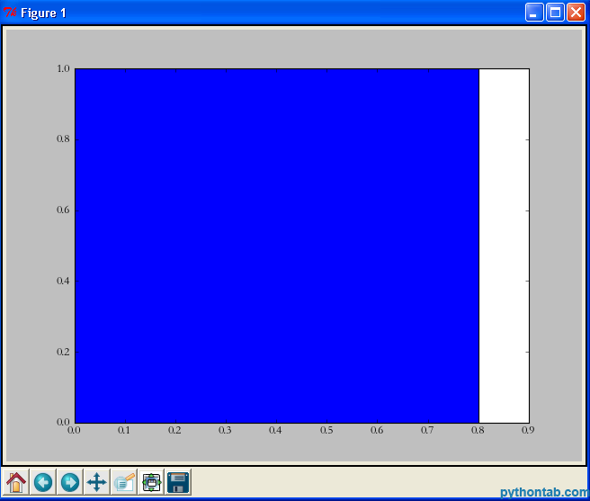
Yes, just three sentences are enough. It is the simplest drawing statement I have ever seen. First we imported matplotlib.pyplot, then directly called its bar method, and finally used show to display the image. Let me explain the two parameters in bar:
left: The position of the left edge of the column. If we specify 1, then the x value of the left edge of the current column is 1.0
height: This is the height of the column, That is, the value of the Y-axis
left, height can not only use a separate value (in this case it is a column), but can also be replaced by a tuple (in this case it represents multiple rectangles). For example, in the following example:
import matplotlib.pyplot as plt

plt.bar(left = (0,1),height = (1,0.5))
plt.show()
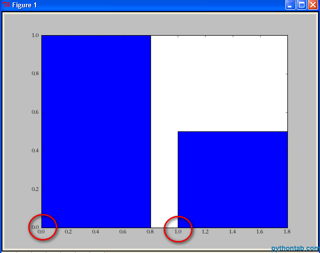
You can see that left = (0,1) means that there are two rectangles in total, the left edge of the first one is 0, and the left edge of the second one is 1. The height parameter is the same.
Of course, you may still think these two rectangles are "too fat". At this point we can set their width by specifying the width parameter of the bar.
import matplotlib.pyplot as plt

plt.bar(left = (0,1),height = (1,0.5),width = 0.35)
plt.show()
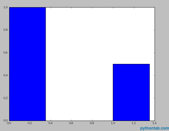
At this time, there is another demand. I need to indicate the instructions for the x and y axes. For example, the x-axis is gender and the y-axis is number of people. The implementation is also very simple, look at the code:
import matplotlib.pyplot as plt

plt.xlabel(u'性别')
plt.ylabel(u'人数')
plt.bar(left = (0,1),height = (1,0.5),width = 0.35)
plt.show()
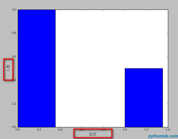
Note that u must be used for Chinese here (it doesn’t seem to be used above 3.0, I use 2.7), because matplotlib only supports unicode. Next, let's illustrate each bar on the x-axis. For example, the first one is "male" and the second one is "female". The usage of
import matplotlib.pyplot as plt

plt.xlabel(u'性别')
plt.ylabel(u'人数')

plt.xticks((0,1),(u'男',u'女'))

plt.bar(left = (0,1),height = (1,0.5),width = 0.35)

plt.show()
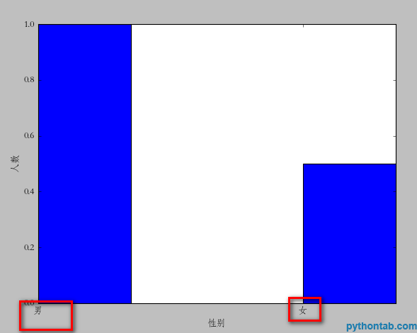
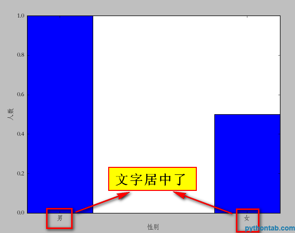
plt.xticks is similar to the usage of left and height we mentioned earlier. If you have several bars, then it is a tuple of several dimensions. The first is the location of the text, and the second is the specific text description. But there is a problem here. Obviously the position we specified is somewhat "offset", and the ideal state should be in the middle of each rectangle. You can change (0,1)=>( (0+0.35)/2, (1+0.35)/2) but this is more troublesome. We can center the text by directly specifying align="center" in the bar method
import matplotlib.pyplot as plt

plt.xlabel(u'性别')
plt.ylabel(u'人数')

plt.xticks((0,1),(u'男',u'女'))

plt.bar(left = (0,1),height = (1,0.5),width = 0.35,align="center")

plt.show()
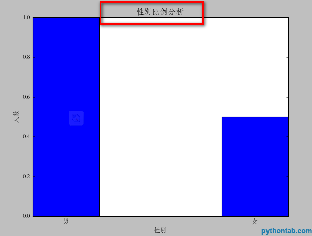
Next, we can also add a title to the icon.
plt.title(u"性别比例分析")
Of course, the legend is also indispensable:
import matplotlib.pyplot as plt

plt.xlabel(u'性别')
plt.ylabel(u'人数')


plt.title(u"性别比例分析")
plt.xticks((0,1),(u'男',u'女'))
rect = plt.bar(left = (0,1),height = (1,0.5),width = 0.35,align="center")

plt.legend((rect,),(u"图例",))

plt.show()
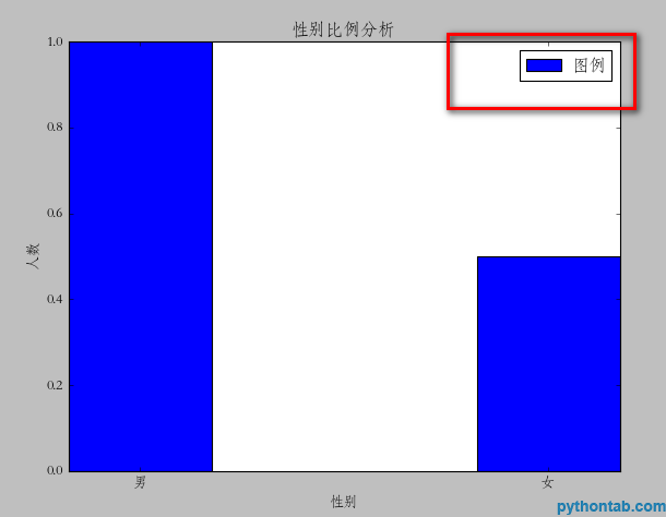
Note the legend method here, the parameters inside must be tuples. Even if you only have one legend, it will not display correctly.
Next, we can also mark the specific point Y value of each rectangle. Here, we need to use a general method:
def autolabel(rects):
    for rect in rects:
        height = rect.get_height()
plt.text(rect.get_x()+rect.get_width()/2., 1.03*height, '%s' % float(height))The parameters of plt.text are: x coordinate, y coordinate, and the text to be displayed. So, the calling code is as follows:
import matplotlib.pyplot as plt

def autolabel(rects):
    for rect in rects:
        height = rect.get_height()
        plt.text(rect.get_x()+rect.get_width()/2., 1.03*height, '%s' % float(height))

plt.xlabel(u'性别')
plt.ylabel(u'人数')


plt.title(u"性别比例分析")
plt.xticks((0,1),(u'男',u'女'))
rect = plt.bar(left = (0,1),height = (1,0.5),width = 0.35,align="center")

plt.legend((rect,),(u"图例",))
autolabel(rect)

plt.show()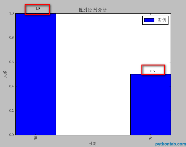
At this point, the graphic is basically complete, but you can see that you have a rectangle close to the top, which doesn’t look very good. It would be best to come out with some distance. I didn't find any specific properties for this setting. However, I did it with a little trick. It is the yerr parameter of the bar attribute. Once this parameter is set, there will be a vertical line on the corresponding rectangle. I don't know what it does. But when I set this value to a very small value, the space above is automatically vacated. As shown in the picture:
rect = plt.bar(left = (0,1),height = (1,0.5),width = 0.35,align="center",yerr=0.000001)
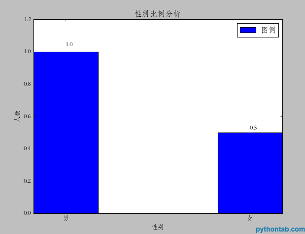
for the left and right sides I haven’t found whether I can leave a blank space (the xerr parameter doesn’t work)


