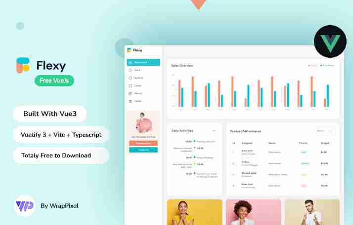
Admin dashboard templates are essential for managing and visualizing data efficiently. Tailwind CSS, known for its utility-first approach, simplifies the process of designing stunning admin dashboards. Adding interactive charts and graphs to these dashboards can transform raw data into insightful visualizations, enhancing the overall user experience. This blog will guide you through the steps of integrating interactive charts into your Tailwind CSS-based admin templates, with examples from popular templates like Spike, Flexy, and MaterialPro.
Interactive charts and graphs provide:
To integrate charts into Tailwind CSS templates, you can use libraries like:
Select a Tailwind CSS admin template. Here's a great starting point:

This template is free, lightweight, and ideal for integrating interactive charts.
Download the template and set up your project:
npm install
npm run dev
Ensure Tailwind CSS is configured by checking the tailwind.config.js file.
For this example, we'll use Chart.js:
npm install chart.js
Create a new component, ChartComponent.js, in your project:
import React from 'react';
import { Line } from 'react-chartjs-2';

const ChartComponent = () => {
  const data = {
    labels: ['Jan', 'Feb', 'Mar', 'Apr', 'May'],
    datasets: [
      {
        label: 'Sales',
        data: [30, 50, 40, 60, 70],
        borderColor: 'rgba(75,192,192,1)',
        backgroundColor: 'rgba(75,192,192,0.2)',
      },
    ],
  };

  const options = {
    responsive: true,
    plugins: {
      legend: {
        position: 'top',
      },
    },
  };

  return <Line data={data} options={options} />;
};

export default ChartComponent;
Import and place the ChartComponent in the desired section of your template:
import React from 'react';
import ChartComponent from './ChartComponent';

const Dashboard = () => {
  return (
    <div className="p-4">
      <h1 className="text-2xl font-bold mb-4">Dashboard Overview</h1>
      <div className="bg-white p-6 rounded shadow-md">
        <ChartComponent />
      </div>
    </div>
  );
};

export default Dashboard;
Modify the dataset and options in ChartComponent.js to fit your data and design requirements.
If you're looking for premium templates with advanced layouts, here are some excellent options:


Adding interactive charts and graphs to your Tailwind CSS admin templates is straightforward and immensely beneficial. Whether you use free templates like Spike or premium ones like MaterialPro, incorporating tools like Chart.js can elevate your dashboards to professional-grade solutions.
Explore Wrappixel's collection to find the perfect template for your project and start building visually stunning and interactive dashboards today!
The above is the detailed content of How to Add Interactive Charts and Graphs to Tailwind CSS Admin Templates. For more information, please follow other related articles on the PHP Chinese website!
 String array assignment method
 Why disabling automatic updates in Windows 11 is invalid
 How to embed CSS styles in HTML
 The difference between official replacement phone and brand new phone
 Can't open app store
 The role of parseint function
 Android desktop software recommendations
 Ethereum today's market price


