Tripetto Alternative: A Comprehensive Comparison with SurveyJS
This article is going to walk you through two form libraries for the web, SurveyJS and Tripetto.
Forms are a crucial part of the user journey on every website in 2024. We use it for everything like collecting basic information about users when they sign up to our site or allowing users to book an appointment, or fill out an application.
As a developer it can be hard to keep up with the ever changing demands that your business has on their forms. If you are manually coding all your forms it’s going to be time consuming to build new features but if you go for a fully managed form system, like Typeform, you lack the control you might need.
This is where form management platforms like SurveyJS and Tripetto come into their own, as they take all the hard work out of building forms but still leave you with the option to create advanced features and integrate with the rest of your system.
Intro to Tripetto
Tripetto is a suite of products that allows you to create and show forms to your users. They offer a fully hosted version of their form tools, a wordpress plugin and an SDK to integrate into your own application.
This article will focus on the SDK as it compares best to SurveyJS in terms of how you use it. All of the different Tripetto products are built using their SDK so most of this article is applicable to all of their product suite.
Tripetto takes a front-end only approach to their form SDK which means that they give you all the front-end libraries to create and show forms but they don’t give you anything to store your forms or your form submissions. The benefit of this is you can integrate directly into your backend, but downside is that it can be extra work to store your forms and results.
Tripetto works by using JSON based definitions, for your forms. Once you have created the form in the studio you will get access to a JSON version of the form which you can then pass into the form runner to display to your users.
Intro to SurveyJS
SurveyJS is a similar suite of products that also allows you to create and show forms to your users.
It takes a similar front-end only approach. This approach makes sense given that forms only exist on the front end, everything after that is just standard data handling that every web application will already do.
Once the data reaches the backend you are free to save the data any way you like. This means that you can save it into your custom backend with ease and take advantage of all that great authentication you have already built. It also means that you don't have to worry about another third party handling your data.
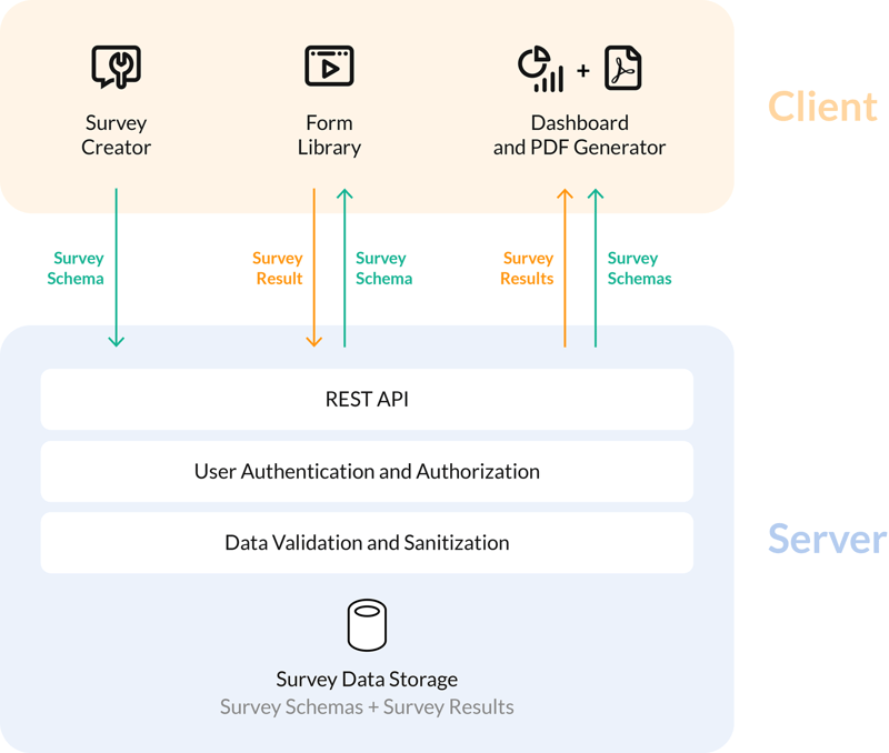
The diagram above shows the design ethos of SurveyJS excellently. Everything in the 'client' section is within the domain of SurveyJS and they build those for you. Everything on the 'server' section is totally up to you, so it will seamlessly integrate with your existing backend.
Creation
Let's start with SurveyJS. To get access to the form creator you are going to have to integrate it into your existing UI. Alternatively, you can use their hosted MySurvey tool, which serves as a full-featured form builder demo. It allows you to try out the form builder UI and build form JSON files without having to integrate the form builder into your application.
SurveyJS provides support for every common front-end framework that you could imagine, and even the ones you couldn't. They support:
- Angular
- Vue
- React
- Vanilla JS
It's really straightforward to integrate the form creator into your existing application. For example to add it your Vue application all you need to do is:
<script setup lang="ts">
import type { ICreatorOptions } from "survey-creator-core";
import { SurveyCreatorModel } from "survey-creator-core";

const creatorOptions: ICreatorOptions = {
  showLogicTab: true,
  isAutoSave: true
};

const creator = new SurveyCreatorModel(creatorOptions);
</script>
<template>
  <SurveyCreatorComponent :model="creator" />
</template>
The output of the form builder in SurveyJS is a JSON object which we will use later with the form rendering library.
The form creator itself is a very nice modern UI that is extremely interactive and feels very snappy. You can drag and drop questions without thinking about it and everything is intuitively where you would expect it to be, which is a tough job when there are so many settings. It even works pretty well on a mobile device which is pretty incredible.
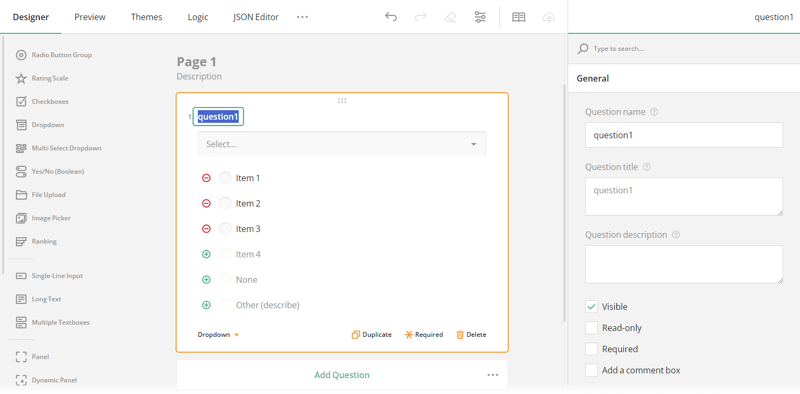
It has all the field types that you would expect from a form builder. It has standard text inputs, checkboxes, radio groups (including matrixes) and drop-downs. There are a few drop-downs that you might not expect but could be very handy. There is a ranking field allowing users to rank a set options top to bottom.
They also have a grouping feature, that allows a respondent to answer a set of questions multiple times if they need to. For example, they can add multiple contact people and fill in each of their details separately. An image picker, allowing a user to select from a group of images. Lastly it even has the ability to accept signatures which is a nice addition.
If you find that you are missing a field type you can add your own type. They have a nice example in the documentation about how to go about doing that.
When it comes to logic it allows you to do everything you could possibly imagine using a dedicated GUI. You can hide questions, answer questions and reset answers. You can do this by defining as many 'rules' as you want, by setting a condition and an action depending on the condition. To developers this will feel familiar as it presents as a giant if statement.
It might take a while for a novice user to get around all the options, but once they figure out where everything is they will quickly find themselves setting up form logic with the intuitive logic options.
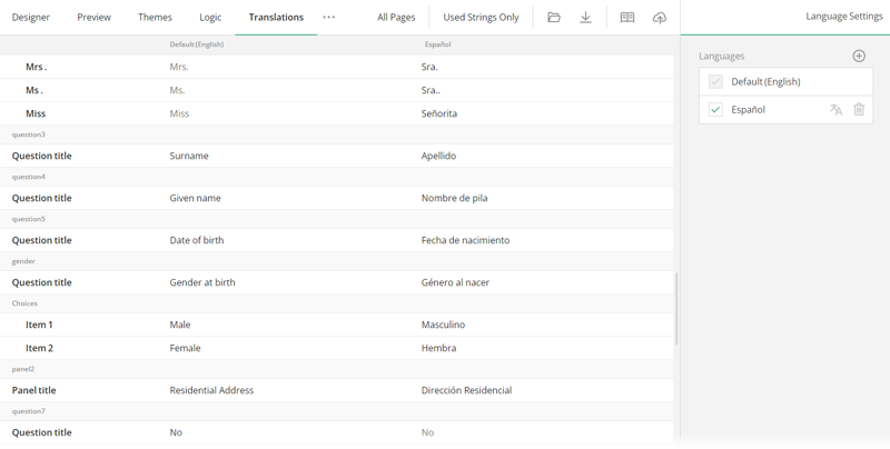
Once you have the form built with all the fields and logic you want you can add translations to each question. You can add all the languages you want to support and input all your translations for the strings in each page. This makes it a breeze to translate large forms with complicated logic. They even provide an API that lets you use machine translation, for example Microsoft Translator, to quickly translate lots of strings and allows you to then manually correct any mistakes.
Next let's take a look at the form builder available from Tripetto. Just like SurveyJS you can integrate it into your application using the SDK they give you. Tripetto also supports a list of popular frameworks such as:
- React
- Angular
- Vanilla JS / HTML
It is very straightforward to add the creator to your existing application, here is an example in React:
import { TripettoBuilder } from "@tripetto/builder/react";
import "@tripetto/block-calculator";
import "@tripetto/block-checkbox";
import "@tripetto/block-checkboxes";
import "@tripetto/block-date";
// Import the rest of the blocks you want to enable

function ExampleApp() {
  return (
    <div>
      <h1>Example app</h1>
      <TripettoBuilder
        onSave={(definition) => {
          console.log("Form saved!");
        }}
      />
    </div>
  );
}
Rendering the TripettoBuilder component will then display the entire builder in a full page mode. You can pass through your CSS classes to style the form container however you want.
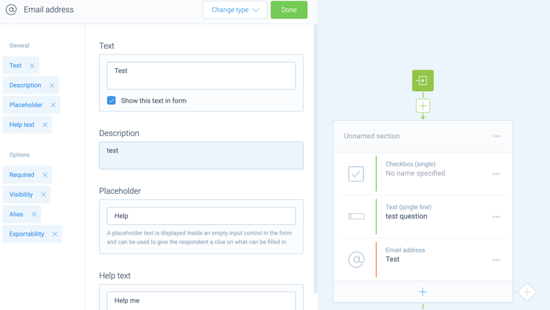
Overall the Tripetto form builder has a nice and pleasing user-interface. It is a bit quirky in a few places, for example it scrolls to the left and right with different settings panels, but you get over those very quickly. It's also quite robust, no matter how complex your form logic gets it is always snappy and easy to use.
They have all of the question types that you would expect to see inside a modern form builder. They have multiple text types and also have a matrix option which is really great for getting customer feedback.
Tripetto has a similar grouping feature to SurveyJS, except they call it iteration. When you start to do these more complex form flows then the Tripetto flow editor really comes into its own as a form builder.
Rather than showing a preview of the form on the main panel you are shown a representation of the ‘flow’ of the form. This allows you to really easily see complicated conditional forms at a quick glance and understand how they all go together. However, I find that the flow view they give you is confusing when you are creating a simple flow with just a few questions.
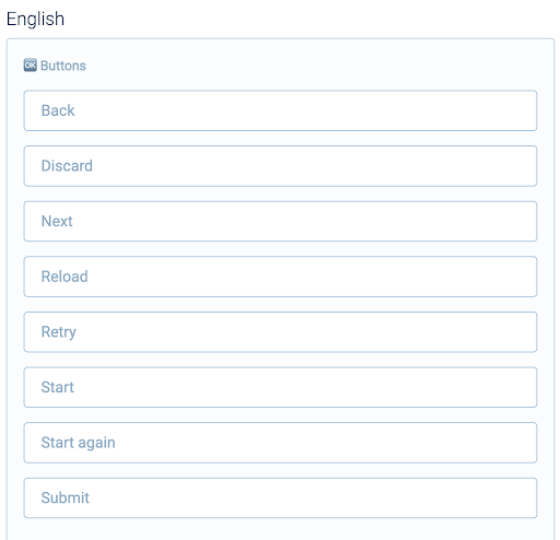
Tripetto also offers you the ability to translate your forms easily through their builder UI. You simply select your new target language and then you are prompted to complete a translation for each section of the form.
Filling
Next up let's look at the experience users will have when they come to complete a form in the system.
First let's take a look at how Tripetto handles form viewing. In the editor you can set what colours and font you want the form to use so you can match it to your branding.
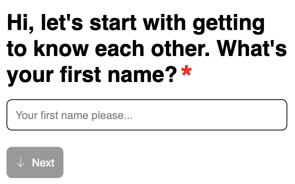
The other thing you can set is the ‘form face’ which really changes how the form looks and acts entirely. Let's start with the default form face which is ‘autoscroll’. This is clearly modelled closely on the interface typeform uses, which is not a bad thing but it's certainly unoriginal. I personally think it's a bit of a gimmick, it stops you exploring the whole form and forces you to complete the form in the right order.
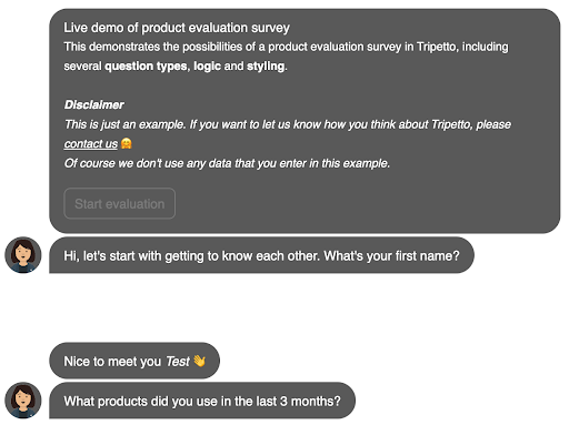
Another ‘form face’ they have is called ‘chat’. It's a unique way of displaying forms as a chat conversation rather than a normal form. It is a clever idea and they have made it look great and it could easily convince people they are interacting with a person or a chat bot. However, I think it is totally impractical, it essentially acts as a chatbot that you can never reach a person through, which as a user is very frustrating, for this reason I wouldn’t recommend using it.
Lastly the best form face is ‘classic’ which acts exactly how you would expect a form to work. It is very responsive and works well on all size devices and it feels snappy with quick error messages when you incorrectly fill out a form.
To render the forms you use the Tripetto SDK which has a Runner component which renders the form with the ‘form face’ you chose.
In general all of the form faces Tripetto offer look and feel very nice and they clearly have a talented design team that focuses on the small details.
Next let's see how SurveyJS handles showing forms to users. To render the form you simply pass JSON object the form creator gives you into the survey component the like so:
function Survey() {
    const survey = new Survey.Model(json);

    survey.applyTheme(themeJson);

    survey.onComplete.add((sender, options) => {
        console.log("Form filled!");
    });

    return (
        <SurveyReact.Survey model={survey} />
    );
}
The default form filling UI is simple and clean and responsive and feels like a top tier form.
SurveyJS lets you do an exceptional amount of customisation. You can change every single colour that is shown on the form using a fully integrated CSS Theme Editors with a panel of UI controls.
Results
After users have submitted their form you probably want a way to access the results and view them. Tripetto provides no solution for this, after the user submits the data you are totally on your own to deal with the data and visualise it.
On the other hand SurveyJS provides a 'Dashboard' library to allow you to analyse your results in a meaningful way.
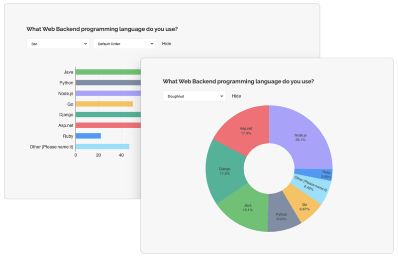
You get access to just about any visualisation graph that you could think of. As with the rest of SurveyJS the customisation is pretty much unlimited. It's a really great way to get a high level overview of the results of your forms.
The great thing with SurveyJS is that you can actually view the data however you want because you fully own it and control it. You can sync it to a Google Sheet if you want and view it there. You can view it in your company's existing business insights platform if you want.
Accessibility
When publishing forms you need to make sure they are accessible for everyone, including users who rely on assistive technology. To measure this we can rely on the WCAG guidelines which describe how a website can be accessible.
SurveyJS published an Accessibility Statement outlining the commitment to accessibility and talks about all the standards they meet. This is something that is missing from FormEngine.
SurveyJS is entirely keyboard accessible which means it can be accessed using alternative access methods.
However, SurveyJS falls short in a few minor ways. For example it has some contrast issues in a few places as well as missing or incorrect labelling on elements.
Tripetto doesn’t have anything on their website about their approach to accessibility within their platform. The Tripetto editor fails the most basic accessibility tests, for example you can’t access it in any meaningful way using the keyboard. A screen reader wouldn’t work well either because there are aria tags missing or wrong across the whole editor.
When I took a look at the form pages themselves it didn't get much better. The elements are also missing aria tags. The form is just about keyboard accessible, but it deviates from the standard keyboard controls in many ways.
If accessibility matters to you, which it should, then you can only go with SurveyJS as Tripetto is missing the basics to support users of assistive technology.
Pricing
When it comes to pricing it's not straightforward to compare these two as they have multiple pieces to them.
For the SDK Tripetto gives you a few ways you can choose to pay for the SDK. If you only want to access the form runner then you need to pay £758.66 per year, this cost only covers one ‘form face’, you have to pay for a full new runner licence per form face.
If you want to use the builder on your own webpages then you need to buy a builder licence too. The cheapest builder licence is £589.20 per year, that gives you access to all the standard questions types and allows you to have 5 users setup on the builder, if you want more users you have to pay extra. If you want to allow custom question types then you have to pay for the more expensive £3203.14 per year builder licence.
If you want the cheapest builder and runner combination then you are looking at paying £1347.86 per year.
SurveyJS on the other hand takes a totally different approach to pricing. They publish all of their libraries on Github for you to install and try out entirely for free. However, if you want to use their products for any commercial uses then you have to look into buying a commercial licence. Their core survey rendering library is MIT licensed which means it's free to use even for commercial uses. If you want to use the Survey Creator then you have to buy a 'Basic' licence for ~£422. If you want the Survey Creator, Dashboard and PDF Generator then you need a 'Pro' licence for ~£760.
The commercial licences from SurveyJS are perpetual meaning that you can use the software for the entirety of your lifetime, but to access updates and support you will have to renew your licence every 12 months. SurveyJS licence key can be used with a specific domain or group of domains and it will also work for subdomains within the specified domain or group without additional payment.
Conclusion
Overall both platforms are easy to use and have really nice user interfaces. They both let you build up your forms on their builder and then render them using their form runner library.
The biggest drawback for Tripetto is the lack of accessibility on their entire platform. They also have a steeper price which comes with more restrictions. However, their API design is really excellent, which makes it super simple to setup and integrate into your application.
SurveyJS on the other hand takes a serious approach to accessibility. If you want the ability to visualise your results out of the box then SurveyJS is your only option.
Overall, both SurveyJS and Tripetto are good options to help you build forms and display them to users. They are both really intuitive and easy to use.
I would encourage you to give them both a try and pick what works best for your needs!
Thanks for reading!
The above is the detailed content of Tripetto Alternative: A Comprehensive Comparison with SurveyJS. For more information, please follow other related articles on the PHP Chinese website!

Hot AI Tools

Undress AI Tool
Undress images for free

Undresser.AI Undress
AI-powered app for creating realistic nude photos

AI Clothes Remover
Online AI tool for removing clothes from photos.

Clothoff.io
AI clothes remover

Video Face Swap
Swap faces in any video effortlessly with our completely free AI face swap tool!

Hot Article

Hot Tools

Notepad++7.3.1
Easy-to-use and free code editor

SublimeText3 Chinese version
Chinese version, very easy to use

Zend Studio 13.0.1
Powerful PHP integrated development environment

Dreamweaver CS6
Visual web development tools

SublimeText3 Mac version
God-level code editing software (SublimeText3)
 Advanced Conditional Types in TypeScript
Aug 04, 2025 am 06:32 AM
TypeScript's advanced condition types implement logical judgment between types through TextendsU?X:Y syntax. Its core capabilities are reflected in the distributed condition types, infer type inference and the construction of complex type tools. 1. The conditional type is distributed in the bare type parameters and can automatically split the joint type, such as ToArray to obtain string[]|number[]. 2. Use distribution to build filtering and extraction tools: Exclude excludes types through TextendsU?never:T, Extract extracts commonalities through TextendsU?T:Never, and NonNullable filters null/undefined. 3
 Generate Solved Double Chocolate Puzzles: A Guide to Data Structures and Algorithms
Aug 05, 2025 am 08:30 AM
This article explores in-depth how to automatically generate solveable puzzles for the Double-Choco puzzle game. We will introduce an efficient data structure - a cell object based on a 2D grid that contains boundary information, color, and state. On this basis, we will elaborate on a recursive block recognition algorithm (similar to depth-first search) and how to integrate it into the iterative puzzle generation process to ensure that the generated puzzles meet the rules of the game and are solveable. The article will provide sample code and discuss key considerations and optimization strategies in the generation process.
 What is the class syntax in JavaScript and how does it relate to prototypes?
Aug 03, 2025 pm 04:11 PM
JavaScript's class syntax is syntactic sugar inherited by prototypes. 1. The class defined by class is essentially a function and methods are added to the prototype; 2. The instances look up methods through the prototype chain; 3. The static method belongs to the class itself; 4. Extends inherits through the prototype chain, and the underlying layer still uses the prototype mechanism. Class has not changed the essence of JavaScript prototype inheritance.
 Mastering JavaScript Array Methods: `map`, `filter`, and `reduce`
Aug 03, 2025 am 05:54 AM
JavaScript's array methods map, filter and reduce are used to write clear and functional code. 1. Map is used to convert each element in the array and return a new array, such as converting Celsius to Fahrenheit; 2. Filter is used to filter elements according to conditions and return a new array that meets the conditions, such as obtaining even numbers or active users; 3. Reduce is used to accumulate results, such as summing or counting frequency, and the initial value needs to be provided and returned to the accumulator; none of the three modify the original array, and can be called in chain, suitable for data processing and conversion, improving code readability and functionality.
 How can you remove a CSS class from a DOM element using JavaScript?
Aug 05, 2025 pm 12:51 PM
The most common and recommended method for removing CSS classes from DOM elements using JavaScript is through the remove() method of the classList property. 1. Use element.classList.remove('className') to safely delete a single or multiple classes, and no error will be reported even if the class does not exist; 2. The alternative method is to directly operate the className property and remove the class by string replacement, but it is easy to cause problems due to inaccurate regular matching or improper space processing, so it is not recommended; 3. You can first judge whether the class exists and then delete it through element.classList.contains(), but it is usually not necessary; 4.classList
 Vercel SPA routing and resource loading: Solve deep URL access issues
Aug 13, 2025 am 10:18 AM
This article aims to solve the problem of deep URL refresh or direct access causing page resource loading failure when deploying single page applications (SPAs) on Vercel. The core is to understand the difference between Vercel's routing rewriting mechanism and browser parsing relative paths. By configuring vercel.json to redirect all paths to index.html, and correct the reference method of static resources in HTML, change the relative path to absolute path, ensuring that the application can correctly load all resources under any URL.
 Vercel Single Page Application (SPA) Deployment Guide: Solving Deep URL Asset Loading Issues
Aug 13, 2025 pm 01:03 PM
This tutorial aims to solve the problem of loading assets (CSS, JS, images, etc.) when accessing multi-level URLs (such as /projects/home) when deploying single page applications (SPAs) on Vercel. The core lies in understanding the difference between Vercel's routing rewriting mechanism and relative/absolute paths in HTML. By correctly configuring vercel.json, ensure that all non-file requests are redirected to index.html and correcting asset references in HTML as absolute paths, thereby achieving stable operation of SPA at any depth URL.
 JavaScript Performance Optimization: Beyond the Basics
Aug 03, 2025 pm 04:17 PM
OptimizeobjectshapesbyinitializingpropertiesconsistentlytomaintainhiddenclassesinJavaScriptengines.2.Reducegarbagecollectionpressurebyreusingobjects,avoidinginlineobjectcreation,andusingtypedarrays.3.Breaklongtaskswithasyncscheduling,usepassiveeventl


