How to put div at the bottom in html
htmlHow to place a div at the bottom: 1. Use the position attribute to position the div tag relative to the browser window, with the syntax "div{position:fixed;}"; 2. Set the distance to the bottom to 0 To place the div always at the bottom of the page, the syntax is "div{bottom:0;}".

The operating environment of this tutorial: Windows 7 system, CSS3&&HTML5 version, Dell G3 computer.
htmlPut the div at the bottom
<!DOCTYPE html>
<html>
	<head>
		<meta charset="utf-8">
		<style>
			body{
				height: 500px;
				background: palegoldenrod;
			}
			div{
				border: 1px solid red;
				position:fixed;
				bottom:0;
			}
		</style>
	</head>

	<body>
		<div>测试文本测试文本测试文本测试文本测试文本测试文本测试文本</div>
	</body>

</html>
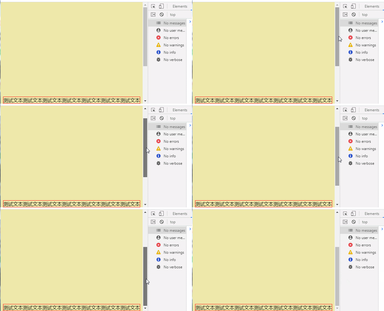
Rendering:

Fixed Positioning (position: fixed;)
fixed generates a fixed positioning element. The element is separated from the document flow and does not occupy the position of the document flow. It can be understood as floating above the document flow and relative to the browser window. position.
If you want to set a fixed positioning in the layer model for an element, you need to set position:fixed; and directly use the browser window as a reference for positioning. It floats in the page, and the element position will not follow the browser window. The scroll bar changes as you scroll, unless you move the screen position of the browser window on the screen, or change the display size of the browser window, so fixedly positioned elements will always be located somewhere in the view within the browser window and will not be affected by the document flow effects.
(Learning video sharing: css video tutorial)
The above is the detailed content of How to put div at the bottom in html. For more information, please follow other related articles on the PHP Chinese website!

Hot AI Tools

Undress AI Tool
Undress images for free

Undresser.AI Undress
AI-powered app for creating realistic nude photos

AI Clothes Remover
Online AI tool for removing clothes from photos.

ArtGPT
AI image generator for creative art from text prompts.

Stock Market GPT
AI powered investment research for smarter decisions

Hot Article

Hot Tools

Notepad++7.3.1
Easy-to-use and free code editor

SublimeText3 Chinese version
Chinese version, very easy to use

Zend Studio 13.0.1
Powerful PHP integrated development environment

Dreamweaver CS6
Visual web development tools

SublimeText3 Mac version
God-level code editing software (SublimeText3)
 What is the doctype in HTML
Sep 26, 2025 am 05:43 AM
The answer is to declare HTML5 document types, ensuring that the browser renders the page in standard mode. It prevents the browser from entering quirks mode and ensures cross-browser consistency. HTML5's doctype is concise and case-insensitive, and is suitable for all modern web development. The old version of doctype is outdated and is only used when maintaining old websites. New projects should always be used.
 How to make a text bold in html?
Sep 26, 2025 am 05:18 AM
Useforimportanttextwithsemanticmeaning,2.Useforvisualboldingwithoutimportance,3.UseCSSfont-weightfordesigncontrol;choosebasedonpurpose.
 What is the CSS will-change property and when to use it
Sep 26, 2025 am 02:57 AM
will-changeisaCSSpropertythathintsbrowsersaboutupcomingchangestooptimizerendering.Itimprovesperformancebypromotingelementstotheirowncompositorlayersaheadofanimations,suchastransformsoropacitychanges.Useitsparingly—applydynamicallyviaJavaScriptoronint
 How to add a non-breaking space in html?
Sep 26, 2025 am 06:57 AM
Use toaddanon-breakingspaceinHTML,preventinglinebreaksandpreservingspacesbetweenwordslike"Mr.Smith"orinmeasurementslike"10kg,"ensuringproperformatting.
 How to animate a border with CSS
Sep 26, 2025 am 02:31 AM
Answer: CSS can implement simple border animations through transition, such as color changes; using pseudo-elements combined with clip-path or gradient backgrounds can create growth borders or stroke effects, suitable for complex visual designs.
 How to use the nav element in html?
Sep 26, 2025 am 06:25 AM
ThenavelementisusedtodefinemajornavigationlinksectionsinHTML,enhancingaccessibilityandsemantics.Itshouldcontainprimarynavigationgroupslikesitemenus,sidebarlinks,orpagination,typicallystructuredwithunorderedlists.Multiplenavelementscanbeusedfordistinc
 How to install consult under Windows
Sep 29, 2025 am 10:27 AM
1. Go to the official website to download: https://www.consul.io/downloads.html2. Decompression: 3. Set environment variables: path to add E:\programfiles\consul; 4.cmd start: consulagent-dev5. Open the URL: http://localhost:8500, you can see the interface and the interface discovered by related services.
 How to create a responsive layout without media queries in CSS?
Sep 28, 2025 am 03:58 AM
Use Flexbox, CSSGrid, relative units, and modern CSS functions to create responsive layouts without media queries. 1. Flexbox realizes automatic line wrapping and scaling of content through flex-wrap and flex attributes; 2. CSSGrid combines auto-fit, minmax and fr units to create an adaptive grid; 3. Use relative units such as %, rem, vw to ensure that the size changes with the viewport; 4. Use functions such as clamp() to set the elastic size range, so that the layout naturally adapts to different screens.


