


本文主要介绍了Angular弹出模态框的两种方式,非常不错,具有参考借鉴价值,需要的朋友可以参考下,希望能帮助到大家。
在开始我们的blog之前,我们要先安装ngx-bootstrap-modal
npm install ngx-bootstrap-modal --save
不然我们的模态框效果会难看到你想吐
一、弹出方式一(此方法来自https://github.com/cipchk/ngx-bootstrap-modal)
1.alert弹框
(1)demo目录
--------app.component.ts
--------app.component.html
--------app.module.ts
--------detail(文件夹)
------------detail.component.ts
------------detail.component.html
(2)demo代码
app.module.ts导入必要的BootstrapModalModule 和ModalModule ,再注册它们
//app.module.ts import { BrowserModule } from '@angular/platform-browser'; import { NgModule } from '@angular/core'; //这种模态框只需要导入下面这两个 import { BootstrapModalModule } from 'ngx-bootstrap-modal'; import { ModalModule } from 'ngx-bootstrap/modal'; import { AppComponent } from './app.component'; import { DetailComponent } from './detail/detail.component'; @NgModule({ declarations: [ AppComponent, DetailComponent ], imports: [ BrowserModule, BootstrapModalModule ], providers: [], entryComponents: [ DetailComponent ], bootstrap: [AppComponent] }) export class AppModule { }
app.component.html创建一个可以弹出模态框的按钮
app.component.ts编写这个按钮的动作showAlert()
import { Component } from '@angular/core'; import { DialogService } from "ngx-bootstrap-modal"; import { DetailComponent } from './detail/detail.component' @Component({ selector: 'app-root', templateUrl: './app.component.html', styleUrls: ['./app.component.css'] }) export class AppComponent { title = 'app'; constructor(public dialogService: DialogService) { } showAlert() { this.dialogService.addDialog(DetailComponent, { title: 'Alert title!', message: 'Alert message!!!' }); } }
detail.component.html编写alert弹框的布局
{{title}}
这是alert弹框
detail.component.ts创建模态框组件,我们需要创建一个组件,然后由 ngx-bootstrap-model 帮忙引导启动
对于这个组件需要继承 DialogComponent
T 外部传参给模态框的类型。
T1 模态框返回值类型。
因此,DialogService应该是DialogComponent的一个构造函数的参数。
import { Component } from '@angular/core'; import { DialogComponent, DialogService } from 'ngx-bootstrap-modal'; export interface AlertModel { title: string; message: string; } @Component({ selector: 'alert', templateUrl: './detail.component.html', styleUrls: ['./detail.component.css'] }) export class DetailComponent extends DialogComponent implements AlertModel { title: string; message: string; constructor(dialogService: DialogService) { super(dialogService); } }
2.confirm弹框
(1)demo目录
--------app.component.ts
--------app.component.html
--------app.module.ts
--------confirm(文件夹)
------------confirm.component.ts
------------confirm.component.html
(2)demo代码
app.module.ts导入必要的BootstrapModalModule 和ModalModule ,再注册它们,这些都跟alert弹框一样,因为这些都是方法一的弹出方式
//app.module.ts import { BrowserModule } from '@angular/platform-browser'; import { NgModule } from '@angular/core'; //这种模态框只需要导入下面这两个 import { BootstrapModalModule } from 'ngx-bootstrap-modal'; import { ModalModule } from 'ngx-bootstrap/modal'; import { AppComponent } from './app.component'; import { DetailComponent } from './detail/detail.component'; @NgModule({ declarations: [ AppComponent, DetailComponent ], imports: [ BrowserModule, BootstrapModalModule ], providers: [], entryComponents: [ DetailComponent ], bootstrap: [AppComponent] }) export class AppModule { }
app.component.html创建一个可以弹出模态框的按钮
app.component.ts编写这个按钮的动作showConfirm()
import { Component } from '@angular/core'; import { DialogService } from "ngx-bootstrap-modal"; import { ConfirmComponent } from './confirm/confirm.component' @Component({ selector: 'app-root', templateUrl: './app.component.html', styleUrls: ['./app.component.css'] }) export class AppComponent { title = 'app'; constructor(public dialogService: DialogService,private modalService: BsModalService) { } showConfirm() { this.dialogService.addDialog(ConfirmComponent, { title: 'Confirmation', message: 'bla bla' }) .subscribe((isConfirmed) => { }); } }
confirm.component.html编写confirm弹框的布局
{{title}}
这是confirm弹框
confirm.component.ts创建模态框组件
import { Component } from '@angular/core'; import { DialogComponent, DialogService } from 'ngx-bootstrap-modal'; export interface ConfirmModel { title:string; message:any; } @Component({ selector: 'confirm', templateUrl: './confirm.component.html', styleUrls: ['./confirm.component.css'] }) export class ConfirmComponent extends DialogComponent implements ConfirmModel { title: string; message: any; constructor(dialogService: DialogService) { super(dialogService); } confirm() { // on click on confirm button we set dialog result as true, // ten we can get dialog result from caller code this.close(true); } cancel() { this.close(false); } }
3.内置弹框
(1)demo目录
--------app.component.ts
--------app.component.html
--------app.module.ts
(2)demo代码
内置弹框也包括 alert confirm prompt 三种形态,都有一些内置的样式
app.module.ts
import { BrowserModule } from '@angular/platform-browser'; import { NgModule } from '@angular/core'; import { BootstrapModalModule } from 'ngx-bootstrap-modal'; import { ModalModule } from 'ngx-bootstrap/modal'; import { AppComponent } from './app.component'; @NgModule({ declarations: [ AppComponent ], imports: [ BrowserModule, BootstrapModalModule, ModalModule.forRoot() ], providers: [], bootstrap: [AppComponent] }) export class AppModule { }
app.component.html很简单,就一个按钮
app.component.ts很简单,连组件的布局都不用写,传入一些参数比如图标icon,大小size等
import { Component } from '@angular/core'; import { DialogService, BuiltInOptions } from "ngx-bootstrap-modal"; @Component({ selector: 'app-root', templateUrl: './app.component.html', styleUrls: ['./app.component.css'] }) export class AppComponent { title = 'app'; constructor(public dialogService: DialogService) { } show(){ this.dialogService.show({ content: '保存成功', icon: 'success', size: 'sm', showCancelButton: false }) } }
二、弹出方式二(此方法来自https://valor-software.com/ngx-bootstrap/#/modals)
还是跟上一种方法一样,先安装ngx-bootstrap-modal,然后导入bootstrap样式表
1.demo目录
--------app.component.ts
--------app.component.html
--------app.module.ts
2.demo代码
app.module.ts导入相应模块,并且注册它们
//app.module.ts import { BrowserModule } from '@angular/platform-browser'; import { NgModule } from '@angular/core'; import { ModalModule } from 'ngx-bootstrap/modal'; import { AppComponent } from './app.component'; @NgModule({ declarations: [ AppComponent ], imports: [ BrowserModule, ModalModule.forRoot() ], providers: [], entryComponents: [ ], bootstrap: [AppComponent] }) export class AppModule { }
app.component.ts
import { Component,TemplateRef } from '@angular/core'; import { BsModalService } from 'ngx-bootstrap/modal'; import { BsModalRef } from 'ngx-bootstrap/modal/modal-options.class'; @Component({ selector: 'app-root', templateUrl: './app.component.html', styleUrls: ['./app.component.css'] }) export class AppComponent { title = 'app'; public modalRef: BsModalRef; constructor(private modalService: BsModalService) { } showSecond(template: TemplateRef){//传入的是一个组件 this.modalRef = this.modalService.show(template,{class: 'modal-lg'});//在这里通过BsModalService里面的show方法把它显示出来 }; }
app.component.html
第二种模态框
第二种模态框弹出方式
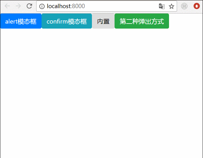
三、最终效果
我们将上面所有的弹框全部写在一起,然后效果就是这样的
相关推荐:
bootstrap模态框嵌套、tabindex属性、去除阴影的方法
详解bootstrap3-dialog-master模态框用法
Das obige ist der detaillierte Inhalt von两种Angular弹出模态框的方式. Für weitere Informationen folgen Sie bitte anderen verwandten Artikeln auf der PHP chinesischen Website!
 Vergleichende Analyse von iqooneo8 und iqooneo9
 So stellen Sie aus dem Papierkorb geleerte Dateien wieder her
 So geben Sie den Drucker in Win10 frei
 So wechseln Sie zwischen Huawei-Dual-Systemen
 Lösung für das Zurücksetzen der Verbindung
 Der Unterschied zwischen HTML und URL
 So entschlüsseln Sie die Bitlocker-Verschlüsselung
 So zentrieren Sie ein Div in CSS


