CSS box model
CSS Box Model
Preface
If you want to try not to use tables to layout web pages, but to use CSS to layout your web pages, which is often heard of using DIV to layout your web pages. Web page structure, or you want to learn web page standard design, or your boss wants you to change the traditional table layout method to improve corporate competitiveness, then one knowledge point you must be exposed to is the CSS box mode. This is the core of DIV typesetting. Traditional table typesetting uses tables of different sizes and table nesting to position and typeset web page content. After switching to CSS typesetting, it uses boxes and box nesting of different sizes defined by CSS. to organize web pages. Because the code of web pages typed in this way is simple, easy to update, and can be compatible with more browsers, such as PDA devices, it can also be browsed normally, so it is worthwhile to give up the table typesetting that I loved before. More importantly, CSS typesetting of web pages The advantages are far more than these. I won’t go into details here. You can find relevant information by yourself.
Understanding the CSS box model
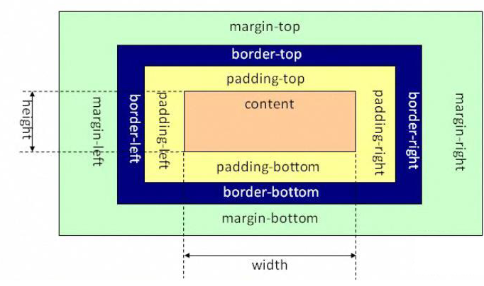
What is the CSS box model? Why is it called a box? Let’s first talk about the attribute names we often hear in web design: content, padding, border, and margin. CSS box mode all has these attributes.

Instructions for different parts:
Margin (margin) - clears the area outside the border, and the margin is transparent.
Border (border) - the border around the padding and content.
Padding (Padding) - clears the area around the content and makes the padding transparent.
Content (content) - the content of the box, showing text and images.
In order to set the width and height of elements correctly in all browsers, you need to know how the box model works.
CSS Box Mode
We can understand these attributes by transferring them to the boxes (boxes) in our daily life. The boxes we see in our daily life also have these attributes, so it is called the box pattern. Then the content is what is in the box; the filling is the foam or other earthquake-resistant auxiliary materials added to prevent the contents (valuable) from being damaged; the border is the box itself; as for the border, it means that the box cannot be placed when it is placed. Stack them all together, leaving a certain gap for ventilation and for easy removal. In web design, content often refers to text, pictures and other elements, but it can also be small boxes (DIV nested). Different from boxes in real life, things in real life generally cannot be larger than the box, otherwise the box will be stretched Broken, and the CSS box is elastic. The things inside are larger than the box itself and will stretch it at most, but it will not be damaged. The filling only has the width attribute, which can be understood as the thickness of the anti-seismic auxiliary materials in the boxes in life, while the border has size and color, which can be understood as the thickness of the boxes we see in life and what color materials the box is made of. The boundary is the distance between the box and other things. In real life, suppose we are in a square and place boxes of different sizes and colors at certain intervals and in a certain order. Finally, when we look down from the square, we will see graphics and structures similar to what we want to do. The web page layout has been designed.
Web page layout piled up by "boxes"
How much do you understand the CSS box mode now? If it is not thorough enough, continue reading. I will give examples later and continue to use boxes. concept to explain it.
Realize the separation of structure and presentation
Before starting the actual layout practice, let’s understand one more thing - the separation of structure and presentation. This also uses the characteristics of CSS layout, the separation of structure and presentation. Finally, the code will be concise and easy to update. Isn't this the purpose of learning CSS? For example, P is a structured tag. Where there is a P tag, it means that it is a paragraph block. Margin is a performance attribute. I want to make a paragraph right-indented by 2 characters. Some people will think of adding spaces and then continue Spaces are added, but now you can specify a CSS style for the P tag: P {text-indent: 2em;}, so that the resulting body content is as follows, without any additional performance control tags:
< p> I have been joining the Tianya community for a while, but I have never had time to write anything. Today I wrote an article about CSS layout, and tried to explain the knowledge points in a popular language, with examples and pictures. I believe it will be helpful to those who are new to CSS layout.
If you want to add font, font size, background, line spacing and other modifications to this paragraph, just add the corresponding CSS to the P style. There is no need to write it like this:
Paragraph content
This is a mixture of structure and expression Written, if many paragraphs have a unified structure and performance, it will be cumbersome to write down the code in this way.
Let’s directly list a piece of code to deepen our understanding of the separation of structure and performance:
Use CSS for typesetting
