1.创建容器代码:
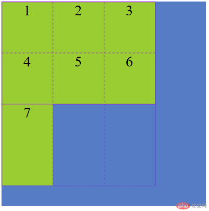
<!DOCTYPE html><html lang="en"> <head> <meta charset="UTF-8" /> <meta name="viewport" content="width=device-width, initial-scale=1.0" /> <title>创建grid容器</title> <style> .container { /* 容器大小 */ width: 400px; height: 400px; background-color: rgb(85, 124, 196); /* 创建grid容器 */ display: grid; /* 设置项目在网格中的填充方案,默认行优先 */ grid-auto-flow: row; /* 设置项目在网格中的填充方案,列优先 */ /* grid-auto-flow: column; */ /* 显示地划分行与列,三列二行 */ grid-template-columns: 100px 100px 100px; grid-template-rows: 100px 100px; /* 对于放置不下的项目会隐式生成单元格 */ grid-auto-rows: auto; grid-auto-rows: 160px; } .item { background-color: yellowgreen; font-size: 1.8rem; text-align: center; } </style> </head> <body> <div class="container"> <div class="item item1">1</div> <div class="item item2">2</div> <div class="item item3">3</div> <div class="item item4">4</div> <div class="item item5">5</div> <div class="item item6">6</div> <div class="item item7">7</div> </div> </body></html>
1.1创建容器演练图:
2.设置单元格的数量与大小代码:
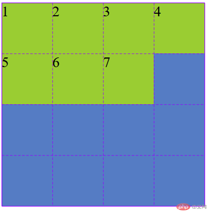
<!DOCTYPE html><html lang="en"> <head> <meta charset="UTF-8" /> <meta name="viewport" content="width=device-width, initial-scale=1.0" /> <title>设置单元格的数量与大小</title> <style> .container { /* 容器大小 */ width: 400px; height: 400px; background-color: rgb(85, 124, 196); /* 创建grid容器 */ display: grid; /* 固定值 */ grid-template-columns: 100px 100px 100px; grid-template-rows: 100px 100px 100px; /* 百分比 */ grid-template-columns: 30% 20% auto; grid-template-rows: 100px 100px 100px; /* 按比例 */ grid-template-columns: 1fr 1fr 1fr; grid-template-rows: 1fr 1fr auto; /* 重复设置 */ grid-template-columns: repeat(3, 100px); grid-template-rows: repeat(3, 100px); /* 按分组来设置 */ grid-template-columns: repeat(2, 50px 100px); grid-template-rows: repeat(2, 50px 100px); /* 弹性设置 */ grid-template-columns: repeat(2, minmax(50px, 100px)); grid-template-rows: repeat(3, minmax(150px, 1fr)); /* 自动填充 */ grid-template-columns: repeat(auto-fill, 100px); grid-template-rows: repeat(auto-fill, 100px); } .item { background-color: yellowgreen; font-size: 1.8rem; } </style> </head> <body> <div class="container"> <div class="item item1">1</div> <div class="item item2">2</div> <div class="item item3">3</div> <div class="item item4">4</div> <div class="item item5">5</div> <div class="item item6">6</div> <div class="item item7">7</div> </div> </body></html>
2.1设置单元格的数量与大小演练图:
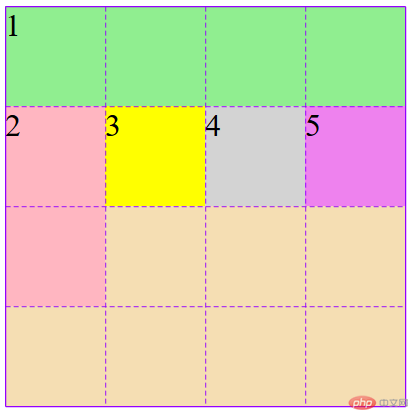
3.使用默认的网格线来划分单元格代码:
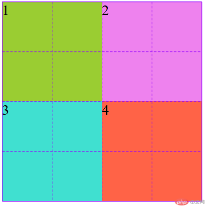
<!DOCTYPE html><html lang="en"> <head> <meta charset="UTF-8" /> <meta name="viewport" content="width=device-width, initial-scale=1.0" /> <title>使用默认的网格线来划分单元格</title> <style> .container { /* 容器大小 */ width: 400px; height: 400px; background-color: rgb(85, 124, 196); grid-template-columns: repeat(4, 1fr); grid-template-rows: repeat(4, 1fr); /* 创建grid容器 */ display: grid; } .item { font-size: 1.8rem; } .item.item1 { background-color: yellowgreen; /* 开始行数1 */ grid-row-start: 1; /* 结束行数3 */ grid-row-end: 3; /* 开始列数1 */ grid-column-start: 1; /* 结束列数3 */ grid-column-end: 3; /* 反方向开始 */ /* 开始行数-1 */ /* grid-row-start: -1; */ /* 结束行数-3 */ /* grid-row-end: -3; */ /* 开始列数1 */ /* grid-column-start: -1; */ /* 结束列数3 */ /* grid-column-end: -3; */ /* 设置中间区域 */ /* grid-row-start: 2; grid-row-end: 4; grid-column-start: 2; grid-column-end: 4; */ /* 完全覆盖所有空间 */ /* grid-row-start: 1; grid-row-end: -1; grid-column-start: 1; grid-column-end: -1; */ } /* 简写1 */ .item.item2 { background-color: violet; grid-row: 1/3; grid-column: 3/5; } /* 使用偏移量来简化,将第三个移到左下角 */ .item.item3 { background-color: turquoise; grid-row: 3 / span 2; grid-column: 1 / span 2; } /* 简写最后一个项目占据剩余空间 */ .item.item4 { background-color: tomato; grid-row-end: span 2; grid-column-end: span 2; } </style> </head> <body> <div class="container"> <div class="item item1">1</div> <div class="item item2">2</div> <div class="item item3">3</div> <div class="item item4">4</div> </div> </body></html>
3.1使用默认的网格线来划分单元格演练图:
4使用命名网格线来划分单元格代码:
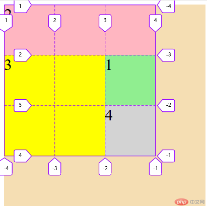
<!DOCTYPE html><html lang="en"> <head> <meta charset="UTF-8" /> <meta name="viewport" content="width=device-width, initial-scale=1.0" /> <title>使用命名网格线来划分单元格</title> <style> .container { /* 容器大小 */ width: 400px; height: 400px; background-color: wheat; /* 创建grid容器 */ display: grid; grid-template-columns: [c1-start] 100px [c1-end c2-start] 100px [c2-end c3-start] 100px [c3-end]; grid-template-rows: [r1-start] 100px [r1-end r2-start] 100px [r2-end r3-start] 100px [r3-end]; } .item { font-size: 2rem; } .item.item1 { background-color: lightgreen; /* 默认就是跨越一行/一列,所以可以省略 */ grid-row-start: r2-start; grid-row-start: r1-end; grid-column-start: c3-start; } /* 简写 */ .item.item2 { background-color: lightpink; /* grid-row: r1-start / r2-start; grid-column: c1-start / c3-end; */ grid-column-end: span 3; } /* 使用偏移量来简化, 将第三个移动到左下角 */ .item.item3 { background-color: yellow; grid-row-end: span 2; grid-column-end: span 2; } .item.item4 { background-color: lightgrey; } </style> </head> <body> <div class="container"> <div class="item item1">1</div> <div class="item item2">2</div> <div class="item item3">3</div> <div class="item item4">4</div> </div> </body></html>
4.1使用命名网格线来划分单元格演练图:
5默认网格区域代码:
<!DOCTYPE html><html lang="en"> <head> <meta charset="UTF-8" /> <meta name="viewport" content="width=device-width, initial-scale=1.0" /> <title>默认网格区域</title> <style> .container { /* 容器大小 */ width: 400px; height: 400px; background-color: wheat; /* 创建grid容器 */ display: grid; grid-template-columns: repeat(4, 1fr); grid-template-rows: repeat(4, 1fr); } .item { font-size: 2rem; } .item.item1 { background-color: lightgreen; /* grid-area: 1 / 1 / 2 / 5; */ /* 用偏移量进行简化 */ /* grid-area: 1 / 1 / span 1 / span 4; */ /* 是从当前位置开始的填充 */ grid-area: span 1 / span 4; } /* 简写 */ .item.item2 { background-color: lightpink; /* grid-area: 2 / 1 / 4 / 2; */ /* grid-area: span 2 / span 1; */ /* 默认就是偏移一行/一列 */ grid-area: span 2; } /* 使用偏移量来简化, 将第三个移动到左下角 */ .item.item3 { background-color: yellow; } .item.item4 { background-color: lightgrey; /* grid-area: row-start / col-start / row-end / col-end; */ } .item.item5 { background-color: violet; } </style> </head> <body> <div class="container"> <div class="item item1">1</div> <div class="item item2">2</div> <div class="item item3">3</div> <div class="item item4">4</div> <div class="item item5">5</div> </div> </body></html>
5.1默认网格区域演练图:
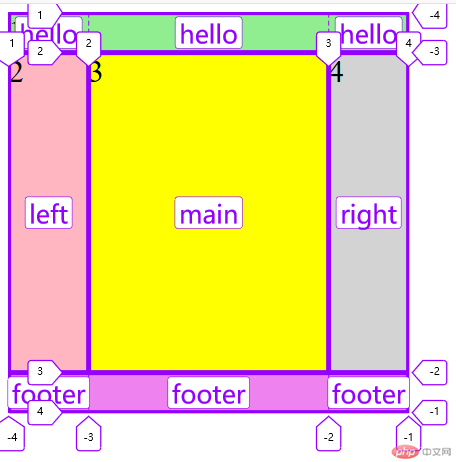
6.命名网格区域代码:
<!DOCTYPE html><html lang="en"> <head> <meta charset="UTF-8" /> <meta name="viewport" content="width=device-width, initial-scale=1.0" /> <title>命名网格区域</title> <style> .container { /* 容器大小 */ width: 400px; height: 400px; background-color: wheat; /* 创建grid容器 */ display: grid; grid-template-columns: 80px 1fr 80px; grid-template-rows: 40px 1fr 40px; /* 设置命名网格区域, 相同名称的命名区域会合并 */ grid-template-areas: "hello hello hello" "left main right" "footer footer footer"; } .item { font-size: 2rem; } .item.item1 { background-color: lightgreen; grid-area: hello; } /* 简写 */ .item.item2 { background-color: lightpink; grid-area: left; } /* 使用偏移量来简化, 将第三个移动到左下角 */ .item.item3 { background-color: yellow; grid-area: main; } .item.item4 { background-color: lightgrey; grid-area: right; } .item.item5 { background-color: violet; grid-area: footer; } </style> </head> <body> <div class="container"> <div class="item item1">1</div> <div class="item item2">2</div> <div class="item item3">3</div> <div class="item item4">4</div> <div class="item item5">5</div> </div> </body></html>
6.1命名网格区域演练图:
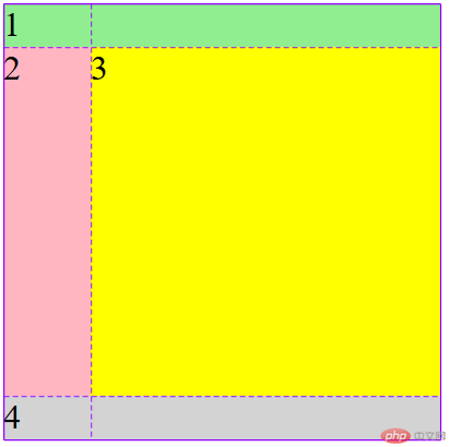
7.网格区域线的默认名称代码:
<!DOCTYPE html><html lang="en"> <head> <meta charset="UTF-8" /> <meta name="viewport" content="width=device-width, initial-scale=1.0" /> <title>网格区域线的默认名称</title> <style> .container { /* 容器大小 */ width: 400px; height: 400px; background-color: wheat; /* 创建grid容器 */ display: grid; grid-template-columns: 80px 1fr; grid-template-rows: 40px 1fr 40px; /* 设置命名网格区域, 相同名称的命名区域会合并 */ grid-template-areas: "header header" ". . " "footer footer"; } .item { font-size: 2rem; } .item.item1 { background-color: lightgreen; grid-area: header-start / header-start / header-end / header-end; } /* 简写 */ .item.item2 { background-color: lightpink; /* 多余 */ /* grid-area: left; */ } /* 使用偏移量来简化, 将第三个移动到左下角 */ .item.item3 { background-color: yellow; /* grid-area: main; */ } .item.item4 { background-color: lightgrey; grid-area: footer-start / footer-start / footer-end / footer-end; } </style> </head> <body> <div class="container"> <div class="item item1">1</div> <div class="item item2">2</div> <div class="item item3">3</div> <div class="item item4">4</div> </div> </body></html>
7.1网格区域线的默认名称演练图:
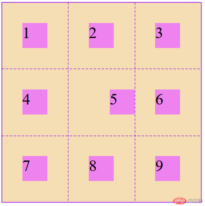
8.1设置某个项目在单元格中的对齐方式代码:
<!DOCTYPE html><html lang="en"> <head> <meta charset="UTF-8" /> <meta name="viewport" content="width=device-width, initial-scale=1.0" /> <title>设置某个项目在单元格中的对齐方式</title> <style> .container { /* 容器大小 */ width: 400px; height: 400px; background-color: wheat; /* 创建grid容器 */ display: grid; grid-template-columns: repeat(3, 1fr); grid-template-rows: repeat(3, 1fr); justify-items: stretch; align-items: stretch; justify-items: start; align-items: center; justify-items: center; align-items: center; /* place-items: 垂直 水平; */ place-items: start end; place-items: center center; place-items: center; } .item { width: 50px; height: 50px; background-color: violet; font-size: 2rem; } .item.item5 { justify-self: end; align-self: end; place-self: center end; } </style> </head> <body> <div class="container"> <div class="item item1">1</div> <div class="item item2">2</div> <div class="item item3">3</div> <div class="item item4">4</div> <div class="item item5">5</div> <div class="item item6">6</div> <div class="item item7">7</div> <div class="item item8">8</div> <div class="item item9">9</div> </div> </body></html>
8.1设置某个项目在单元格中的对齐方式演练图:
9.学习总结
这节课的知识点很多,要花很多时间去消化。


