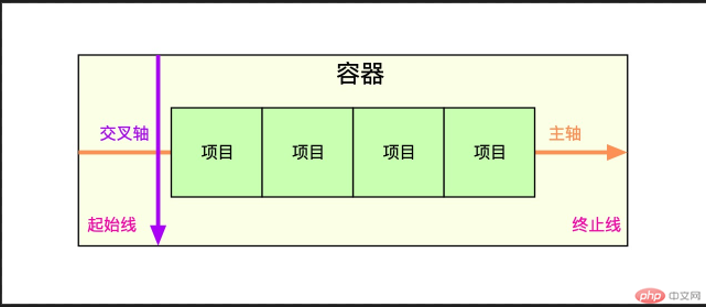
flex布局概述
1.flex是什么
- flex是Flexible box的缩写,意为弹性布局
- flex 2009 年就已出现,浏览器兼容性很好。
2.flex 解决了什么问题
- 块元素的垂直居中,flex 可以轻松解决
- 元素大小在容器中的自动伸缩,以适应容器的变化,特别适合移动端布局
—
3.flex 项目的布局方向是什么
- 一个物体在平面中,要么水平排列,要么垂直排列,flex 借鉴了这个思维
- flex 是一维布局,项目任何时候只能沿一个方向排列,要么水平,要么垂直
- flex 项目排列的方向,称为主轴,水平和垂直俩种
- 与主轴垂直的称为交叉轴
4.flex布局中常用术语有哪些
| 简记 |
术语 |
| 二成员 |
容器和项目(container/item) |
| 二根轴 |
主轴与交叉轴(main-axis/cross-axis) |
| 二根线 |
起始线与结束线(flex-start/flex-end)} |
5.flex 容器属性有哪些
| 属性 |
描述 |
flex-direction |
设置容器的主轴方向:行/水平方向,列/垂直方向 |
flex-wrap |
是否允许创建多行容器,即flex项目一列排列不下时,是否允许换行 |
flex-flow |
简化flex-direction,flex-wrap属性 |
justify-content |
设置flex项目在主轴上对齐方式 |
align-items |
设置flex项目在交叉轴对齐方式 |
align-content |
多行容器中,项目在交叉轴上的对齐方式 |
6.flex项目的属性有哪些
| 属性 |
描述 |
flex-basis |
项目宽度:项目分配主轴剩余空间之前,项目所占据的主轴空间宽度 |
flex-grow |
项目的宽度扩展:将主轴上的剩余空间按比例分配给指定项目 |
flex-shrink |
项目的宽度收缩:将项目上多出空间按比例在项目间进行缩减 |
flex |
上上面三个属性的简写:flex:flex-grow flex-shrink flex-basis |
align-self |
单独定义某个项目在交叉轴上的对齐方式 |
order |
自定义项目在主轴上的排列顺序,默认为 0,书写顺序,值越小位置越靠前 |
flex 容器与项目
1.display属性
| 属性值 |
描述 |
备注 |
flex; |
创建flex块级容器 |
内容字元素自动成为flex项目 |
inline-flex |
创建flex行内容器 |
内容子元素自动成为flex项目 |
2.flex 容器与项目特征
| 容器/项目 |
默认行为 |
| 容器主轴 |
水平方向 |
| 项目排列 |
沿主轴起始线排列(当前起始线居左) |
| 项目类型 |
自动转换‘行内块级’元素,不管值钱的是什么类型 |
| 容器主轴空间不足时 |
项目自动收缩尺寸以适应空间变化,不会换行显示 |
| 容器主轴存在未分配空间时 |
项目保持自身大小不会放大并充满空间 |
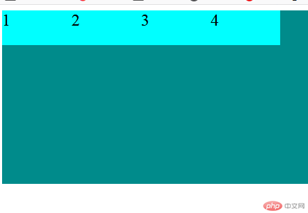
<!DOCTYPE html><html lang="en"><head> <meta charset="UTF-8"> <meta name="viewport" content="width=device-width, initial-scale=1.0"> <title>Document</title> <style> .container { height: 150px; background-color: darkcyan; } .item { width: 100px; height: 50px; background-color: cyan; font-size: 1.5rem; } </style></head><body> <div class="container"> <div class="item">1</div> <div class="item">2</div> <div class="item">3</div> <div class="item">4</div> </div></body></html>
- 预览效果
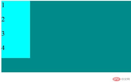
- 当添加
.container{display:flex;}样式时。效果图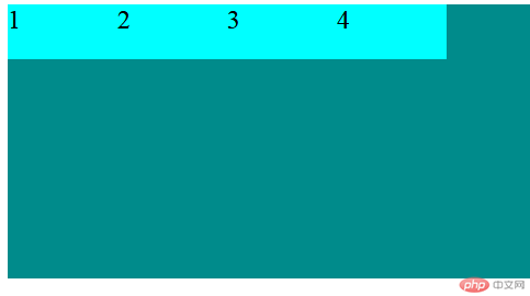
- 当注释
.container{display:flex;}添加.container{display:inline-flex;}样式时。效果图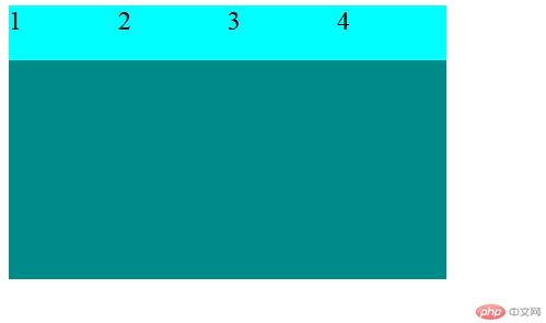
flex 容器主轴方向
1.flex-direction属性
| 属性值 |
描述 |
row默认值 |
主轴水平:起始线居中,项目从左到右显示 |
row-reverse |
主轴水平:起始线居右,项目从右向左显示 |
column |
主轴垂直:起始线居上,项目从上向下显示 |
column-reverse |
主轴垂直:起始线居下,项目从下向上显示 |
<!DOCTYPE html><html lang="en"><head> <meta charset="UTF-8"> <meta name="viewport" content="width=device-width, initial-scale=1.0"> <title>Document</title> <style> .container { height: 250px; background-color: darkcyan; } .container { display: flex; } .item { width: 100px; height: 50px; background-color: cyan; font-size: 1.5rem; } </style></head><body> <div class="container"> <div class="item">1</div> <div class="item">2</div> <div class="item">3</div> <div class="item">4</div> </div></body></html>
-效果预览
- 当添加
.container{flex-direction:row-reverse;}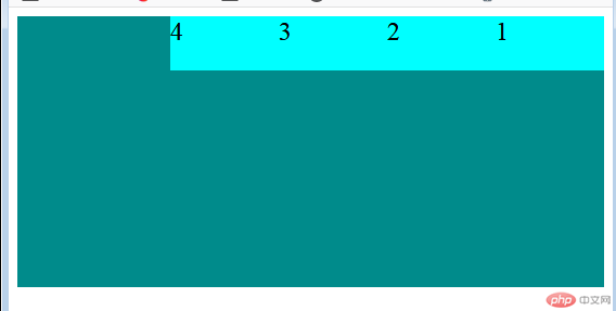
- 当添加
.container{flex-direction:column;}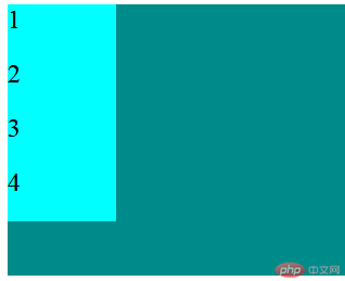
- 当添加
.container{flex-direction:column-reverse;}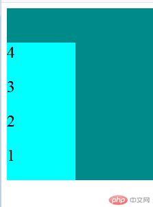
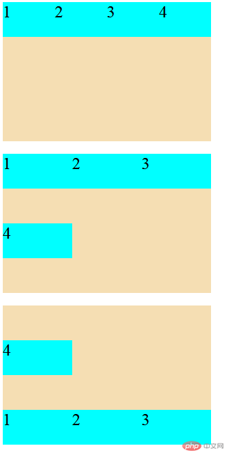
flex 容器主轴项目换行
1.flex-wrap属性
| 属性值 |
描述 |
nowrap默认值 |
项目不换行:单行容器 |
wrap |
项目换行:多行容器,第一行在上方 |
wrap-reverse |
项目换行:多行容器,第一行在下方 |
<!DOCTYPE html><html lang="en"><head> <meta charset="UTF-8"> <meta name="viewport" content="width=device-width, initial-scale=1.0"> <title>Document</title> <style> .container1 { width: 300px; height: 200px; background-color: wheat; display: flex; flex-direction: row; /* 默认不换行,若当前容器容纳不下,项目会自动收缩 */ flex-wrap: nowrap; /* 换行显示,当前行容纳不下的项目会拆行显示 */ } .container2 { width: 300px; height: 200px; background-color: wheat; display: flex; flex-direction: row; flex-wrap: wrap; } .container3 { width: 300px; height: 200px; background-color: wheat; display: flex; flex-direction: row; flex-wrap: wrap-reverse; } .item { width: 100px; height: 50px; background-color: cyan; font-size: 1.5rem; } </style></head><body> <div class="container"> <div class="container1"> <div class="item">1</div> <div class="item">2</div> <div class="item">3</div> <div class="item">4</div> </div> <br> <div class="container2"> <div class="item">1</div> <div class="item">2</div> <div class="item">3</div> <div class="item">4</div> </div> <br> <div class="container3"> <div class="item">1</div> <div class="item">2</div> <div class="item">3</div> <div class="item">4</div> </div> </div></body></html>
- 预览效果
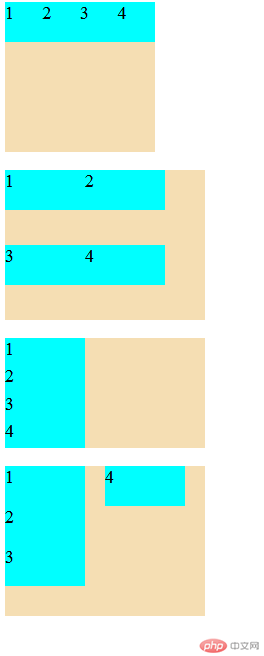
flex 容器主轴与项目换行简写
1. flex-flow属性
flex-flow是属性flex-direction和flex-wrap的简写
-语法: flex-flow:flex-direction flex-wrap
<!DOCTYPE html><html lang="en"><head> <meta charset="UTF-8"> <meta name="viewport" content="width=device-width, initial-scale=1.0"> <title>Document</title> <style> .container1 { width: 150px; height: 150px; background-color: wheat; display: flex; flex-flow: row nowrap; } .container2 { width: 200px; height: 150px; background-color: wheat; display: flex; flex-flow: row wrap; } .container3 { width: 200px; height: 110px; background-color: wheat; display: flex; flex-flow: column nowrap; } .container4 { width: 200px; height: 150px; background-color: wheat; display: flex; flex-flow: column wrap; } .item { width: 80px; height: 40px; background-color: cyan; font-size: 1.1rem; } </style></head><body> <div class="container"> <span>container1</span> <div class="container1"> <div class="item">1</div> <div class="item">2</div> <div class="item">3</div> <div class="item">4</div> </div> <br> <div class="container2"> <div class="item">1</div> <div class="item">2</div> <div class="item">3</div> <div class="item">4</div> </div> <br> <div class="container3"> <div class="item">1</div> <div class="item">2</div> <div class="item">3</div> <div class="item">4</div> </div> <br> <div class="container4"> <div class="item">1</div> <div class="item">2</div> <div class="item">3</div> <div class="item">4</div> </div> </div></body></html>
- 预览效果
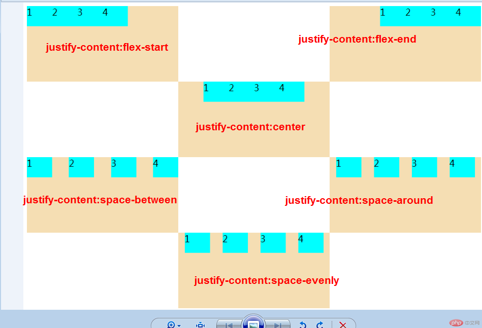
flex 容器主轴项目对齐
1.justify-content属性
当容器中主轴方向上存在剩余空间时, 该属性才有意义
| 属性值 |
描述 |
flex-start默认 |
所有项目与主轴起始线对齐 |
flex-end |
所有项目与主轴终止线对齐 |
center |
所有项目与主轴中间线对齐:居中对齐 |
space-between |
俩端对齐:剩余空间在头尾项目之外的项目平均分配 |
space-around |
分散对齐:剩余空间在每个项目二测平均分配 |
space-evenly |
平均对齐:剩余空间在每个项目之间平均分配 |
<!DOCTYPE html><html lang="en"><head> <meta charset="UTF-8"> <meta name="viewport" content="width=device-width, initial-scale=1.0"> <title>Document</title> <style> .container { display: grid; grid-auto-flow: row; grid-template-columns: 300px 300px 300px; grid-template-rows: 150px 150px 150px; } .container1 { width: 300px; height: 150px; background-color: wheat; display: flex; justify-content: flex-start; /* justify-content: flex-end; */ } .container2 { width: 300px; height: 150px; background-color: wheat; display: flex; justify-content: flex-end; } .container3 { width: 300px; height: 150px; background-color: wheat; display: flex; justify-content: center; } .container4 { width: 300px; height: 150px; background-color: wheat; display: flex; justify-content: space-between; } .container5 { width: 300px; height: 150px; background-color: wheat; display: flex; justify-content: space-around; } .container6 { width: 300px; height: 150px; background-color: wheat; display: flex; justify-content: space-evenly; } .item { width: 50px; height: 40px; background-color: cyan; font-size: 1.1rem; } </style></head><body> <div class="container"> <div class="container1"> <div class="item">1</div> <div class="item">2</div> <div class="item">3</div> <div class="item">4</div> </div> <br> <div class="container2"> <div class="item">1</div> <div class="item">2</div> <div class="item">3</div> <div class="item">4</div> </div> <br> <div class="container3"> <div class="item">1</div> <div class="item">2</div> <div class="item">3</div> <div class="item">4</div> </div> <br> <div class="container4"> <div class="item">1</div> <div class="item">2</div> <div class="item">3</div> <div class="item">4</div> </div> <br> <div class="container5"> <div class="item">1</div> <div class="item">2</div> <div class="item">3</div> <div class="item">4</div> </div> <br> <div class="container6"> <div class="item">1</div> <div class="item">2</div> <div class="item">3</div> <div class="item">4</div> </div> </div></body></html>
- 预览效果
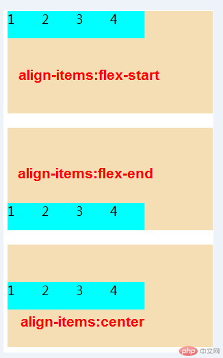
flex 容器交叉轴项目对齐
1.align-items属性
- 该属性仅适用于: 单行容器
- 当容器中交叉轴方向上存在剩余空间时, 该属性才有意义
| 属性值 |
描述 |
flex-start默认 |
与交叉轴起始线对齐 |
flex-end |
与交叉轴终止线对齐 |
center |
与交叉轴中间线对齐: 居中对齐 |
<!DOCTYPE html><html lang="en"><head> <meta charset="UTF-8"> <meta name="viewport" content="width=device-width, initial-scale=1.0"> <title>Document</title> <style> .container1 { width: 300px; height: 150px; background-color: wheat; display: flex; align-items: flex-start; } .container2 { width: 300px; height: 150px; background-color: wheat; display: flex; align-items: flex-end; } .container3 { width: 300px; height: 150px; background-color: wheat; display: flex; align-items: center; } .item { width: 50px; height: 40px; background-color: cyan; font-size: 1.1rem; } </style></head><body> <div class="container"> <div class="container1"> <div class="item">1</div> <div class="item">2</div> <div class="item">3</div> <div class="item">4</div> </div> <br> <div class="container2"> <div class="item">1</div> <div class="item">2</div> <div class="item">3</div> <div class="item">4</div> </div> <br> <div class="container3"> <div class="item">1</div> <div class="item">2</div> <div class="item">3</div> <div class="item">4</div> </div> </div></body></html>
- 预览效果
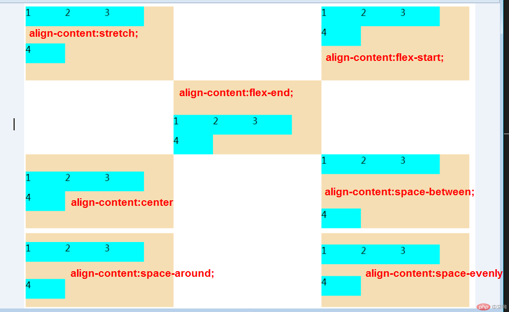
flex 多行容器交叉轴项目对齐
1.align-content属性
- 该属性仅适用于: 多行容器
- 多行容器中, 交叉轴会有多个项目, 剩余空间在项目之间分配才有意义
| 属性值 |
描述 |
stretch默认 |
项目拉伸占据整个交叉 |
flex-start |
所有项目与交叉轴起始线(顶部)对齐 |
flex-end |
所有项目与交叉轴终止线对齐 |
center |
所有项目与交叉轴中间线对齐:居中对齐 |
space-between |
俩端对齐:剩余空间在头尾项目之外的项目间平均分配 |
space-around |
分散对齐: 剩余空间在每个项目二侧平均分配 |
space-evenly |
平均对齐: 剩余空间在每个项目之间平均分配 |
提示: 多行容器中通过设置flex-wrap: wrap | wrap-reverse实现
flex 项目的顺序排列
1.order属性
- order 属性 设置或检索弹性盒模型对象的子元素出现的順序
- 注意:如果元素不是弹性盒对象的元素,则 order 属性不起作用。
| 值 |
描述 |
| number |
默认值是0,规定灵活项目的顺序 |
initial |
设置该属性为它的默认值。 |
inherit |
从父元素继承该属性 |
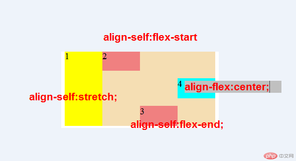
flex 项目交叉轴单独对齐
1.align-self属性
- 该属性可覆盖容器的
align-items,用以自定义某个项目的对齐方式
| 属性 |
描述 |
auto默认值 |
继承align-items属性值 |
flex-start |
与交叉轴起始线对齐 |
flex-end |
与交叉轴终止线对齐 |
center |
与交叉轴中间线对齐:居中对齐 |
stretch |
在交叉轴方向上拉伸 |
baseline |
与基线对齐(与内容相关用得极少) |
<!DOCTYPE html><html lang="en"><head> <meta charset="UTF-8"> <meta name="viewport" content="width=device-width, initial-scale=1.0"> <title>Document</title> <style> .container1 { width: 300px; height: 150px; background-color: wheat; display: flex; align-self: auto; /* align-items: center; */ } .container1>.item:first-of-type { height: inherit; background-color: yellow; /* align-self: 会覆盖掉父项目中的align-items; */ align-self: stretch; } .container1>.item:nth-of-type(2) { background-color: lightcoral; align-self: flex-start; } .container1>.item:nth-of-type(3) { background-color: lightcoral; align-self: flex-end; } .container1>.item:last-of-type { align-self: center; } .item { width: 80px; height: 40px; background-color: cyan; font-size: 1.1rem; } </style></head><body> <div class="container"> <div class="container1"> <div class="item">1</div> <div class="item">2</div> <div class="item">3</div> <div class="item">4</div> </div> </div></body></html>
- 效果图
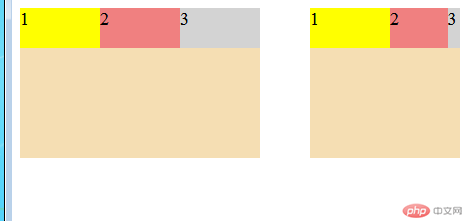
flex 项目放大因子\收缩因子
1.flex-grow属性
- 在容器主轴上存在剩余空间时,
flex-grow才有意义 - 该属性的值,称为放大因子,常见的属性值如下:
| 属性值 |
描述 |
0默认值 |
不放大,保持初始值 |
initial |
设置默认值,与0等效 |
n |
放大因子:正数 |
2.flex-shrink属性
- 当容器主轴 “空间不足” 且 “禁止换行” 时,
flex-shrink才有意义 - 该属性的值,称为收缩因子, 常见的属性值如下:
| 属性值 |
描述 |
1默认值 |
允许项目收缩 |
initial |
设置默认值,与1等效 |
0 |
禁止收缩,保持原始尺寸 |
n |
放大因子:正数 |
<!DOCTYPE html><html lang="en"><head> <meta charset="UTF-8"> <meta name="viewport" content="width=device-width, initial-scale=1.0"> <title>Document</title> <style> .container { display: flex; } .container1 { width: 300px; height: 150px; background-color: wheat; display: flex; /* flex-grow: inherit; */ } .container1>.item:first-of-type { background-color: yellow; flex-grow: 0; } .container1>.item:nth-of-type(2) { background-color: lightcoral; flex-grow: 1; } .container1>.item:nth-of-type(3) { background-color: lightgray; flex-grow: 3; } .container2 { width: 150px; height: 150px; background-color: wheat; display: flex; flex-flow: row nowrap; margin-left: 50px; flex-shrink: 0; } .container2>.item:first-of-type { background-color: yellow; flex-shrink: 0; } .container2>.item:nth-of-type(2) { background-color: lightcoral; flex-shrink: 1; } .container2>.item:nth-of-type(3) { background-color: lightgray; flex-shrink: 3; } .item { width: 80px; height: 40px; background-color: cyan; font-size: 1.1rem; } </style></head><body> <div class="container"> <div class="container1"> <div class="item">1</div> <div class="item">2</div> <div class="item">3</div> </div> <div class="container2"> <div class="item">1</div> <div class="item">2</div> <div class="item">3</div> </div> </div></body></html>
- 预览效果
flex 项目计算尺寸
1.flex-basis属性
- 在分配多余空间之前,项目占据的主轴空间
- 浏览器根据这个属性,计算主轴是否有多余空间
- 该属性会覆盖项目原始大小(width/height)
- 该属性会被项目的
min-width/min-height值覆盖
| 属性 |
描述 |
auto |
默认值:项目原来大小 |
px |
像素 |
& |
百分比 |
优先级: 项目大小 < flex-basis < min-width/height
flex 项目缩放的简写
1.flex属性
- 项目放大,缩写与计算尺寸,对于项目非常重要,也很常用
- 每次都要写三个属性,非常麻烦,且没有必要
flex属性,可以将以上三个属性进行简化:- 语法:
flex:flex-grow flex-shrink flex-basis
1.1 三值语法
|属性值|描述|
|第一个值:整数|flex-grow|
|第二个值:整数|flex-shrink|
|第三个值:有效宽度|flex-basis|
| 案例 |
描述 |
flex: 0 1 auto |
默认值:不放大,可收缩,初始宽度 |
flex: 1 1 auto |
项目自动放大或收缩适应容器 |
flex: 0 0 100px |
按计算大小填充到容器中 |
1.2双值语法
| 属性值 |
描述 |
| 第一个值:整数 |
flex-grow |
| 第二个值:有效宽度 |
flex-basis |
|案例|描述|
|flex:0 180px|禁止放大。按计算大小填充到容器中|
1.3单值语法
| 属性值 |
描述 |
| 整数 |
flex-grow |
| 有效宽度 |
flex-basis |
| 关键字 |
initial、auto、none |
| 案例 |
描述 |
flex:1 |
flex:1 1 auto |
flex:180px |
flex:1 1 180px |
initial |
flex:0 1 auto |
auto |
flex:1 1 auto |
none |
flex:0 0 auto |
推荐使用flex, 就像推荐使用flex-grow设置主轴与换行一样
总结
- 创建弹性盒子,
flex中各种样式选择了解,项目在容器布局中的布局样式,
Correcting teacher: 天蓬老师
Correction status:qualified
Teacher's comments:推荐使用flex, 就像推荐使用flex-grow设置主轴与换行一样, 这句话不对, 课件已经更正过了, 应该是flex-flow
天蓬老师
Correction status:qualified
Teacher's comments:推荐使用flex, 就像推荐使用flex-grow设置主轴与换行一样, 这句话不对, 课件已经更正过了, 应该是flex-flow


![[Web front-end] Node.js quick start](https://img.php.cn/upload/course/000/000/067/662b5d34ba7c0227.png)


 Collection


