

✨
This article is part of a larger series that is available on my own website. Click here to know more about CSS 101: The Series. It's completely free!
Welcome to the magical realm of CSS positioning, where you get to play architect and designer for your web elements! If you've ever wondered how to put that button exactly where you want it, or how to make sure your header doesn't wander off, you're in the right place. Let's dive into the basics of CSS positioning with a touch of wit and a sprinkle of fun.
Static positioning is like the default setting on your TV. Nothing fancy, just basic and straightforward. By default, all elements are statically positioned; which means they flow in the document as you'd expect - one after another.
div { position: static; }
When you use position: static;, you're essentially telling the browser to lay out the element in its normal spot, just like it would naturally. It's the "nothing to see here" of positioning.
Relative positioning is like having a friend who's always slightly out of place but in a charming way. It lets you move an element relative to where it would normally be, without disturbing the rest of the page.
.relative-box { position: relative; top: 10px; left: 20px; }
Here, .relative-box will be shifted 10 pixels down and 20 pixels to the right from itsoriginalposition. The rest of the elements around it will still be in their original spots.
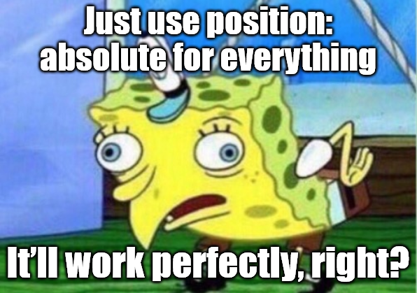
Absolute positioning is like your adventurous friend who doesn't follow the crowd. It lets you position an element anywhere you want, relative to the nearest "non-static" ancestor (i.e., an ancestor with position: relative, absolute, fixed, or sticky).
.parent { position: relative; } .child { position: absolute; top: 30px; right: 10px; }
In this example, .child will be positioned 30 pixels from the top and 10 pixels from the right of the .parent. If .parent wasn't there, it would be positioned relative to the nearest positioned ancestor or the viewport.
Pro Tip?
When an element is absolutely positioned inside a parent with transform applied, it's positioned relative to the transformed parent, not the original document flow. Be mindful of this behavior to avoid unexpected layout shifts and positioning issues.
Fixed positioning is like having a favorite chair that you never move. It lets you position an element relative to the viewport, so it stays in the same spot no matter how much you scroll.
.floating-action-button { position: fixed; bottom: 20px; right: 20px; }
With position: fixed;, the .floating-action-button will stay 20 pixels from the bottom and 20 pixels from the right of the viewport, even if you scroll down. It's perfect for those sticky elements like the header of your site or a chat widget or a persistent call-to-action button.
Sticky positioning is like having a friend who's always partially in and out of the spotlight. You can think of it as ahybrid between relative and fixed positioning. An element with position: sticky will stick to its position within its container when you scroll past a certain point, but otherwise behaves like a relatively positioned element.
.sticky-box { position: sticky; top: 0; }
In this example, .sticky-box will stick to the top of its container once you scroll past it and remain there as you continue scrolling, but only as long as the container is in view. When the container scrolls out of view, the sticky element will scroll with it. It is great for headers, navigation menus, or sidebars that you want to stay visible within a certain section of your page.
Ah, the z-index! This is where things get a bit competitive. When elements overlap, z-index determines which one sits on top. It's like a high school popularity contest, but for your web elements.
.box1 { position: absolute; z-index: 10; } .box2 { position: absolute; z-index: 5; }
In this case, .box1 will appear above .box2 because it has a higher z-index. Just remember, z-index only works on positioned elements (relative, absolute, fixed, or sticky).
Pro Tip?
There's more to z-index than what was explained above. Stay tuned for a deeper dive into "stacking contexts", which will give you a fuller understanding of how z-index works in complex layouts.
CSS-Positionierung mag wie ein Rätsel erscheinen, aber sobald Sie den Dreh raus haben, werden Sie Elemente mit Präzision und Gespür platzieren. Jeder Positionstyp hat seine eigene besondere Rolle im Webdesign. Probieren Sie sie aus und sehen Sie, wie Sie Ihre Webseite genau richtig aussehen lassen können.
Viel Spaß beim Codieren!
✨
Psst! Wenn Ihnen das, was Sie gelesen haben, gefallen hat, sollten Sie hier klicken, um CSS 101: The Series auszuprobieren. Es ist völlig kostenlos!
以上是CSS 定位:你认为你到底要去哪里?的详细内容。更多信息请关注PHP中文网其他相关文章!


