

本文主要介紹了Angular彈出模態框的兩種方式,非常不錯,具有參考借鑒價值,需要的朋友可以參考下,希望能幫助到大家。
在開始我們的blog之前,我們要先安裝ngx-bootstrap-modal
npm install ngx-bootstrap-modal --save
不然我們的模態框效果會難看到你想吐
一、彈出方式一(此方法來自https://github.com/cipchk/ngx-bootstrap-modal)
1.alert彈框
(1)demo目錄
--------app.component.ts
--------app.component.html
--------app.module .ts
--------detail(資料夾)
------------detail.component.ts
# ------------detail.component.html
(2)demo代碼
app.module.ts導入必要的BootstrapModalModule 和ModalModule ,再註冊它們
//app.module.ts import { BrowserModule } from '@angular/platform-browser'; import { NgModule } from '@angular/core'; //这种模态框只需要导入下面这两个 import { BootstrapModalModule } from 'ngx-bootstrap-modal'; import { ModalModule } from 'ngx-bootstrap/modal'; import { AppComponent } from './app.component'; import { DetailComponent } from './detail/detail.component'; @NgModule({ declarations: [ AppComponent, DetailComponent ], imports: [ BrowserModule, BootstrapModalModule ], providers: [], entryComponents: [ DetailComponent ], bootstrap: [AppComponent] }) export class AppModule { }
app.component.html建立一個可以彈出模態框的按鈕
app.component.ts寫這個按鈕的動作showAlert()
import { Component } from '@angular/core'; import { DialogService } from "ngx-bootstrap-modal"; import { DetailComponent } from './detail/detail.component' @Component({ selector: 'app-root', templateUrl: './app.component.html', styleUrls: ['./app.component.css'] }) export class AppComponent { title = 'app'; constructor(public dialogService: DialogService) { } showAlert() { this.dialogService.addDialog(DetailComponent, { title: 'Alert title!', message: 'Alert message!!!' }); } }
detail.component .html編寫alert彈框的佈局
{{title}}
这是alert弹框
detail.component.ts建立模態框元件,我們需要建立一個元件,然後由ngx-bootstrap-model 幫忙引導啟動
對於這個元件需要繼承DialogComponent
T 外部傳給模態框的型別。
T1 模態框傳回值類型。
因此,DialogService應該是DialogComponent的一個建構子的參數。
import { Component } from '@angular/core'; import { DialogComponent, DialogService } from 'ngx-bootstrap-modal'; export interface AlertModel { title: string; message: string; } @Component({ selector: 'alert', templateUrl: './detail.component.html', styleUrls: ['./detail.component.css'] }) export class DetailComponent extends DialogComponent implements AlertModel { title: string; message: string; constructor(dialogService: DialogService) { super(dialogService); } }
2.confirm彈框
(1)demo目錄
#--------app.component.ts
----- ---app.component.html
--------app.module.ts
--------confirm(資料夾)
------- -----confirm.component.ts
------------confirm.component.html
#(2)demo程式碼
app.module .ts導入必要的BootstrapModalModule 和ModalModule ,再註冊它們,這些都跟alert彈框一樣,因為這些都是方法一的彈出方式
//app.module.ts import { BrowserModule } from '@angular/platform-browser'; import { NgModule } from '@angular/core'; //这种模态框只需要导入下面这两个 import { BootstrapModalModule } from 'ngx-bootstrap-modal'; import { ModalModule } from 'ngx-bootstrap/modal'; import { AppComponent } from './app.component'; import { DetailComponent } from './detail/detail.component'; @NgModule({ declarations: [ AppComponent, DetailComponent ], imports: [ BrowserModule, BootstrapModalModule ], providers: [], entryComponents: [ DetailComponent ], bootstrap: [AppComponent] }) export class AppModule { }
app.component.html創建一個可以彈出模態框的按鈕
app.component.ts寫這個按鈕的動作showConfirm()
import { Component } from '@angular/core'; import { DialogService } from "ngx-bootstrap-modal"; import { ConfirmComponent } from './confirm/confirm.component' @Component({ selector: 'app-root', templateUrl: './app.component.html', styleUrls: ['./app.component.css'] }) export class AppComponent { title = 'app'; constructor(public dialogService: DialogService,private modalService: BsModalService) { } showConfirm() { this.dialogService.addDialog(ConfirmComponent, { title: 'Confirmation', message: 'bla bla' }) .subscribe((isConfirmed) => { }); } }
confirm.component.html編寫confirm彈框的佈局
{{title}}
这是confirm弹框
confirm.component. ts建立模態框元件
import { Component } from '@angular/core'; import { DialogComponent, DialogService } from 'ngx-bootstrap-modal'; export interface ConfirmModel { title:string; message:any; } @Component({ selector: 'confirm', templateUrl: './confirm.component.html', styleUrls: ['./confirm.component.css'] }) export class ConfirmComponent extends DialogComponent implements ConfirmModel { title: string; message: any; constructor(dialogService: DialogService) { super(dialogService); } confirm() { // on click on confirm button we set dialog result as true, // ten we can get dialog result from caller code this.close(true); } cancel() { this.close(false); } }
3.內建彈框
(1)demo目錄
--------app.component.ts
--------app.component.html
--------app.module.ts
#(2)demo程式碼
內建彈框也包含alert confirm prompt 三種形態,都有一些內建的樣式
app.module.ts
import { BrowserModule } from '@angular/platform-browser'; import { NgModule } from '@angular/core'; import { BootstrapModalModule } from 'ngx-bootstrap-modal'; import { ModalModule } from 'ngx-bootstrap/modal'; import { AppComponent } from './app.component'; @NgModule({ declarations: [ AppComponent ], imports: [ BrowserModule, BootstrapModalModule, ModalModule.forRoot() ], providers: [], bootstrap: [AppComponent] }) export class AppModule { }
app.component.html很簡單,就一個按鈕
app.component.ts很簡單,連組件的佈局都不用寫,傳入一些參數比如圖標icon,大小size等
import { Component } from '@angular/core'; import { DialogService, BuiltInOptions } from "ngx-bootstrap-modal"; @Component({ selector: 'app-root', templateUrl: './app.component.html', styleUrls: ['./app.component.css'] }) export class AppComponent { title = 'app'; constructor(public dialogService: DialogService) { } show(){ this.dialogService.show({ content: '保存成功', icon: 'success', size: 'sm', showCancelButton: false }) } }
二、彈出方式二(此方法來自https://valor-software.com/ngx-bootstrap/#/modals)
還是跟上一個方法一樣,先安裝ngx-bootstrap-modal,然後再導入bootstrap樣式表
1.demo目錄
--------app.component.ts
--------app.component.html
------- -app.module.ts
2.demo代碼
app.module.ts導入對應模組,並且註冊它們
//app.module.ts import { BrowserModule } from '@angular/platform-browser'; import { NgModule } from '@angular/core'; import { ModalModule } from 'ngx-bootstrap/modal'; import { AppComponent } from './app.component'; @NgModule({ declarations: [ AppComponent ], imports: [ BrowserModule, ModalModule.forRoot() ], providers: [], entryComponents: [ ], bootstrap: [AppComponent] }) export class AppModule { }
app.component.ts
import { Component,TemplateRef } from '@angular/core'; import { BsModalService } from 'ngx-bootstrap/modal'; import { BsModalRef } from 'ngx-bootstrap/modal/modal-options.class'; @Component({ selector: 'app-root', templateUrl: './app.component.html', styleUrls: ['./app.component.css'] }) export class AppComponent { title = 'app'; public modalRef: BsModalRef; constructor(private modalService: BsModalService) { } showSecond(template: TemplateRef){//传入的是一个组件 this.modalRef = this.modalService.show(template,{class: 'modal-lg'});//在这里通过BsModalService里面的show方法把它显示出来 }; }
app.component.html
第二种模态框
第二种模态框弹出方式
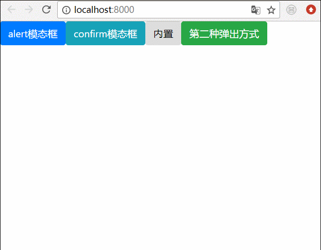
三、最終效果
我們將上面所有的彈框全部寫在一起,然後效果就是這樣的
相關推薦:
bootstrap模態框嵌套、tabindex屬性、去除陰影的方法
詳解bootstrap3-dialog-master模態方塊用法
以上是兩種Angular彈出模態框的方式的詳細內容。更多資訊請關注PHP中文網其他相關文章!


