
<!doctype html><html lang="en">
    <head>
        <meta charset="UTF-8">
        <title>CSS制作立体导航</title>
        <link rel="stylesheet" href="http://www.w3cplus.com/demo/css3/base.css">
        <style>
            body{
              background: #ebebeb;
            }
            .nav{
              width:560px;
              height: 50px;
              font:bold 0/50px Arial;
              text-align:center;
              margin:40px auto 0;
              background: #f65f57;
             /*制作导航圆角*/
              border-radius: 8px;
             /*制作导航立体效果*/
              box-shadow: 0 7px 0 #ba4a45;
            }
            .nav a{
              display: inline-block;
              /* a元素的过渡属性:1、设置所有a标签过渡;2、过渡时间;3、速度曲线:以慢速开始的过渡效果 */
                -webkit-transition: all 0.2s ease-in;/* Safari 和 Chrome */
                -moz-transition: all 0.2s ease-in;/* Firefox */
               -o-transition: all 0.2s ease-in;/* Opera */
               -ms-transition: all 0.2s ease-in;/* IE 9 */
               transition: all 0.2s ease-in;
            }
            .nav a:hover{
                /* 鼠标移上时的效果;定义2D旋转10度 */
              -webkit-transform:rotate(10deg);
              -moz-transform:rotate(10deg);
              -o-transform:rotate(10deg);
              -ms-transform:rotate(10deg);
              transform:rotate(10deg);
            }

            .nav li{
              position:relative;
              display:inline-block;
              padding:0 16px;
              font-size: 14px;
              text-shadow:1px 2px 4px rgba(0,0,0,.5);
              list-style: none outside none;
            }
            /*制作导航分隔线效果*/
            .nav li::before,
            .nav li::after{
              content:"";
              position:absolute;
              top:14px;
              height: 25px;
              width: 1px;
            }
            .nav li::after{
              right: 0;
              /* 线性渐变 */
              background: -moz-linear-gradient(top, rgba(255,255,255,0), rgba(255,255,255,.2) 50%, rgba(255,255,255,0));
              background: -webkit-linear-gradient(top, rgba(255,255,255,0), rgba(255,255,255,.2) 50%, rgba(255,255,255,0));
              background: -o-linear-gradient(top, rgba(255,255,255,0), rgba(255,255,255,.2) 50%, rgba(255,255,255,0));
              background: -ms-linear-gradient(top, rgba(255,255,255,0), rgba(255,255,255,.2) 50%, rgba(255,255,255,0));
              background: linear-gradient(top, rgba(255,255,255,0), rgba(255,255,255,.2) 50%, rgba(255,255,255,0));
            }
            .nav li::before{
              left: 0;
              background: -moz-linear-gradient(top, #ff625a, #9e3e3a 50%, #ff625a);
              background: -webkit-linear-gradient(top, #ff625a, #9e3e3a 50%, #ff625a);
              background: -o-linear-gradient(top, #ff625a, #9e3e3a 50%, #ff625a);
              background: -ms-linear-gradient(top, #ff625a, #9e3e3a 50%, #ff625a);
              background: linear-gradient(top, #ff625a, #9e3e3a 50%, #ff625a);
            }
            /*删除导航第一个导航项左边的分隔线*/
            .nav li:first-child::before{
              background: none;
            }
            /*删除导航最后一个导航右边的分隔线*/
            .nav li:last-child::after{
              background: none;
            }
            .nav a,
            .nav a:hover{
              color:#fff;
              text-decoration: none;
            }

        </style>
    </head>
    <body>
        <ul class="nav">
        <li><a href="">首页</a></li>
        <li><a href="">个人简介</a></li>
        <li><a href="">作品集</a></li>
        <li><a href="">博客</a></li>
        <li><a href="">资源</a></li>
        <li><a href="">联系我</a></li>
        </ul>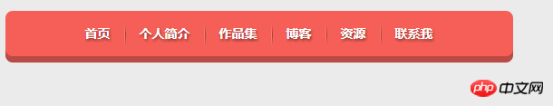
</body></html>效果圖:
1
#2
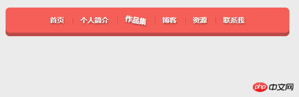
#總結:1、body部分用無序列表2、(1)hover
滑鼠移上時的效果。
::before和:before的區別
w3c關於css選擇器的規格:A pseudo-element is made of two colons (::) followed by the name of the pseudo-element.This :: notation is introduced by the current document in order to establish a discrimination between pseudo-classes and pseudo-elements. For compatibility with existing style sheets, agent agents previous the prevgents previous one-colon notation for pseudo-elements introduced in CSS levels 1 and 2 (namely, :first-line
:first-letter, :before and ##:after). This compatibility is not allowed for the new pseudo-elements introduced in CSS level 3.
## 簡單翻譯:偽元素名稱由雙冒號和偽元素名稱組成。雙冒號是在當前規範中引入的,用於區分偽類和偽元素。不過瀏覽器需要同時支援舊的已經存在的偽元素寫法,例如:first-line、:first-letter、:before、:after等,而新的CSS3中引入的偽元素則不允許
再支持舊的單冒號的寫法。 那麼現在就可以完整的回答標題中的問題了,對於CSS2之前已有的偽元素,比如:before,單冒號和雙冒號的寫法::before作用是一樣的。
###### 所以,如果你的網站###只需要###相容於webkit、firefox、opera等瀏覽器,建議對於偽元素採用雙冒號的寫法,如果不得不相容IE瀏覽器,還是用CSS2的單冒號寫法比較安全。 ###以上是用CSS製作立體導覽列的方法的詳細內容。更多資訊請關注PHP中文網其他相關文章!


