

實作如圖所示的點點
提交订单中<span class="ani_dot">...</span>
.ani_dot {
    font-family: simsun;
}
:root .ani_dot { /* 这里使用Hack是因为IE6~IE8浏览器下, vertical-align解析不规范,值为bottom或其他会改变按钮的实际高度*/
    display: inline-block;
    width: 1.5em;
    vertical-align: bottom;
    overflow: hidden;
}
@-webkit-keyframes dot {
    0% { width: 0; margin-right: 1.5em; }
    33% { width: .5em; margin-right: 1em; }
    66% { width: 1em; margin-right: .5em; }
    100% { width: 1.5em; margin-right: 0;}
}
.ani_dot {
    -webkit-animation: dot 3s infinite step-start;
}

@keyframes dot {
    0% { width: 0; margin-right: 1.5em; }
    33% { width: .5em; margin-right: 1em; }
    66% { width: 1em; margin-right: .5em; }
    100% { width: 1.5em; margin-right: 0;}
}
.ani_dot {
    animation: dot 3s infinite step-start;
} 出現的就是如圖所示的結果。
 2.animate動畫是連續的,但是我們這兒是一幀一幀的,一卡一卡的,不是那麼連續的效果,用到
step-start。 3.上面程式碼也用到了css3的選擇器:root。 :root為IE9+以及其他現代瀏覽器Hack, IE6-7甚至IE8下,inline-block水平元素的vertical-align:bottom解析與inline水平是有差異的,會導致高度撐開,因此,display: inline- block要hack處理。
語法二:動畫(animation)的參數詳解
由於上面用到了animation動畫,這裡詳細介紹下這個animation的參數。
簡介CSS動畫(Animations)簡單說就是在一段固定的動畫時間內暗中在某一頻率內改變其CSS某個或某些值,從而達到視覺上的轉換動畫效果。 Animations的許多方面都是可以控制的,包括動畫運行時間,開始值和結束值,還有動畫的暫停和延遲其開始時間等。
<single-animation> = <single-animation-name> || <time> || <single-animation-timing-function> || <time> || <single-animation-iteration-count> || <single-animation-direction> || <single-animation-fill-mode> || <single-animation-play-state> <' animation-name '>:检索或设置对象所应用的动画名称<' animation-duration '>:检索或设置对象动画的持续时间<' animation-timing-function '>:检索或设置对象动画的过渡类型<' animation-delay '>:检索或设置对象动画延迟的时间<' animation-iteration-count '>:检索或设置对象动画的循环次数<' animation-direction '>:检索或设置对象动画在循环中是否反向运动<' animation-fill-mode '>:检索或设置对象动画时间之外的状态<' animation-play-state '>:检索或设置对象动画的状态。w3c正考虑是否将该属性移除,因为动画的状态可以通过其它的方式实现,比如重设样式
]?):接受兩個參數的步進函數。第一個參數必須為正整數,指定函數的步數。第二個參數取值可以是start或end,指定每個步驟的值發生變化的時間點。第二個參數是可選的,預設值為end。
cubic-bezier(
animation-delay
animation-iteration-count
reverse
"running"。還有個值paused
from to:p{
width:100px;
height:100px;
background:red;
position:relative;
animation:mymove 5s infinite;
-moz-animation:mymove 5s infinite; /*Firefox*/
-webkit-animation:mymove 5s infinite; /*Safari and Chrome*/
}
@keyframes mymove{
from {left:0px;}
to {left:200px;}
}
@-moz-keyframes mymove { /*Firefox*/
from {left:0px;}
to {left:200px;}
}
@-webkit-keyframes mymove{ /*Safari and Chrome*/
from {left:0px;}
to {left:200px;}
}@keyframes myfirst{
0% {background: red; left:0px; top:0px;}
25% {background: yellow; left:200px; top:0px;}
50% {background: blue; left:200px; top:200px;}
75% {background: green; left:0px; top:200px;}
100% {background: red; left:0px; top:0px;}
}
@-moz-keyframes myfirst{ /* Firefox */
0% {background: red; left:0px; top:0px;}
25% {background: yellow; left:200px; top:0px;}
50% {background: blue; left:200px; top:200px;}
75% {background: green; left:0px; top:200px;}
100% {background: red; left:0px; top:0px;}
}
@-webkit-keyframes myfirst{ /* Safari 和 Chrome */
0% {background: red; left:0px; top:0px;}
25% {background: yellow; left:200px; top:0px;}
50% {background: blue; left:200px; top:200px;}
75% {background: green; left:0px; top:200px;}
100% {background: red; left:0px; top:0px;}
}
@-o-keyframes myfirst {/* Opera */
0% {background: red; left:0px; top:0px;}
25% {background: yellow; left:200px; top:0px;}
50% {background: blue; left:200px; top:200px;}
75% {background: green; left:0px; top:200px;}
100% {background: red; left:0px; top:0px;}
}只有webkit内核的浏览器才能看到相关3D动画效果。
实现效果如图所示: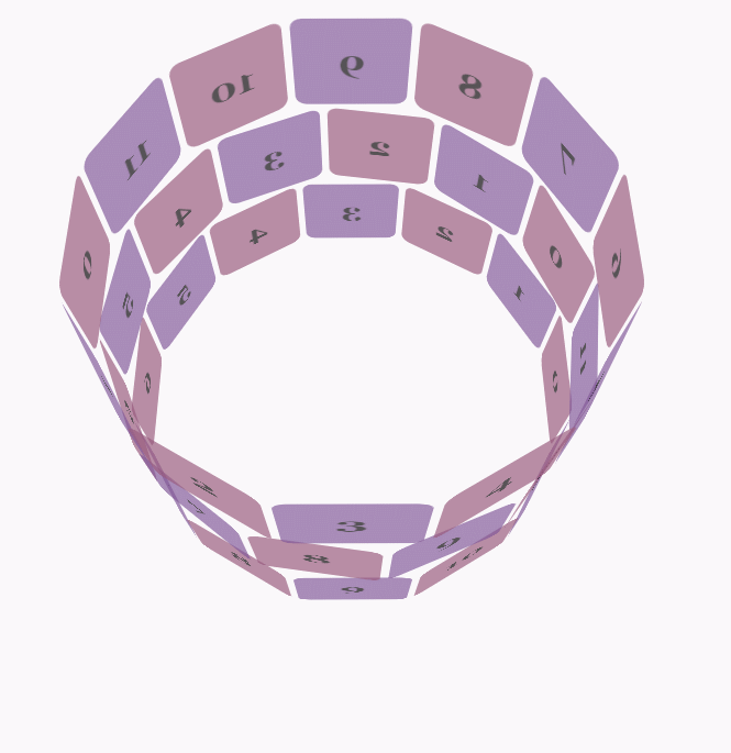
css代码:
body {
        font-family: 'Lucida Grande', Verdana, Arial;
        font-size: 12px;
      }

      #stage {
        margin: 150px auto;
        width: 600px;
        height: 400px;
        -webkit-perspective: 800;
      }

      #rotate {
        margin: 0 auto;
        width: 600px;
        height: 400px;
        -webkit-transform-style: preserve-3d;
        -webkit-animation-name: x-spin;
        -webkit-animation-duration: 7s;
        -webkit-animation-iteration-count: infinite;
        -webkit-animation-timing-function: linear;
      }

      .ring {
        margin: 0 auto;
        height: 110px;
        width: 600px;
        -webkit-transform-style: preserve-3d;
        -webkit-animation-iteration-count: infinite;
        -webkit-animation-timing-function: linear;
      }

      .ring > :nth-child(odd) {
        background-color: #995C7F;
      }

      .ring > :nth-child(even) {
        background-color: #835A99;
      }

      .poster {
        position: absolute;
        left: 250px;
        width: 100px;
        height: 100px;
        opacity: 0.7;
        color: rgba(0,0,0,0.9);
        -webkit-border-radius: 10px;
      }

      .poster > p {
        font-family: 'Georgia', serif;
        font-size: 36px;
        font-weight: bold;
        text-align: center;
        margin-top: 28px;
      }

      #ring-1 {
        -webkit-animation-name: y-spin;
        -webkit-animation-duration: 5s;
      }

      #ring-2 {
        -webkit-animation-name: back-y-spin;
        -webkit-animation-duration: 4s;
      }

      #ring-3 {
        -webkit-animation-name: y-spin;
        -webkit-animation-duration: 3s;
      }

      @-webkit-keyframes x-spin {
        0%    { -webkit-transform: rotateX(0deg); }
        50%   { -webkit-transform: rotateX(180deg); }
        100%  { -webkit-transform: rotateX(360deg); }
      }

      @-webkit-keyframes y-spin {
        0%    { -webkit-transform: rotateY(0deg); }
        50%   { -webkit-transform: rotateY(180deg); }
        100%  { -webkit-transform: rotateY(360deg); }
      }

      @-webkit-keyframes back-y-spin {
        0%    { -webkit-transform: rotateY(360deg); }
        50%   { -webkit-transform: rotateY(180deg); }
        100%  { -webkit-transform: rotateY(0deg); }
}html代码:
<p id="stage">
  <p id="rotate">
    <p id="ring-1" class="ring"></p>
    <p id="ring-2" class="ring"></p>
    <p id="ring-3" class="ring"></p>
  </p>
</p>js代码:
const POSTERS_PER_ROW = 12;
const RING_RADIUS = 200;
function setup_posters (row){
var posterAngle = 360 / POSTERS_PER_ROW;
for (var i = 0; i < POSTERS_PER_ROW; i ++) {
var poster = document.createElement('p');
poster.className = 'poster';
var transform = 'rotateY(' + (posterAngle * i) + 'deg) translateZ(' + RING_RADIUS + 'px)';
poster.style.webkitTransform = transform;
var content = poster.appendChild(document.createElement('p'));
content.textContent = i;
row.appendChild(poster);
}
}
function init (){
setup_posters(document.getElementById('ring-1'));
setup_posters(document.getElementById('ring-2'));
setup_posters(document.getElementById('ring-3'));
}
window.addEventListener('load', init, false);以上是關於CSS3的animate如何實現「...」loading動畫效果(一)的詳細內容。更多資訊請關注PHP中文網其他相關文章!


