


紫色星球的神秘航行

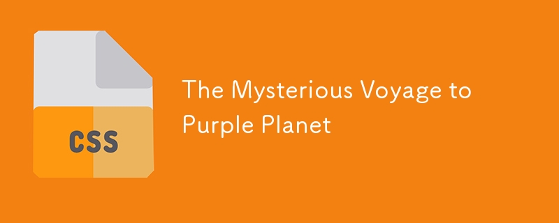
紫色星球的神祕航程
在浩瀚的太空中,一位孤獨的航海家穿越遙遠的宇宙,到達了一顆詭異的紫色星球。當船著陸時,一根巨大的觸手從陰影中爆發出來,吞噬了船和隨風飄揚的鄰近旗幟。一切都消失得無影無蹤。這個星球出奇地安靜,但這起神秘事件卻暗示著一些深刻的事情:外星人是存在的,而我們是他們世界裡真正的局外人。
這是示範:
https://jagroop2001.github.io/DEV-To-Frontend-challenge/
程式碼擴充:
該專案使用簡單的 HTML 和 CSS 來製作宇宙之旅的視覺效果,而 JavaScript 動態添加星星來創建身臨其境的空間環境。動畫包含幾個關鍵元素:
- 劃過夜空的流星。
- 一艘在太空中航行的旋轉太空船。
- 神秘的火星景觀,佈滿隕石坑和揮舞的觸手。
HTML 結構
<!DOCTYPE html>
<html lang="en">

<head>
    <meta charset="UTF-8">
    <meta name="viewport" content="width=device-width, initial-scale=1.0">
    <title>CSS Space Animation</title>
    <link rel="stylesheet" href="styles.css">
</head>

<body>
    <div class="space">
        <div class="shooting-star shooting1"></div>
        <div class="shooting-star shooting2"></div>
        <div class="shooting-star shooting3"></div>
        <div class="ship">
            <div class="ship-rotate">
                <div class="pod"></div>
                <div class="fuselage"></div>
            </div>
        </div>
        <div class="ship-shadow"></div>
        <div class="mars">
            <div class="tentacle"></div>
            <div class="flag">
                <div class="small-tentacle"></div>
            </div>
            <div class="planet">
                <div class="surface"></div>
                <div class="crater1"></div>
                <div class="crater2"></div>
                <div class="crater3"></div>
            </div>
        </div>
    </div>
    <script src="script.js"></script>
</body>

</html>
此 HTML 結構包含幾層 div 元素,代表恆星、太空船、火星以及行星表面的觸手和隕石坑等其他細節。我們將在 CSS 部分中設定這些元素的樣式和動畫。
CSS 魔法:空間樣式與動畫
@import url('https://fonts.googleapis.com/css2?family=Roboto:wght@400;700&display=swap');


body {
    margin: 0;
    height: 100vh;
    overflow: hidden;
    font-family: 'Roboto', sans-serif;
}

.space {
    position: absolute;
    top: 0;
    left: 0;
    width: 100%;
    height: 100%;
    background: #000000;
    overflow: hidden;

}

.star {
    position: absolute;
    background-color: white;
    border-radius: 50%;
    opacity: 0.8;
    box-shadow: 0 0 10px rgba(255, 255, 255, 0.5);
    animation: twinkle 2s infinite ease-in-out alternate, move 5s infinite ease-in-out;
}

@keyframes move {

    0%,
    100% {
        transform: translateX(0) translateY(0);
    }

    50% {
        transform: translateX(10px) translateY(5px);
    }
}

@keyframes twinkle {
    0% {
        opacity: 0.8;
    }

    100% {
        opacity: 0.3;
    }
}

.ship {
    position: absolute;
    right: 50%;
    top: 50%;
    margin-top: -55px;
    margin-right: -55px;
    height: 22px;
    background: rgba(0, 0, 0, .1);
    transform-origin: 0% 100% 0;
    z-index: 1;
    animation: ship 12s cubic-bezier(0.645, 0.045, 0.355, 1) infinite;

    .ship-rotate {
        position: absolute;
        height: 22px;
        transform: rotate(-110deg);
        animation: ship-rotate 12s cubic-bezier(0.645, 0.045, 0.355, 1) infinite;
    }

    .pod {
        position: absolute;
        top: 0;
        left: -8px;
        height: 16px;
        width: 16px;
        background: #eee;
        border-radius: 100% 0 100% 0;
        transform: rotate(-45deg);
    }

    .fuselage {
        position: absolute;
        top: 14px;
        left: -6px;
        height: 8px;
        width: 12px;
        background: #eee;
        border-radius: 100% 100% 0 0;

        &:after {
            content: "";
            position: absolute;
            left: 2px;
            top: 100%;
            width: 0;
            height: 0;
            border-left: 4px solid transparent;
            border-right: 4px solid transparent;
            border-top: 6px solid #fc7100;
        }
    }
}


.mars {
    position: absolute;
    top: 50%;
    left: 50%;
    z-index: 2;

    .tentacle {
        position: absolute;
        top: -60px;
        right: -80px;
        z-index: 1;
        height: 70px;
        width: 70px;
        border-radius: 100%;
        border-left: 15px solid #fd13f2;
        transform: rotate(-30deg);
        animation: tentacle 12s cubic-bezier(0.645, 0.045, 0.355, 1) infinite;
    }

    .flag {
        position: absolute;
        height: 17px;
        width: 15px;
        top: -57px;
        left: -1px;
        animation: flag-pole 12s cubic-bezier(0.645, 0.045, 0.355, 1) infinite;

        &:before {
            content: "";
            position: absolute;
            height: 17px;
            width: 2px;
            background: #eee;
        }

        &:after {
            content: "";
            position: absolute;
            height: 10px;
            width: 14px;
            left: 2px;
            top: 0;
            background: #aaa;
            animation: flag-unfurl 12s cubic-bezier(0.645, 0.045, 0.355, 1) infinite;
        }

        .small-tentacle {
            position: absolute;
            left: -16px;
            top: 3px;
            height: 50px;
            width: 50px;
            border-left: 10px solid #fd13f2;
            border-radius: 100%;
            transform: rotate(25deg);
            animation: small-tentacle 12s cubic-bezier(0.645, 0.045, 0.355, 1) infinite;
            z-index: 2;
        }
    }

    .planet {
        position: absolute;
        border-radius: 100%;
        height: 120px;
        width: 120px;
        overflow: hidden;
        margin-left: -60px;
        margin-top: -60px;
        z-index: 2;

        .surface {
            position: absolute;
            border-radius: 100%;
            height: 140%;
            width: 140%;
            top: -30%;
            right: -10%;
            border: 30px solid rgba(0, 0, 0, .15);
            background: #9562C7;
        }

        .crater1,
        .crater2,
        .crater3 {
            position: absolute;
            border-radius: 100%;
            background: rgba(0, 0, 0, .15);
            box-shadow: inset 3px 3px 0 rgba(0, 0, 0, .2);
        }

        .crater1 {
            height: 20px;
            width: 20px;
            top: 32%;
            left: 17%;
        }

        .crater2 {
            height: 10px;
            width: 10px;
            top: 26%;
            left: 55%;
            box-shadow: inset 2px 2px 0 rgba(0, 0, 0, .2);
        }

        .crater3 {
            height: 10px;
            width: 10px;
            top: 60%;
            left: 40%;
            box-shadow: inset 2px 2px 0 rgba(0, 0, 0, .2);
        }
    }
}

@keyframes small-tentacle {
    0% {
        transform: rotate(-60deg);
    }

    86% {
        transform: rotate(-60deg);
    }

    89% {
        transform: rotate(10deg);
    }

    100% {
        transform: rotate(10deg);
    }
}

@keyframes tentacle {
    0% {
        transform: rotate(-30deg);
    }

    75% {
        transform: rotate(-30deg);
    }

    80% {
        transform: rotate(-165deg) translate(6px, 8px);
    }

    82.5% {
        transform: rotate(-165deg) translate(28px, -17px);
    }

    100% {
        transform: rotate(-165deg) translate(35px, -22px);
    }
}

@keyframes ship {
    0% {
        right: -10%;
        top: -10%;
        margin-top: -55px;
        margin-right: -55px;
    }

    40% {
        right: 50%;
        top: 50%;
    }

    79.5% {
        margin-top: -55px;
        margin-right: -55px;
    }

    84% {
        margin-top: -20px;
        margin-right: 0px;
    }

    100% {
        right: 50%;
        top: 50%;
        margin-top: 0px;
        margin-right: 0px;
    }
}

@keyframes ship-rotate {
    0% {
        transform: rotate(-110deg);
    }

    20% {
        transform: rotate(-110deg);
    }

    34% {
        transform: rotate(47deg);
    }

    79% {
        transform: rotate(47deg);
    }

    100% {
        transform: rotate(47deg);
    }
}

@keyframes ship-shadow {
    0% {
        right: -10%;
        transform: scale(1.4, 1);
        opacity: .3;
    }

    40% {
        right: 50%;
        transform: scale(.75, 1);
        opacity: 1;
    }

    100% {
        right: 50%;
    }
}

@keyframes flag-pole {
    0% {
        top: -57px;
    }

    48% {
        top: -57px;
    }

    54% {
        top: -77px;
    }

    90% {
        top: -77px;
    }

    92% {
        top: -57px;
    }

    100% {
        top: -57px;
    }
}

@keyframes flag-unfurl {
    0% {
        width: 0;
    }

    55% {
        width: 0;
    }

    60% {
        width: 14px;
    }

    90% {
        width: 14px;
    }

    100% {
        width: 14px;
    }
}
使用 JavaScript 加入星星
document.addEventListener('DOMContentLoaded', () => {
    const galaxy = document.querySelector('.space');

    for (let i = 0; i < 200; i++) {
        const star = document.createElement('div');
        star.classList.add('star');

        // Randomize the position and size of the stars
        const size = Math.random() * 4 + 'px';
        star.style.width = size;
        star.style.height = size;
        star.style.top = Math.random() * 100 + '%';
        star.style.left = Math.random() * 100 + '%';

        galaxy.appendChild(star);
    }
});
以上是紫色星球的神秘航行的詳細內容。更多資訊請關注PHP中文網其他相關文章!

熱AI工具

Undress AI Tool
免費脫衣圖片

Undresser.AI Undress
人工智慧驅動的應用程序,用於創建逼真的裸體照片

AI Clothes Remover
用於從照片中去除衣服的線上人工智慧工具。

Clothoff.io
AI脫衣器

Video Face Swap
使用我們完全免費的人工智慧換臉工具,輕鬆在任何影片中換臉!

熱門文章
熱工具

記事本++7.3.1
好用且免費的程式碼編輯器

SublimeText3漢化版
中文版,非常好用

禪工作室 13.0.1
強大的PHP整合開發環境

Dreamweaver CS6
視覺化網頁開發工具

SublimeText3 Mac版
神級程式碼編輯軟體(SublimeText3)


 顯示:內聯,顯示:塊和顯示:內聯塊之間有什麼區別?
Jul 11, 2025 am 03:25 AM
顯示:內聯,顯示:塊和顯示:內聯塊之間有什麼區別?
Jul 11, 2025 am 03:25 AM
Themaindifferencesbetweendisplay:inline,block,andinline-blockinHTML/CSSarelayoutbehavior,spaceusage,andstylingcontrol.1.Inlineelementsflowwithtext,don’tstartonnewlines,ignorewidth/height,andonlyapplyhorizontalpadding/margins—idealforinlinetextstyling
 造型與CSS不同訪問的鏈接
Jul 11, 2025 am 03:26 AM
造型與CSS不同訪問的鏈接
Jul 11, 2025 am 03:26 AM
設置訪問過鏈接的樣式能提升用戶體驗,尤其在內容密集型網站中幫助用戶更好導航。 1.使用CSS的:visited偽類可定義已訪問鏈接樣式,如顏色變化;2.注意瀏覽器出於隱私限制僅允許修改部分屬性;3.顏色選擇應與整體風格協調,避免突兀;4.移動端可能不顯示該效果,建議結合其他視覺提示如icon輔助標識。
 如何使用CSS創建響應式圖像?
Jul 15, 2025 am 01:10 AM
如何使用CSS創建響應式圖像?
Jul 15, 2025 am 01:10 AM
要使用CSS創建響應式圖片,主要可通過以下方法實現:1.使用max-width:100%和height:auto讓圖片在保持比例的同時自適應容器寬度;2.結合HTML的srcset和sizes屬性智能加載適配不同屏幕的圖片源;3.利用object-fit和object-position控製圖片裁剪與焦點展示。這些方法共同確保圖片在不同設備上清晰、美觀地呈現。
 什麼是常見的CSS瀏覽器不一致?
Jul 26, 2025 am 07:04 AM
什麼是常見的CSS瀏覽器不一致?
Jul 26, 2025 am 07:04 AM
不同瀏覽器對CSS解析存在差異,導致顯示效果不一致,主要包括默認樣式差異、盒模型計算方式、Flexbox和Grid佈局支持程度及某些CSS屬性行為不一致。 1.默認樣式處理不一致,解決方法是使用CSSReset或Normalize.css統一初始樣式;2.舊版IE的盒模型計算方式不同,建議統一使用box-sizing:border-box;3.Flexbox和Grid在邊緣情況或舊版本中表現有差異,應多測試並使用Autoprefixer;4.某些CSS屬性行為不一致,需查閱CanIuse並提供降級
 描述'不透明度”屬性
Jul 15, 2025 am 01:23 AM
描述'不透明度”屬性
Jul 15, 2025 am 01:23 AM
opacity是CSS中用於控制元素整體透明度的屬性,取值範圍為0(完全透明)到1(完全不透明)。 1.常用於圖片hover淡出效果,通過設置opacity過渡增強交互體驗;2.製作背景遮罩層提昇文字可讀性;3.控制按鈕或圖標在禁用狀態下的視覺反饋。需注意它會影響所有子元素,且與rgba不同,後者僅影響指定顏色部分。搭配transition可實現平滑動畫,但頻繁使用可能影響性能,建議結合will-change或transform使用。合理應用opacity能增強頁面層次感和交互性,但應避免干擾用戶
 什麼是口音色的物業?
Jul 26, 2025 am 09:25 AM
什麼是口音色的物業?
Jul 26, 2025 am 09:25 AM
accent-color是CSS中用於自定義復選框、單選按鈕和滑塊等表單元素高亮顏色的屬性;1.它直接改變表單控件選中狀態的默認顏色,如將復選框的藍色勾選標記改為紅色;2.支持的元素包括type="checkbox"、type="radio"和type="range"的輸入框;3.使用accent-color可避免複雜的自定義樣式和額外DOM結構,保持原生可訪問性;4.現代瀏覽器普遍支持,舊瀏覽器需降級處理;5.設置accent-col
 描述`:has()`pseudo-class(父挑選器)
Jul 15, 2025 am 12:32 AM
描述`:has()`pseudo-class(父挑選器)
Jul 15, 2025 am 12:32 AM
The:has()pseudo-classinCSSallowstargetingaparentelementbasedonitschildelements.Itworksbyusingthesyntaxparent:has(child-selector)toapplystylesconditionally.Forexample,div:has(img)appliesstylestoadivcontaininganimage.Multipleselectorscanbeusedwithcomma
 了解CSS盒裝屬性:Content-Box與Border-Box
Jul 12, 2025 am 03:21 AM
了解CSS盒裝屬性:Content-Box與Border-Box
Jul 12, 2025 am 03:21 AM
為什麼設置了100px寬度的盒子會顯示更寬?因為默認使用的是content-box模型,實際寬度包括內容、padding和border。 1.默認情況下,box-sizing是content-box,設置的width僅指內容區域,padding和border會額外增加整體寬度;2.使用border-box可讓設定的width包含內容、padding和border,佈局更直觀;3.推薦全局設置box-sizing:border-box,避免佈局錯位,尤其適合響應式設計;4.特殊場景下可使用conte
