

作者:卡洛斯·穆庫霍✏️
倒數計時器是許多網站上的熱門功能,可增強活動、銷售和用戶參與度的功能。雖然 JavaScript 通常用於網路上的動態行為,但也可以只使用 CSS 建立功能強大且視覺上吸引人的倒數計時器。
在本教程中,我們將探索這兩種方法,從基本的 JavaScript 倒數計時器開始,然後轉向純 CSS 倒數計時器。最後,我們將使用 Chrome DevTools 來比較兩種方法的效能,並討論它們各自的優缺點。
我們將首先建立一個每秒更新一次的簡單倒數計時器。計時器將包括一個開始和暫停按鈕來控制其操作。
在創建 JavaScript 倒數計時器之前,我們需要建立一個目錄來儲存我們將在本教程中建立的應用程式。
開啟終端機窗口,導覽至適合您的專案的目錄,然後使用以下命令建立名為 countdown-timer 的目錄:
然後,導覽至此目錄:
建立兩個名為 javascript-countdown 和 css-only-countdown 的子目錄,並在每個子目錄中建立一個名為 public 的子目錄:
接下來,導覽到 javascript-countdown 子目錄,使用預設設定初始化一個新的節點項目,並安裝 Express 套件:
打開您最喜歡的文字編輯器,建立一個名為 server.js 的文件,並在其中添加以下程式碼:
上面的程式碼建立了一個 Express 伺服器,用於為連接埠 3001 中的 JavaScript 倒數計時應用程式提供服務。
仍在文字編輯器中,在 javascript-countdown 目錄內的 public 子目錄中建立以下檔案:
將以下程式碼加入index.html:
此 HTML 檔案設定了一個基本結構,其中包含一個包含控制按鈕的容器和一個倒數顯示區域。
接下來,我們將新增 JavaScript 來管理倒數邏輯。在index.js中加入以下程式碼:
在此程式碼區塊中,我們透過各自的 ID 和類別來初始化 startBtn、pauseBtn 和 countdownView 元素。我們也設定了一些初始變數:totalTime、timeLeft、countDownIntervalID 和 isPaused。此外,我們將暫停按鈕設為最初隱藏。
現在,讓我們為開始和暫停按鈕新增事件偵聽器:
這些行將點擊事件偵聽器附加到開始和暫停按鈕。稍後定義函數startOrStopTimer 和pauseOrResumeTimer 來處理按鈕點選。
加入以下程式碼來定義startOrStopTimer函數:
在此函數中,我們在「開始」和「停止」之間切換開始按鈕文字。如果倒數計時未運行且未暫停,我們將 timeLeft 初始化為totalTime 並啟動計時器。否則,我們停止計時器並重置視圖。
現在,定義 startTimer 函數:
此函數設定每秒更新倒數計時的間隔。如果 timeLeft 達到零,我們將停止計時器,重置開始按鈕文本,並隱藏暫停按鈕。
接下來,加入stopTimer函數:
此函數清除倒數間隔並重設 countDownIntervalID。最後加入pauseOrResumeTimer函數:
在此函數中,我們在「暫停」和「恢復」之間切換暫停狀態和按鈕文字。如果倒數計時正在運行,我們就停止計時器;否則,我們重新開始。
現在,讓我們使用 CSS 設定倒數計時器的樣式。將以下程式碼加入 styles.css:
此 CSS 定義了倒數計時器介面的樣式。正文背景設定為黑色,我們使用 Arial 作為主要字體。 .container 類別的樣式使其內容居中並在元素之間提供間距。 .controls 類別設定用於啟動和暫停計時器的按鈕的樣式,確保它們均勻分佈且響應靈敏。 .countdown-container 類別定義倒數計時顯示的大小和外觀,包括邊框和邊距。
返回終端並執行以下命令開始提供 JavaScript 倒數計時應用程式:
node server.js
Open a new tab in your browser, navigate to http://localhost:3001, and you should see something similar to the following: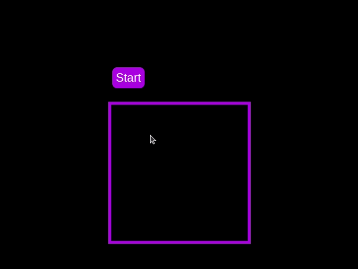 Test out the countdown timer and once you are done, terminate the server application and move to the next step.
To enhance the user experience of our countdown timer, let’s add a circular progress indicator to give the user a visual representation of the time remaining.
First, we need to modify our HTML code to include the circular progress element. In index.html, we add a span element with a class of circular-progress inside the countdown-container div. This span element will be used to create the circular progress indicator:
Next, we need to define the CSS for the circular progress indicator. In styles.css, we add the following code:
.countdown-container { ... /* border : 0.4em solid #9b51e0; */ } .circular-progress { width: 20vw; height: 20vw; border-radius: 50%; display: flex; justify-content: center; align-items: center; position: absolute; transition: 0.5s; background-color: #13171f; } .circular-progress::before { width: 18.5vw; height: 18.5vw; content: ""; position: absolute; border-radius: 50%; background-color: black; }
This code first removes the border from the countdown-container div, then sets the dimensions and shape of the circular progress indicator, as well as its position and background color. We also add a ::before pseudo-element to create the inner circle of the progress indicator.
Now we need to add the JavaScript code to animate the circular progress indicator.
Add the following code in the variables initialization block:
const circularProgressEl = document.getElementsByClassName("circular-progress")[0]; let circularProgress; let circularProgressIntervalID;
This code initializes the circularProgressEl variable to target the circular progress element and creates two new variables, circularProgress and circularProgressIntervalID, that will be used to animate the progress indicator.
Add the following code below the pauseOrResumeTimer() function:
function startCircularProgressAnimation() { let start = totalTime - timeLeft; let degreesPerSecond = 360 / totalTime; let degreesPerInterval = degreesPerSecond / 20; circularProgress = degreesPerSecond * start; circularProgressIntervalID = setInterval(() => { if (Math.round(circularProgress) === 360) { clearInterval(circularProgressIntervalID); } else { circularProgress = circularProgress + degreesPerInterval; circularProgressEl.style.background = `conic-gradient(#9b51e0 ${circularProgress}deg, #13171f 0deg)`; } }, 50); }
This code defines the startCircularProgressAnimation function, which calculates the starting point and degree of rotation for the circular progress indicator, and sets up an interval to animate the progress indicator.
Add the following code below the startCircularProgressAnimation:
function resumeCircularProgressAnimation() { startCircularProgressAnimation(); } function pauseCircularProgressAnimation() { clearInterval(circularProgressIntervalID); } function stopCircularProgressAnimation() { clearInterval(circularProgressIntervalID); circularProgressEl.style.background = `conic-gradient(#9b51e0 0deg, #13171f 0deg)`; }
This code defines the resumeCircularProgressAnimation, pauseCircularProgressAnimation, and stopCircularProgressAnimation functions, which are used to start, pause, and stop the circular progress animation.
Finally, we need to modify the startOrStopTimer and pauseOrResumeTimer functions to start and stop the circular progress animation along with the timer:
function startOrStopTimer() { // ... if (countDownIntervalID === undefined && !isPaused) { // ... startCircularProgressAnimation(); } else { // ... stopCircularProgressAnimation(); } } function pauseOrResumeTimer() { // ... if (countDownIntervalID !== undefined) { stopTimer(); pauseCircularProgressAnimation(); } else { startTimer(); resumeCircularProgressAnimation(); } }
With these modifications, our countdown timer now includes a circular progress indicator that animates along with the timer.
Return to your terminal and run the following command to start serving the JavaScript countdown application:
node server.js
Go back to the tab in your browser where you visited the http://localhost:3001 URL, refresh the page, and you should see something similar to the following: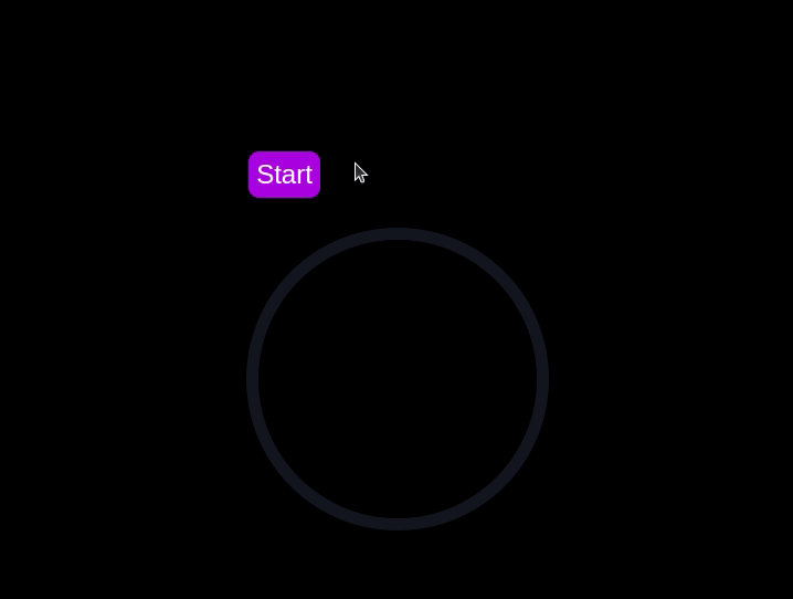
In this section, we'll dive into creating a countdown timer that updates every second and is made using only CSS. Our timer will be simple yet functional, featuring start and pause buttons to control its operation.
Navigate to the css-only-countdown subdirectory, initialize a new node project, and install the express package:
cd ../css-only-countdown npm init -y npm install express
Then, return to your text editor, create a file named server.js, and add the following code to it:
const express = require('express'); const app = express(); const port = 3002 app.use(express.static('public')); app.listen(port, () => { console.log(`Css-only countdown app server started on port ${port}`); });
The code above creates an express server that will be used to serve the JavaScript countdown application in port 3002.
Still in your text editor, create the following files in the public subdirectory:
Add the following code to the index.html file:
CSS Countdown Timer
- 10
- 9
- 8
- 7
- 6
- 5
- 4
- 3
- 2
- 1
This code sets up the basic structure of our countdown timer. It includes a container div that holds the controls for starting and pausing the timer, as well as the countdown display itself. The controls div contains two checkboxes with labels that will serve as our start and pause buttons. These buttons toggle their respective states using CSS, thanks to the checkbox hack.
The countdown-container div holds an unordered list (ul) of list items (li) representing the countdown numbers from 10 to one. These numbers will be displayed one by one as the timer counts down.
Now, let's style the countdown timer using CSS. Add the following code to styles.css:
body { background-color: black; font-family: Arial, sans-serif; height: 100%; } .container { display: flex; flex-direction: column; justify-content: center; align-items: center; } .controls { width: 20%; margin-top: 10%; display: flex; justify-content: space-between; flex-direction: row; flex-wrap: wrap; } .countdown-container { position: relative; width: 20vw; height: 20vw; margin-top: 12%; border : 0.4em solid #9b51e0; } #startLabel span { display: none; } label { cursor: pointer; font-size: 1.5em; padding: 0.3em; background-color: #9b51e0; border-radius: 0.4em; color: white; } #startBtn:checked~#startLabel span:nth-child(1) { display: inline; } #startBtn:not(:checked)~#startLabel span:nth-child(2) { display: inline; } #startBtn:not(:checked)~#pauseLabel, #pauseBtn { display: none; } #pauseLabel span { display: none; } #pauseBtn:checked~#pauseLabel span:nth-child(1) { display: inline; } #pauseBtn:not(:checked)~#pauseLabel span:nth-child(2) { display: inline; } .checkbox-wrapper { display: none; }
In this CSS file, we start by setting some basic styles for the body and container. The body has a black background and uses the Arial font. The container is centered using flexbox and has a margin to push it down from the top of the viewport.
The controls div is styled to be responsive and to ensure that the buttons are spaced out evenly. The countdown-container div is styled with a border, which will later be replaced by the circular progress indicator.
We use the checkbox hack to toggle the visibility of the labels for the start and pause buttons. Depending on whether the checkboxes are checked or not, different spans within the labels are displayed. This allows the labels to show different text (Start or Stop, Pause or Resume) based on the state of the checkboxes.
Now, add the following code to the bottom of the styles.css file:
.countdown { position: relative; width: 100%; height: 100%; list-style: none; padding: 0; margin: 0; display: flex; justify-content: center; align-items: center; font-size: 5em; color: #9b51e0; } .countdown li { position: absolute; opacity: 0; transition: opacity 1s linear; } #startBtn:checked~.countdown-container .countdown li:nth-child(1) { animation-delay: 0s; } #startBtn:checked~.countdown-container .countdown li:nth-child(2) { animation-delay: 1s; } #startBtn:checked~.countdown-container .countdown li:nth-child(3) { animation-delay: 2s; } #startBtn:checked~.countdown-container .countdown li:nth-child(4) { animation-delay: 3s; } #startBtn:checked~.countdown-container .countdown li:nth-child(5) { animation-delay: 4s; } #startBtn:checked~.countdown-container .countdown li:nth-child(6) { animation-delay: 5s; } #startBtn:checked~.countdown-container .countdown li:nth-child(7) { animation-delay: 6s; } #startBtn:checked~.countdown-container .countdown li:nth-child(8) { animation-delay: 7s; } #startBtn:checked~.countdown-container .countdown li:nth-child(9) { animation-delay: 8s; } #startBtn:checked~.countdown-container .countdown li:nth-child(10) { animation-delay: 9s; } @keyframes countdownAnimation { 0%, 10% { opacity: 1; } 11%, 100% { opacity: 0; } } #startBtn:checked~.countdown-container .countdown li { animation: countdownAnimation 10s steps(10) forwards; } #pauseBtn:checked~.countdown-container .countdown li { animation-play-state: paused; }
With this code, we style the countdown list. The countdown class is positioned absolutely within the countdown-container, and its list items are initially hidden with opacity: 0.
We then use keyframes and the animation property to create the countdown effect. The list items are displayed one by one with a delay using the animation-delay property. The countdownAnimation keyframes control the visibility of each list item, making them visible for a short period before hiding them again.
We also pause the animation when the pause button is checked, using the animation-play-state property.
Go back to your terminal and run the following command to start serving the CSS-only countdown application:
node server.js
Open a new tab in your browser, navigate to http://localhost:3002 URL, and you should see something similar to the following: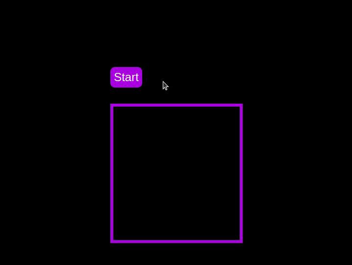 Test out the countdown timer and once you are done, terminate the server application and move to the next step.
To make the countdown timer more visually appealing, we can add a circular progress indicator that shows the remaining time. To do this, we will modify the HTML and CSS code as follows:
First, replace the countdown-container div in the index.html file with the following code:
- 10
- 9
- 8
- 7
- 6
- 5
- 4
- 3
- 2
- 1
In this code, we add a span element with a class of circular-progress inside the countdown-container div.
Next, add the following code to the styles.css file:
.countdown-container { ... /* border : 0.4em solid #9b51e0; */ } .circular-progress { width: 20vw; height: 20vw; border-radius: 50%; display: flex; justify-content: center; align-items: center; position: absolute; transition: 0.5s; background: conic-gradient(#9b51e0 var(--angle), #13171f 0deg); } .circular-progress::before { width: 18.5vw; height: 18.5vw; content: ""; position: absolute; border-radius: 50%; background-color: black; } @keyframes circularProgressAnimation { to { --angle: 360deg; } } @property --angle { syntax: ""; initial-value: 0deg; inherits: false; } #startBtn:checked~.countdown-container .circular-progress { opacity: 1; animation: circularProgressAnimation 10s linear; } #pauseBtn:checked~.countdown-container .circular-progress { animation-play-state: paused; }
In this code, we first remove the border from the countdown-container div, and then add styles for the circular-progress class. The circular progress indicator is a span element that is absolutely positioned within the countdown-container. It uses a conic gradient to create the circular progress effect.
We also define a keyframe animation, circularProgressAnimation, that animates the progress indicator from 0 to 360 degrees over the duration of the countdown. The --angle CSS property is used to control the angle of the gradient.
Finally, we use the checkbox hack to start and pause the circular progress animation along with the countdown numbers. The animation is applied to the circular-progress span when the start button is checked and paused when the pause button is checked.
With these modifications, our countdown timer now includes a circular progress indicator that animates along with the timer.
Go back to your terminal and run the following command to start serving the CSS-only countdown application:
node server.js
Return to the tab in your browser where you visited the http://localhost:3002 URL, refresh the page, and you should see something similar to the following: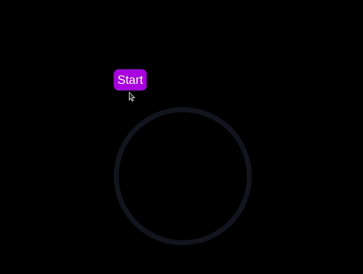
Now that we have implemented both the CSS-only and JavaScript countdown timers, let's compare their performance using Chrome DevTools.
To get started, open the Chrome browser and navigate to the webpage containing the countdown timers. Right-click anywhere on the page and selectInspectto open Chrome DevTools.
In the DevTools window, click on theNetworktab and then refresh both the JavaScript and CSS-only countdown pages. This tab allows you to monitor all network requests made by the page, including HTML, CSS, JavaScript, and other resources:
By analyzing the requests, you can determine how many resources are being loaded, their sizes, and the overall impact on page load time:
| CSS-only countdowntimer | JavaScript countdowntimer | |
|---|---|---|
| Number of requests | 2 | 3 |
| Total size | 4.5 KB | 4.7 KB |
| Page load | 24 ms | 27 ms |
From these results, we can see that the CSS-only countdown timer requires fewer requests and has a slightly smaller total size compared to the JavaScript countdown timer. This leads to a marginally faster page load time for the CSS-only version, making it more efficient in terms of initial loading.
Now, in the DevTools window, navigate to thePerformancetab and initiate a recording session by clicking on theRecordbutton. To evaluate the JavaScript countdown timer, click on theStartbutton located on its respective page and allow the timer to run its course. Once the timer has stopped, cease the recording in thePerformancetab.
Do this process for both the JS and CSS-only countdown pages to gather performance data for each implementation. ThePerformancetab offers a comprehensive analysis of your page's runtime performance, encompassing scripting, rendering, and painting times. By analyzing these metrics, you can pinpoint areas that may require optimization to enhance the performance of your web application:
|
JavaScript countdown timer | |||||||||||||
|---|---|---|---|---|---|---|---|---|---|---|---|---|---|---|
| Scripting | 2 ms | 49 ms | ||||||||||||
| Rendering | 510 ms | 103 ms | ||||||||||||
| Painting | 275 ms | 55 ms |
Interpreting these results, we observe that the scripting time for the CSS-only countdown timer is significantly lower than for the JavaScript countdown timer, indicating minimal execution overhead. However, the CSS-only countdown timer has higher rendering and painting times. This is because CSS animations can sometimes require more effort from the browser to render, especially for complex styles or transitions.
In contrast, the JavaScript countdown timer shows higher scripting time due to the logic involved in updating the countdown, but it benefits from lower rendering and painting times. This suggests that while JavaScript adds some overhead in terms of script execution, it can be more efficient in terms of updating the DOM and rendering changes.
Overall, the CSS-only countdown timer is more efficient for scenarios where minimizing script execution time is critical, whereas the JavaScript timer may perform better in cases where rendering and painting times are the primary concern.
Having explored both the CSS-only and JavaScript countdown timers, let's weigh their advantages and disadvantages to determine which approach best suits your needs.
The CSS-only countdown timer leverages pure CSS to achieve the countdown effect, providing a lightweight and straightforward solution.
Its pros include the following:
Cons to this approach include:
The JavaScript countdown timer, on the other hand, uses JavaScript to manage the countdown logic and DOM updates. This approach offers greater control and flexibility.
Pros of this approach include:
Cons include:
The CSS-only timer is lightweight and easy to understand, making it a good choice for simple countdowns with minimal scripting. However, it may struggle with more complex animations and interactive features. On the other hand, the JavaScript timer offers greater control and flexibility, allowing for more dynamic interactions. This comes at the cost of higher scripting overhead and increased complexity.
Ultimately, the choice between the two approaches depends on the specific needs of your project and the trade-offs you are willing to accept.
In this tutorial, we explored two methods for creating a countdown timer: using JavaScript and using only CSS. We started with a basic JavaScript countdown timer, adding functionality and styling to make it user-friendly and visually appealing. Then, we implemented a CSS-only countdown timer, showcasing the power of CSS for creating simple yet effective animations.
Whether you choose the CSS-only approach for its simplicity or the JavaScript approach for its flexibility, you now have the tools and knowledge to implement a countdown timer that suits your project's needs.
As web frontends get increasingly complex, resource-greedy features demand more and more from the browser. If you’re interested in monitoring and tracking client-side CPU usage, memory usage, and more for all of your users in production, try LogRocket.
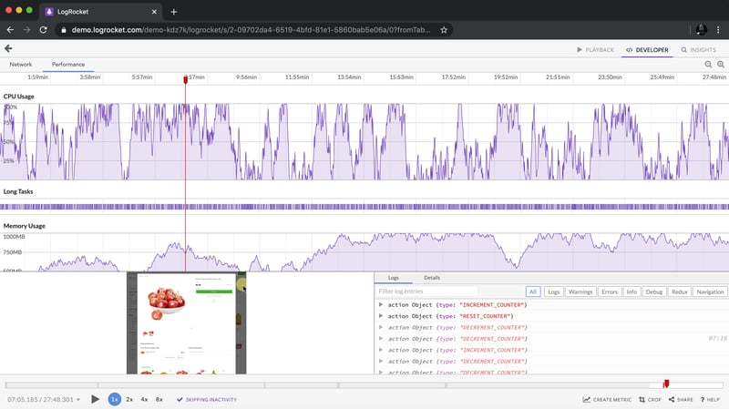
LogRocket is like a DVR for web and mobile apps, recording everything that happens in your web app, mobile app, or website. Instead of guessing why problems happen, you can aggregate and report on key frontend performance metrics, replay user sessions along with application state, log network requests, and automatically surface all errors.
Modernize how you debug web and mobile apps — start monitoring for free.
以上是如何使用 CSS 建立倒數計時器的詳細內容。更多資訊請關注PHP中文網其他相關文章!


