

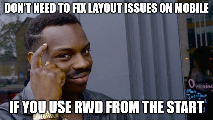
Welcome to the wonderful world of responsive web design!
If you're new to web development, you might be wondering, "What makes a siteresponsive?" Think of it like this: Responsive web design is like having a wardrobe that magically adjusts to fit every occasion - whether you're dressing for a casual brunch or a fancy gala. In web terms, it means your website looks fabulous on any device, from smartphones to tablets to desktop monitors.
Ready to make your site the life of the digital party? Let's dive in!
Imagine you have a magical scroll that changes the appearance of your website based on the viewer's device. That's exactly whatmedia queriesdo in CSS. They let you apply different styles depending on things like screen width, orientation, and resolution. Here's how you can cast your first responsive spell.
/* For screens smaller than 600px */ @media (max-width: 600px) { body { background-color: lightblue; } }
This snippet will turn your background light blue on screens that are 600px wide or smaller. It's like giving your site a stylish makeover for mobile devices!
Just as stretchy pants are perfect foralmostevery occasion, fluid layouts allow your website to expand and contract gracefully. Instead of using fixed widths, use % (percentages) or vw (viewport width) units to make your layout adapt to different screen sizes.
.container { width: 80%; /* Takes up 80% of the viewport width */ margin: 0 auto; /* Center-aligns the container */ }
This way, your container will always take up 80% of the screen, no matter the device. Stretchy pants for your website - what's not to love?
Just like you wouldn't squeeze into a pair of jeans that don't fit, images on your website should resize smoothly. Use the max-width property to ensure your images adjust to fit their containers without overflowing.
img { max-width: 100%; height: auto; }
This rule ensures your images scale down if necessary but never exceed their container's width. No more broken images or awkward zooming!
When your site is viewed on mobile devices, you need to tell the browser how to scale it properly. The viewport meta tag is your ticket to mobile-friendly magic. Add this to your HTML.
This tag ensures your site scales correctly to fit the width of any device and keeps it looking sharp and usable.
Just like a great outfit needs the right accessories, your website needs responsive typography to look its best. Use relative units like em or rem instead of fixed sizes to ensure your text scales appropriately.
h1 { font-size: 2rem; /* Scales with the user's default font size */ }
This way, your headings will look great no matter the screen size, and readers won't have to squint to read your fabulous content.
Before you roll out your site to the world, test it on various devices and screen sizes. Emulators and responsive design testing tools can help you see how your site looks on different screens. Think of it as a dress rehearsal before the big performance.
Pro Tip?
Your favourite browser probably has dev tools that you can use to test how your site looks across different screen sizes. Use them!
Responsive web design is your golden ticket to creating websites that look great on any device, making sure everyone has a top-notch experience. With a bit of magic from media queries, fluid layouts, and flexible images, your site will be ready to impress on mobile, tablet, and desktop screens alike.
So, get your responsive web design wand ready and start making your site mobile-friendly today. After all, in the digital age, everyone deserves a little web love, no matter what device they're using.
Happy coding!
✨
Psst! If you liked what you read, you should click here to checkout CSS 101: The Series. It's completely free!
以上是響應式網頁設計:讓您的網站適合行動裝置的詳細內容。更多資訊請關注PHP中文網其他相關文章!


